
Chart of the Day: A Case for Diversification aka the Chicklets Chart
Contents
About the Author

Learn about our Refer-a-Friend Program. Terms and conditions apply.
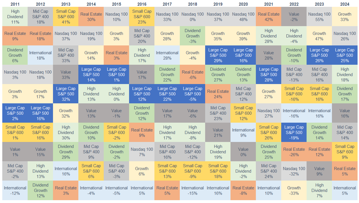
Today’s Chart of the Day, often referred to as the Chicklets Chart, is updated annually to reflect the returns of the major factors in the equity market going back to 2011.
Factors include size, dividend level, growth/income, and international/domestic. A quick scan of each year shows how each factor’s returns vary - some go from best to worst, some are flat year-to-year, and some, like the Large-Cap S&P 500 (in dark blue), which combines many of the factors into one, tend to sit in the middle each year.
We refer to this chart as the "Case for Diversification" because it demonstrates that concentration in one factor can add unneeded risk in your portfolio.
Samuel serves as Senior Vice President, Chief Investment Officer for the Crews family of banks. He manages the individual investment holdings of his clients, including individuals, families, foundations, and institutions throughout the State of Florida. Samuel has been involved in banking since 1996 and has more than 20 years experience working in wealth management.
Investments are not a deposit or other obligation of, or guaranteed by, the bank, are not FDIC insured, not insured by any federal government agency, and are subject to investment risks, including possible loss of principal.