Chart of the Day: The Everything Portfolio (Part 2)

Learn about our Refer-a-Friend Program. Terms and conditions apply.
Hurricane season is unpredictable. Your finances shouldn’t be. A Home Equity Line of Credit (HELOC) gives you access to funds when you need them most.

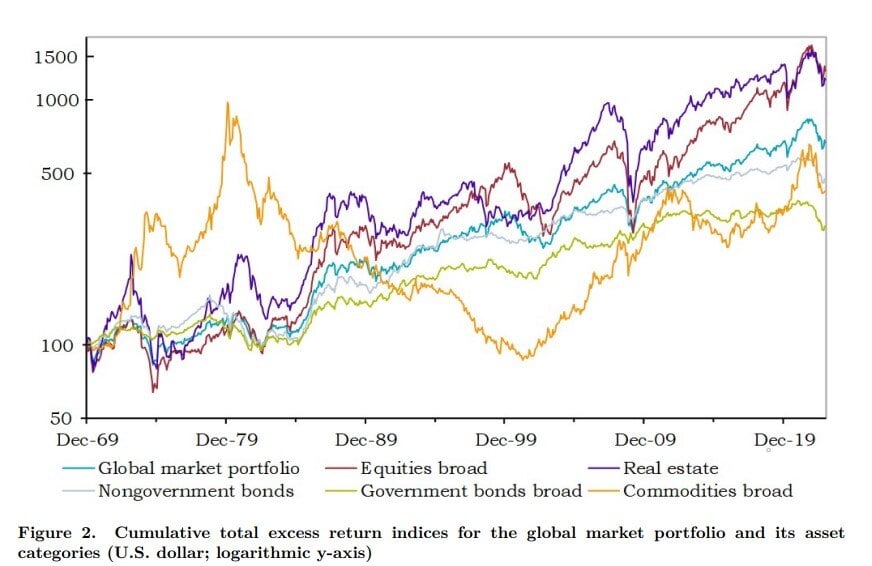
Today’s Chart of the Day is a follow up from the previous post and is from an academic paper called “The Risk and Reward of Investing” published by Doeswijk and Swinkel in July 2024.
It shows in blue the total returns above or below the Global Market Portfolio, which consists of all the investable assets in the world. While the past is no predictor, the past shows that since 1970, the only two asset classes that have outperformed have been stocks (brown) and real estate (purple).
Not to say that this will hold true in the future because looking back, there were times when commodities (gold) significantly outperformed in the 1970’s and bonds (gray) outperformed in the Great Recession and Dot.com era. However, on the longest timeline, stocks and real estate have been the clear winner.

Samuel serves as Senior Vice President, Chief Investment Officer for the Crews family of banks. He manages the individual investment holdings of his clients, including individuals, families, foundations, and institutions throughout the State of Florida. Samuel has been involved in banking since 1996 and has more than 20 years experience working in wealth management.
Investments are not a deposit or other obligation of, or guaranteed by, the bank, are not FDIC insured, not insured by any federal government agency, and are subject to investment risks, including possible loss of principal.

