
Chart of the Day: The Value Stocks of Big Oil
Contents
About the Author

Be financially ready for hurricane season. Access funds when you need them with a Home Equity Line of Credit (HELOC). Loans subject to credit approval. NMLS #406389
Today’s Chart of the Day, shared by my colleague Angie Parsons, is from an article in Bloomberg which illustrates what a “value” stock is.
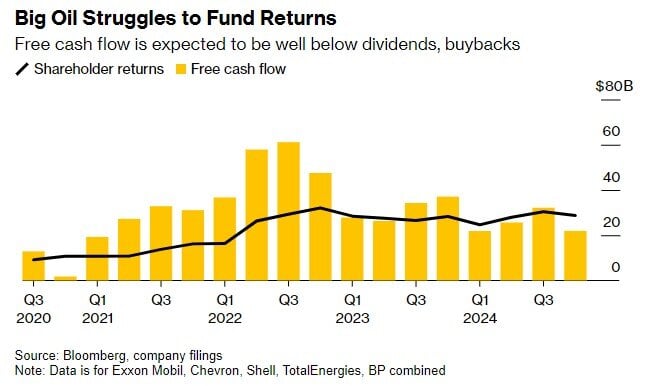
The black line represents the history of five of some of the largest oil companies’ distributions to their shareholders vs. their earnings in yellow. As you can see, last year they distributed (through dividends and stock buybacks) more than 100% of their earnings to shareholders, which makes this a textbook example of value stocks: companies in a mature industry, demonstrating stable profits, low growth, and able to give profits back to shareholders.
In contrast, “growth” stocks, which are the exact opposite, are typically in a growing industry, such as technology, that does not have a lot of profits yet since they reinvest them into research and development and use any excess cash flow to invest for future growth.
Experienced professionals from our wealth management services team can help you achieve a bright financial future through investment strategies tailored to you. We’ll show you all of the options available and help you choose the ones best suited to you. We’ll provide high-quality, personal service as we work toward your goals together. Our Portfolio Managers do not receive commissions on trades; our recommendations of investments are based solely on your best interests.
Investments are not a deposit or other obligation of, or guaranteed by, the bank, are not FDIC insured, not insured by any federal government agency, and are subject to investment risks, including possible loss of principal.