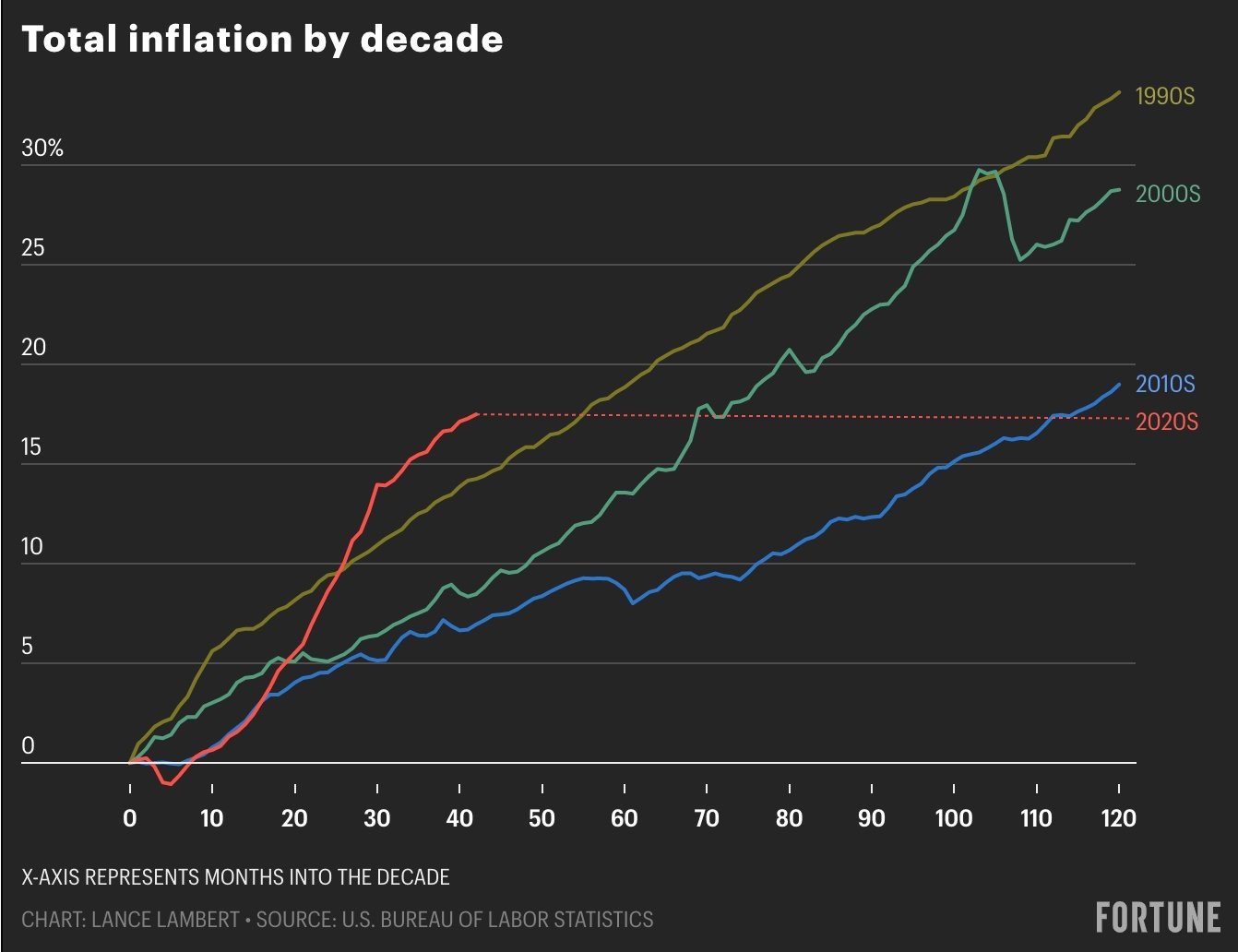
Chart of the Day: Inflation by the Decade/Paradigm Shift

Learn about our Refer-a-Friend Program. Terms and conditions apply.

Today’s Chart of the Day comes from Lance Lambert, @NewsLambert on Twitter, who works for Fortune Magazine. The chart shows total inflation by decade going back to the 1990s.During the first 42 months of the 120 (months that span the decade of the 2020s), our 17% inflation is almost as high as the combined 19% from the 2010’s. An additional thought is that if we simply average 3% a year for the remaining 2020s, it will put us at a new record for the last 40 years. This will result in a paradigm shift for the younger generations.

Samuel serves as Senior Vice President, Chief Investment Officer for the Crews family of banks. He manages the individual investment holdings of his clients, including individuals, families, foundations, and institutions throughout the State of Florida. Samuel has been involved in banking since 1996 and has more than 20 years experience working in wealth management.
Investments are not a deposit or other obligation of, or guaranteed by, the bank, are not FDIC insured, not insured by any federal government agency, and are subject to investment risks, including possible loss of principal.

