Percentages On-Time

Learn about our Refer-a-Friend Program. Terms and conditions apply.

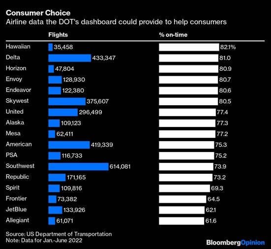
The Chart of the Day comes from Bloomberg. It's not a necessarily a financial chart, but instead shows percentages of on-time flights, and the amount of passengers traveled per airline.
There is a push for the Transportation Department to make such statistics more available to help consumers make better decisions.
For those of us in Southwest Florida, the airline at the bottom of the list is no surprise.

Samuel serves as Senior Vice President, Chief Investment Officer for the Crews family of banks. He manages the individual investment holdings of his clients, including individuals, families, foundations, and institutions throughout the State of Florida. Samuel has been involved in banking since 1996 and has more than 20 years experience working in wealth management.
Investments are not a deposit or other obligation of, or guaranteed by, the bank, are not FDIC insured, not insured by any federal government agency, and are subject to investment risks, including possible loss of principal.

