
Chart of the Day: Return Distributions
Contents
About the Author

Learn about our Refer-a-Friend Program. Terms and conditions apply.
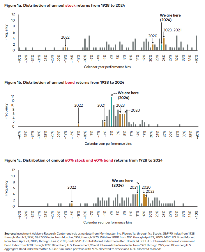
Today’s Chart of the Day from Vanguard shows the distribution of returns from 1928 to 2024, for stocks, bonds, and a combined 60% stock/40% bond portfolio. It also shows where we have ended up in the last four years.
Two interesting things to note:
First: The spread of stocks is significantly wider and flatter from a 40% loss to a 40%+ gain, while bonds (except for a few outliers) are more concentrated in the -2% to 10% range. And when combining the two, as expected, there is a little less of both returns and losses.
Second: Though it feels like we have had an odd few years, except for 2022, they were within a normal range.
Samuel serves as Senior Vice President, Chief Investment Officer for the Crews family of banks. He manages the individual investment holdings of his clients, including individuals, families, foundations, and institutions throughout the State of Florida. Samuel has been involved in banking since 1996 and has more than 20 years experience working in wealth management.
Investments are not a deposit or other obligation of, or guaranteed by, the bank, are not FDIC insured, not insured by any federal government agency, and are subject to investment risks, including possible loss of principal.