Chart of the Day: Stocks in the Rear View Mirror

Plan Today. Protect Tomorrow. Attend an Educational Estate-Planning Seminar

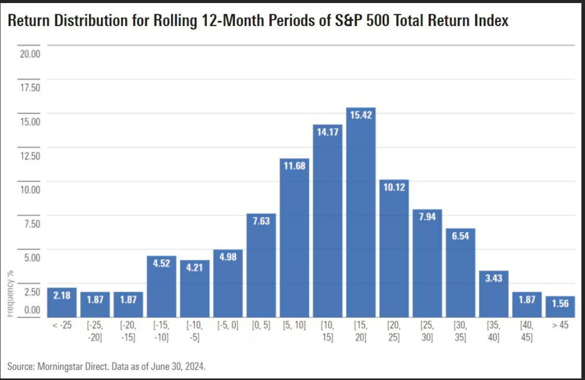
Today’s Chart of the Day from a Morningstar article about “Buffer” ETFs (aka exchange-traded funds), shows the distribution of returns for rolling 12-month periods for the stock market.
The blue bars represent the percentage of time they are within the ranges of returns. The average return of the stock market has been 10% since the 1930's. (Note: During that time, the market returned that 10% return in a 12-month period only 14% of the time.)
The rest of the time, it was lower or higher, leading to the observation, “at any point in time, the stock market never feels normal, and only does when we look back in the rear-view mirror.”
PS: The article about buffer ETFs was one of caution, since yes, they limit your losses but also cap your gains on anything over 9%-10%. When looking at the chart, that happens over 60% of the time. So, buyer beware. There is never a free lunch in the stock market and that’s a lot of return to give up.

Samuel serves as Senior Vice President, Chief Investment Officer for the Crews family of banks. He manages the individual investment holdings of his clients, including individuals, families, foundations, and institutions throughout the State of Florida. Samuel has been involved in banking since 1996 and has more than 20 years experience working in wealth management.
Investments are not a deposit or other obligation of, or guaranteed by, the bank, are not FDIC insured, not insured by any federal government agency, and are subject to investment risks, including possible loss of principal.

