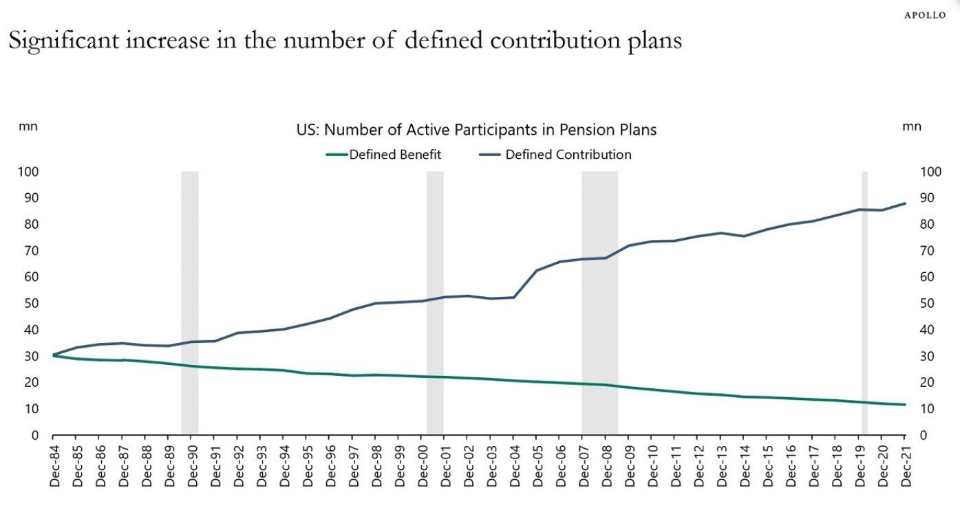
Chart of the Day: More 401(k)'s Than Ever

Plan Today. Protect Tomorrow. Attend an Educational Estate-Planning Seminar.
Production of the U.S. penny has officially ended. Learn what this means for you.

Today’s Chart of the Day comes from Torsten Slok who is the Chief Economist with Apollo. It shows the increase of defined contributions (401K’s and the like) and decline in defined benefit (aka pensions) since 1984. Whether this is a good thing or not is too long to discuss in this post, but regardless, it good to note we went from only 60 million people having a retirement plan to now over 100 million.

Experienced professionals from our wealth management services team can help you achieve a bright financial future through investment strategies tailored to you. We’ll show you all of the options available and help you choose the ones best suited to you. We’ll provide high-quality, personal service as we work toward your goals together. Our Portfolio Managers do not receive commissions on trades; our recommendations of investments are based solely on your best interests.
Investments are not a deposit or other obligation of, or guaranteed by, the bank, are not FDIC insured, not insured by any federal government agency, and are subject to investment risks, including possible loss of principal.

