Chart of the Day: Stocks for the Long Run

Learn about our Refer-a-Friend Program. Terms and conditions apply.

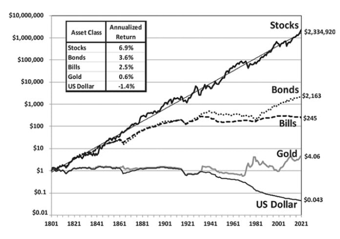
Today’s Chart of the Day is a reoccurring one we like to keep updated with current data. It first appeared in the book, “Stocks for the Long Run” by Jeremy Siegel in 1994 and shows the return of various asset classes dating back to 1801. This chart is legendary in our industry to show true, historical “long run” returns.
It’s important to note this chart is logarithmic and shows the percentage changes vs. actual values. If not, it would look like the chart went straight to the moon, as the $1 went to $10 in the first 20 years, vs. $500,000 to $2,300,000 in the last 20. If all goes well, imagine what the next 20 years could look like.

Samuel serves as Senior Vice President, Chief Investment Officer for the Crews family of banks. He manages the individual investment holdings of his clients, including individuals, families, foundations, and institutions throughout the State of Florida. Samuel has been involved in banking since 1996 and has more than 20 years experience working in wealth management.
Investments are not a deposit or other obligation of, or guaranteed by, the bank, are not FDIC insured, not insured by any federal government agency, and are subject to investment risks, including possible loss of principal.

