
Chart of the Day: 14% Downturns
Today’s Chart of the Day from OneDigital shows the return of the S&P 500 each calendar year since 1980 as well as the maximum drawdown during the year.
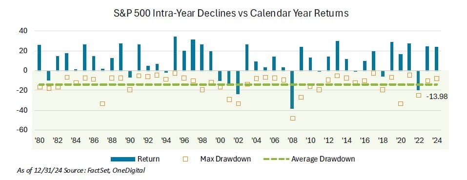
Today’s Chart of the Day from OneDigital shows the return of the S&P 500 each calendar year since 1980 as well as the maximum drawdown during the..
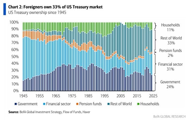
Today’s Chart of the Day from BofA Global Research shows the percentages of US treasury bond ownership spanning from 1945 to 2025.

Today’s Chart of the Day is from Visual Capitalist detailing and ranking common types of fraud. The report suggests losses are half a trillion..
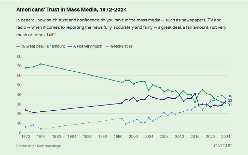
Today’s Chart of the Day is from Gallup and shows the change in American’s Trust in Mass Media from 1972 to 2024. The choice of “None at all” went..
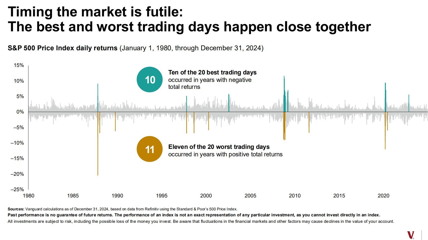
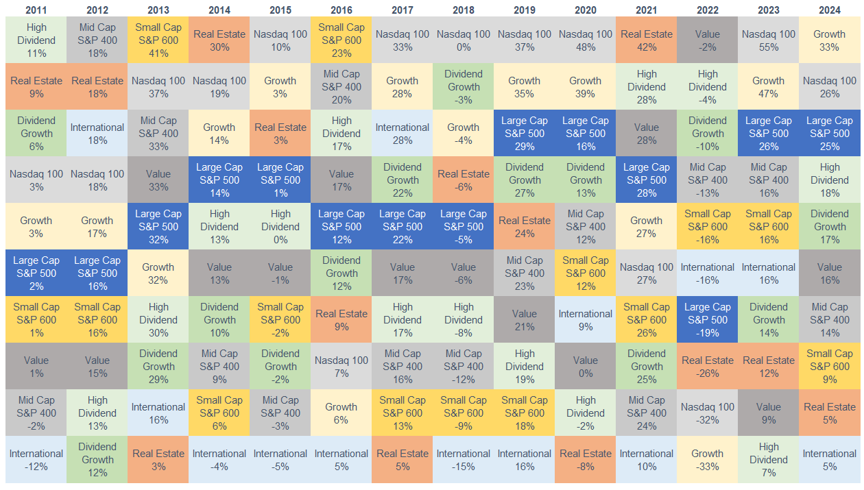
Today’s Chart of the Day is a classic one provided by Vanguard and was recently updated to reflect 2024 performance. It highlights the best and worst..
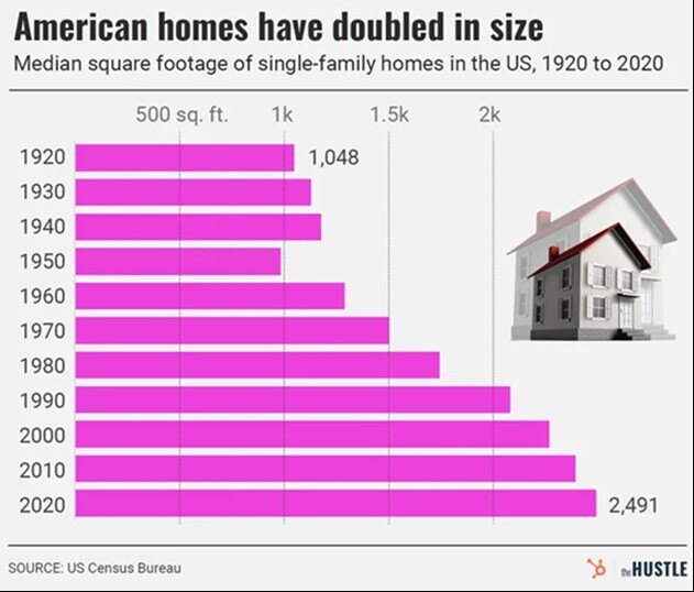
Today’s Chart of the Day is from theHUSTLE with data from the US Census Bureau showing that the median square footage of houses in the US has..
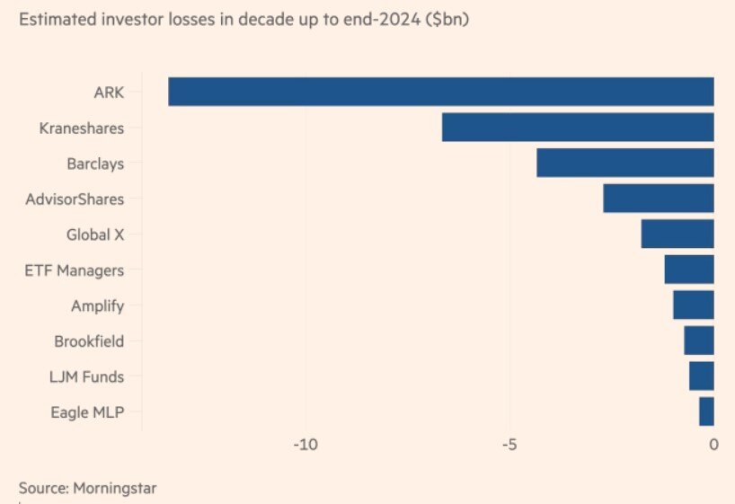
Today’s Chart of the Day is from the Financial Times in an article titled “Which funds have incinerated the most value over the past decade?” The..
Today’s Chart of the Day, often referred to as the Chicklets Chart, is updated annually to reflect the returns of the major factors in the equity..
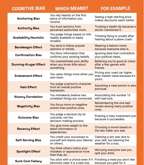
Today’s Chart of the Day from PageTear was shared by Charlie Bilello. It shows 15 different Cognitive Biases, their definition, and examples.
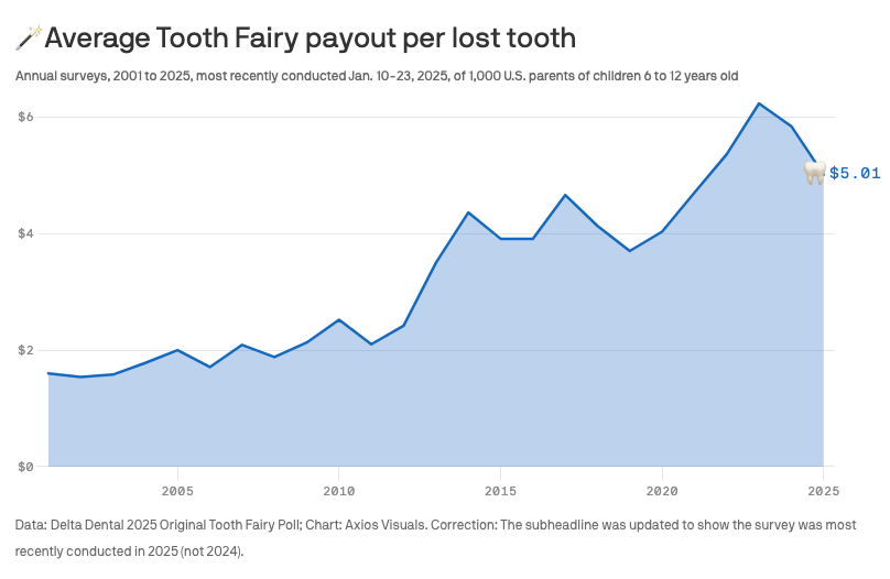
Today’s Chart of the Day is from Delta Dental and shows the average Tooth Fairy payout per lost tooth since 2001. A tongue in cheek survey but also..
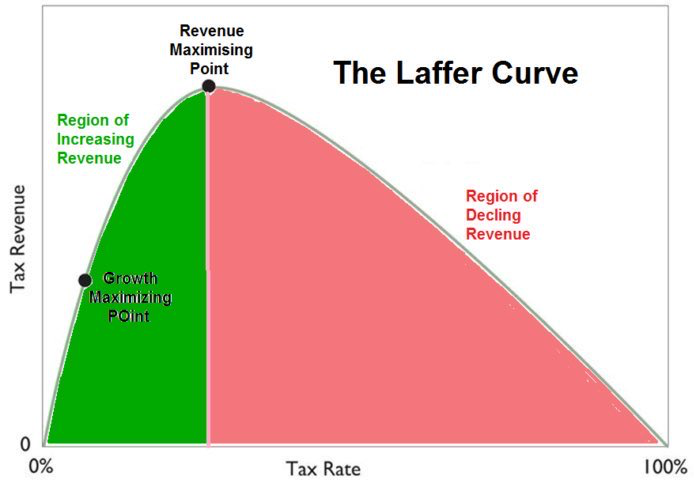
Today’s Chart of the Day highlights The Laffer Curve, an economic theory created by Arthur Laffer in 1974. It proposes that there is a maximum amount..
Today’s Chart of the Day was shared by my colleague, and fellow Portfolio Manger, Angie Parsons. It's a from Bloomberg article showing the changes in..
Today’s Chart of the Day and commentary is from Angie Parsons, my colleague and fellow Portfolio Manager. The chart from BlackRock shows stock..
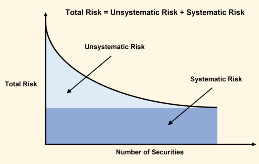
Today’s Chart of the Day spotlights an important investment concept which was pioneered by Harry Markowitz, a Nobel Prize winner and pioneer of the..
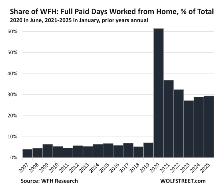
Today’s Chart of the Day from Wolfstreet shows that Work from Home, a.k.a. WFH, is getting “sticky” at 30% after peaking at 60% during the pandemic.