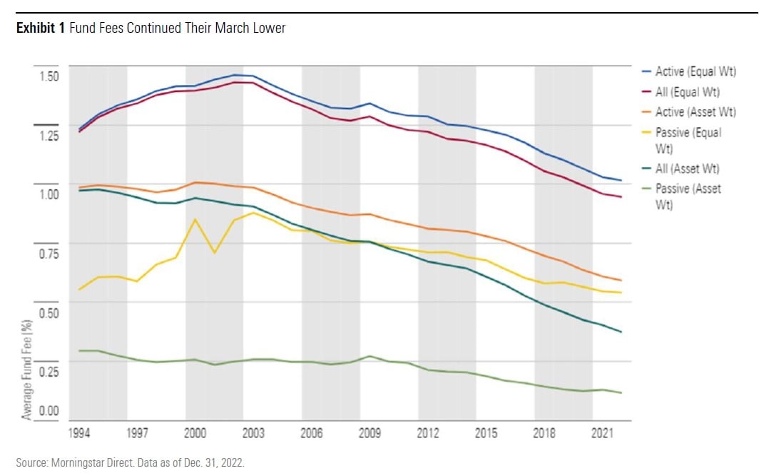
Skip to content

Plan Today. Protect Tomorrow. Attend an Educational Estate-Planning Seminar

Get Started 863-222-7005

Blog

Your Weekly
Financial Forecast


Stay informed with sound financial know-how

Chart of the Day: Hindsight is Always 20/20

Today’s Chart of the Day is a reminder that investing in the “next big thing” can be fraught with risk, and, in this case, cannabis-related companies..

Read More

 1991 and 2002 recessions, 2008 Global Financial Crisis, 2009 European debt crisis and holding cash shown in shades of blue

Chart of the Day: Even Worst Timing is Better than Cash

Today’s Chart of the Day and commentary is from Invesco and shows three instances when cash balances were high — following the 1991 and 2002..

Read More

Orange bar chart shows the impact of timing the market. Investment totals range from nearly $65,000 to only about $4,000

Chart of the Day: Don't Sell When the Market is Down

Today’s Chart of the Day from Visual Capitalist shows the impact of missing just a few positive days over the last 20 years. If you've followed the..

Read More

Alt text: Chart shows that almost half of Americans have nothing saved

Chart of the Day: Retirement Fall Off

Today’s Chart of the Day shows how much families have saved for retirement. Roughly 50% have ZERO saved, and only 21% have over $100,000.

Read More

chart shows 2022 at 6.2, which is the highest on the chart

Chart of the Day: Join the Bond ETF Movement

Today’s Chart of the Day from BlackRock shows the increasing use of Bond Exchange Traded Funds (ETFs) in the US. Why? Many investors see them as more..

Read More

the 2020s is represented by a red line

Chart of the Day: Inflation by the Decade/Paradigm Shift

Today’s Chart of the Day comes from Lance Lambert, @NewsLambert on Twitter, who works for Fortune Magazine. The chart shows total inflation by decade..

Read More

modern gray couch

Comment of the Day: Aretha Franklin's Will

I’m going to take a small detour from my typical Chart of the Day to tell a short story of Aretha Franklin’s will.

Read More

rolling returns from 1914 to 2021 represented by blue line

Chart of the Day: Rolling 10-Year Returns

Today’s Chart of the Day from Cambria shows the rolling 10-year US stock return going back 108 years to 1914. There are two general periods where..

Read More

blue bar chart denoting years stock is held and periods of positive return, range from 1 day to 30 years

Chart of the Day: Better than 50/50, Especially in the Long Run

Today’s Chart of the Day from @morganhousel on Twitter illustrates the odds that you will have a positive return in the stock market based on how..

Read More

chart shows average US car prices from 2016 - 2023

Chart of the Day: Record Car Prices

Today’s Chart of the Day is from a CNBC article titled, “With just 8% of new vehicles costing under $30,000, ‘it’s the least affordable car market in..

Read More

chart shows the impact of inflation on income, countries included are Germany, UK, US, and Japan

Chart of the Day: A Productive US vs. the UK/Japan

Today’s Chart of the Day from Invesco’s mid-year outlook shows that high inflation is reducing household disposable income. A closer look shows..

Read More

US dollar is represented in dark blue, other currencies considered include the Euro, Pound and Yen

Chart of the Day: Dollar Reign

Today’s Chart of the Day comes from the Financial Times and shows the dominance of the US dollar in central bank reserves globally, represented in..

Read More

orange bar chart shows passenger trips on public transport broken down monthly from 2019 - 2023

Chart of the Day: Post-Pandemic Trips

Today’s Chart of the Day is from the Wall Street Journal. Some things have not gone back to “pre-pandemic” days. One is the percentage of those who..

Read More

graph shows relationship between buying and renting from 1970 to 2022

Chart of the Day: Buying vs. Renting

Today’s Chart of the Day comes from re:venture in a discussion on Reddit. It's important to remember that the monthly cost to buy (yellow) is usually..

Read More

Samuel A. Kiburz, Senior Vice President, Chief Investment Officer

Samuel serves as Senior Vice President, Chief Investment Officer for the Crews family of banks. He manages the individual investment holdings of his clients, including individuals, families, foundations, and institutions throughout the State of Florida. Samuel has been involved in banking since 1996 and has more than 20 years experience working in wealth management.

Investments are not a deposit or other obligation of, or guaranteed by, the bank, are not FDIC insured, not insured by any federal government agency, and are subject to investment risks, including possible loss of principal.

Find me on:

Recent Posts

Chart of the Day: Hindsight is Always 20/20

Today’s Chart of the Day is a reminder that investing in the “next big thing” can be fraught with risk, and, in this case, cannabis-related companies are the focus. My finance professor at the University of Florida, Dr. David Nye, always said, “Hindsight is always 20/20,” and in this case, this is very apparent.

More

Chart of the Day: Even Worst Timing is Better than Cash

Today’s Chart of the Day and commentary is from Invesco and shows three instances when cash balances were high — following the 1991 and 2002 recessions, the 2008 Global Financial Crisis, and the 2009 European debt crisis — and calculates what $12,000 invested yearly in the stock market for 10 years would have been worth.

More

Chart of the Day: Don't Sell When the Market is Down

Today’s Chart of the Day from Visual Capitalist shows the impact of missing just a few positive days over the last 20 years. If you've followed the blog for a while, you already know that missing just a few days can be devastating to your account.

More

Chart of the Day: Rent Inflation is Down

Today I have good news for renters.

More

Chart of the Day: Retirement Fall Off

Today’s Chart of the Day shows how much families have saved for retirement. Roughly 50% have ZERO saved, and only 21% have over $100,000.

More

Chart of the Day: Join the Bond ETF Movement

Today’s Chart of the Day from BlackRock shows the increasing use of Bond Exchange Traded Funds (ETFs) in the US. Why? Many investors see them as more liquid and they often cost less.

More

Chart of the Day: Inflation by the Decade/Paradigm Shift

Today’s Chart of the Day comes from Lance Lambert, @NewsLambert on Twitter, who works for Fortune Magazine. The chart shows total inflation by decade going back to the 1990s.

More

Comment of the Day: Aretha Franklin's Will

I’m going to take a small detour from my typical Chart of the Day to tell a short story of Aretha Franklin’s will.

More

Chart of the Day: Rolling 10-Year Returns

Today’s Chart of the Day from Cambria shows the rolling 10-year US stock return going back 108 years to 1914. There are two general periods where stocks realized a negative return over a 10-year span: one during the Great Depression in the 1930s and the other during the Great Recession in 2008.

More

Chart of the Day: Better than 50/50, Especially in the Long Run

Today’s Chart of the Day from @morganhousel on Twitter illustrates the odds that you will have a positive return in the stock market based on how long you own stocks.

More

Chart of the Day: Record Car Prices

Today’s Chart of the Day is from a CNBC article titled, “With just 8% of new vehicles costing under $30,000, ‘it’s the least affordable car market in modern history,' expert says.”

More

Chart of the Day: A Productive US vs. the UK/Japan

Today’s Chart of the Day from Invesco’s mid-year outlook shows that high inflation is reducing household disposable income. A closer look shows another interesting note: $100 worth of income in the United States in 1999 is now $170 in 2022, an impressive 70% increase.

More

Chart of the Day: Dollar Reign

Today’s Chart of the Day comes from the Financial Times and shows the dominance of the US dollar in central bank reserves globally, represented in dark blue.

More

Chart of the Day: Post-Pandemic Trips

Today’s Chart of the Day is from the Wall Street Journal. Some things have not gone back to “pre-pandemic” days. One is the percentage of those who continue to work from home.

More

Chart of the Day: Buying vs. Renting

Today’s Chart of the Day comes from re:venture in a discussion on Reddit. It's important to remember that the monthly cost to buy (yellow) is usually more than the cost to rent (blue), but a large difference between the two is not sustainable.

More