Skip to content

Learn about our Refer-a-Friend Program. Terms and conditions apply.

Get Started 863-222-7005

Blog

Your Weekly
Financial Forecast


Stay informed with sound financial know-how

Older couple holding hands and walking along the beach

Seven Steps to Manage Your Retirement

You made it to retirement! Now what? How do you plan to pay all the expenses you’ll have for the rest of your life? This can be a daunting task. Many..

Read More

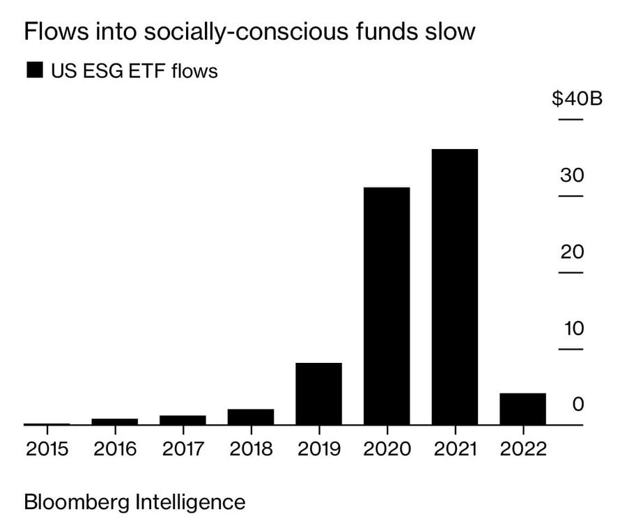
Chart shows the money flows into ESG = Environmental, Social, and Governance ETFs since they appeared in 2015.

The Shying Away from ESG

Today's chart is from Bloomberg Intelligence, which shows the money flows into ESG (Environmental, Social, and Governance) ETFs since they appeared..

Read More

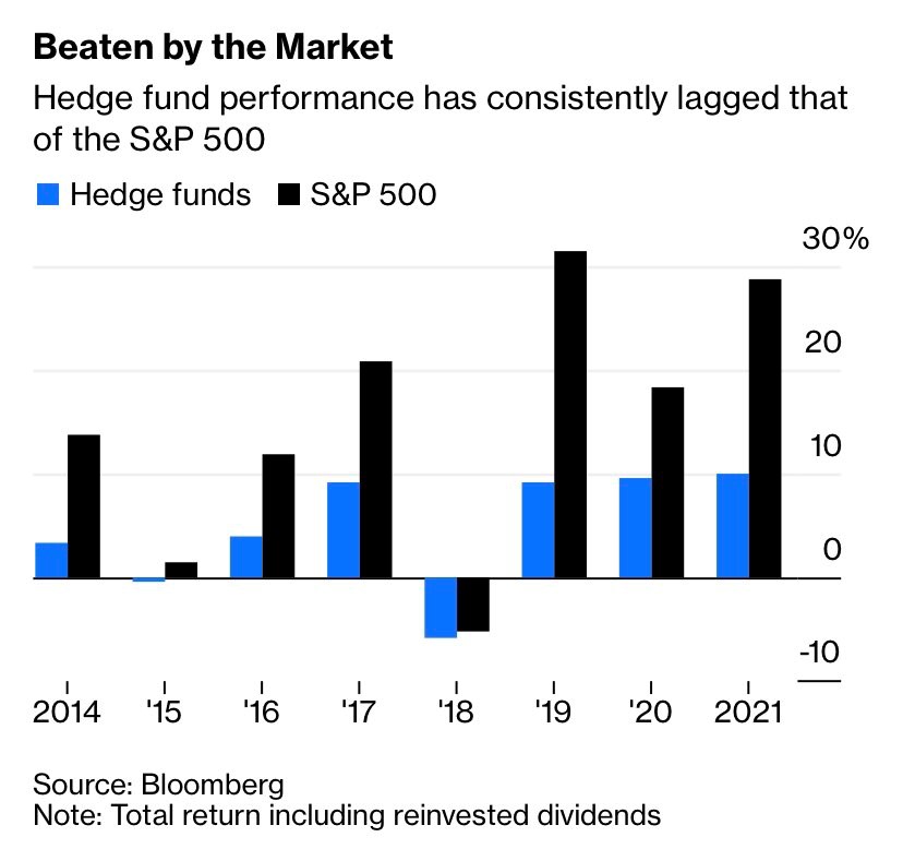
Chart shows the performance between hedge funds and the S&P 500 from 2014 - 2021.

No More Heydays for Hedge Funds

People may ask, “Why not use hedge funds?” Today's chart comes from Bloomberg and shows us the reason why. In addition to their typical expense ratio..

Read More

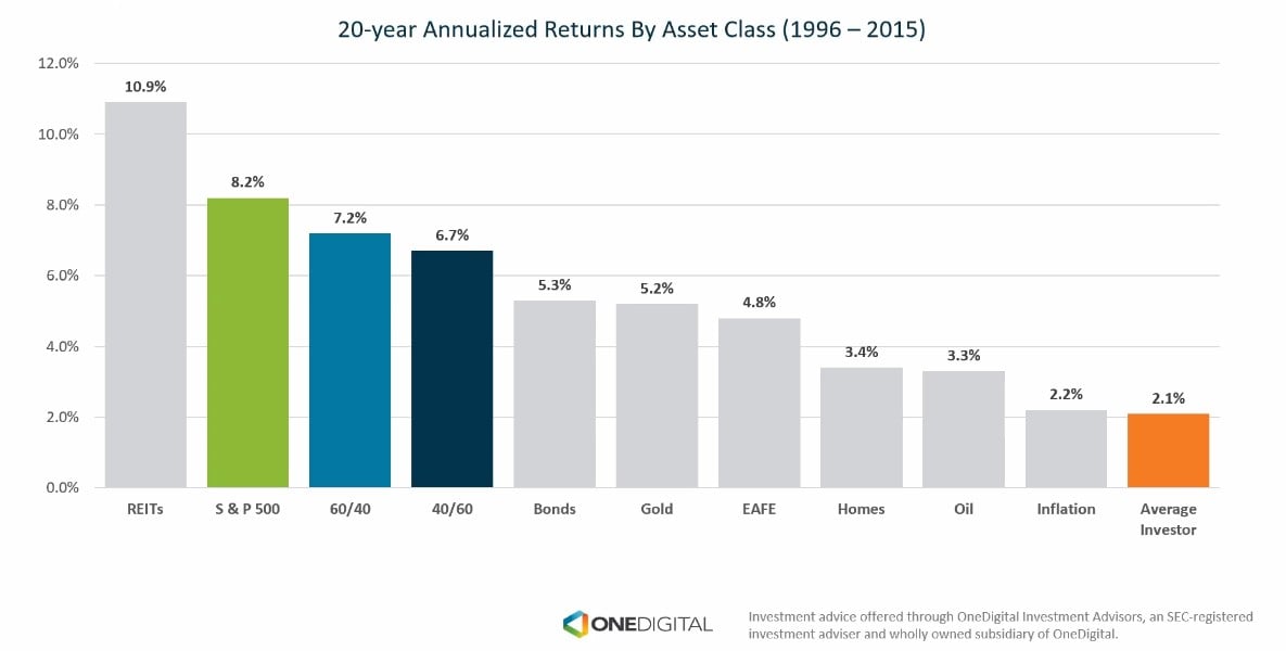
chart shows the average return for 20-years ending in 2015

S&P 500 vs. Average Investor

Today's chart comes from OneDigital and shows that the average return for 20-years ending in 2015 was 8.2% for the S&P 500, while the average..

Read More

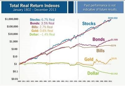
Chart shows the real returns of stocks, bonds, bills, gold, and cash from 1802 - 2013

Total Return Since 1802

The following chart from Brian Ferdoldi shows the ultra long-term history of real returns from various asset classes dating back to 1802. Real..

Read More

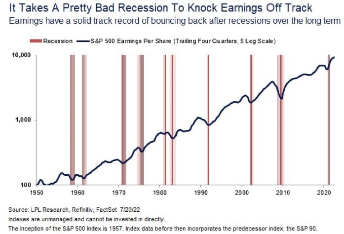
Chart shows the consistent upward growth of the S&P 500 since 1950.

Hard to Hurt Earnings

Today's chart comes from LPL Research and shows the growth of company earnings since 1950. When you buy a stock fund you are purchasing the steam of..

Read More

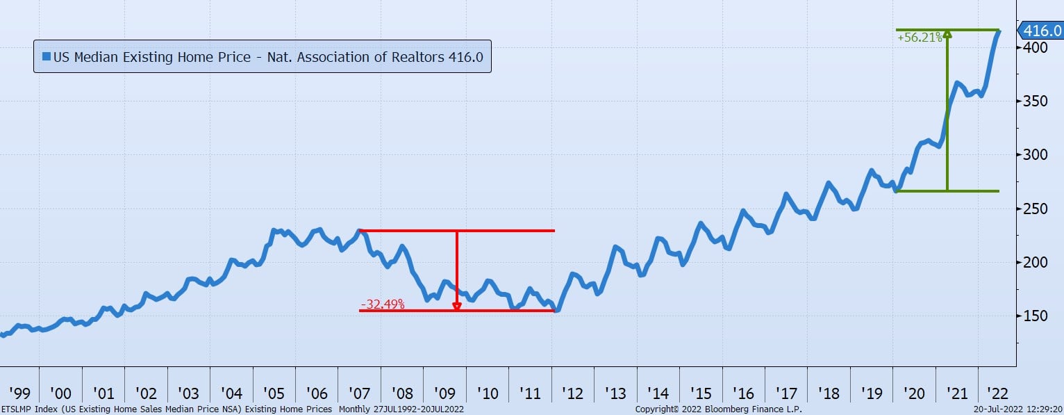
Chart shows a blue line indicating the rise and fall of housing prices from 1999 - 2022.

Record Real Estate Prices

Today's Chart of the Day is a Bloomberg chart of the U.S. Median Existing Home Price provided by the National Association of Realtors going all the..

Read More

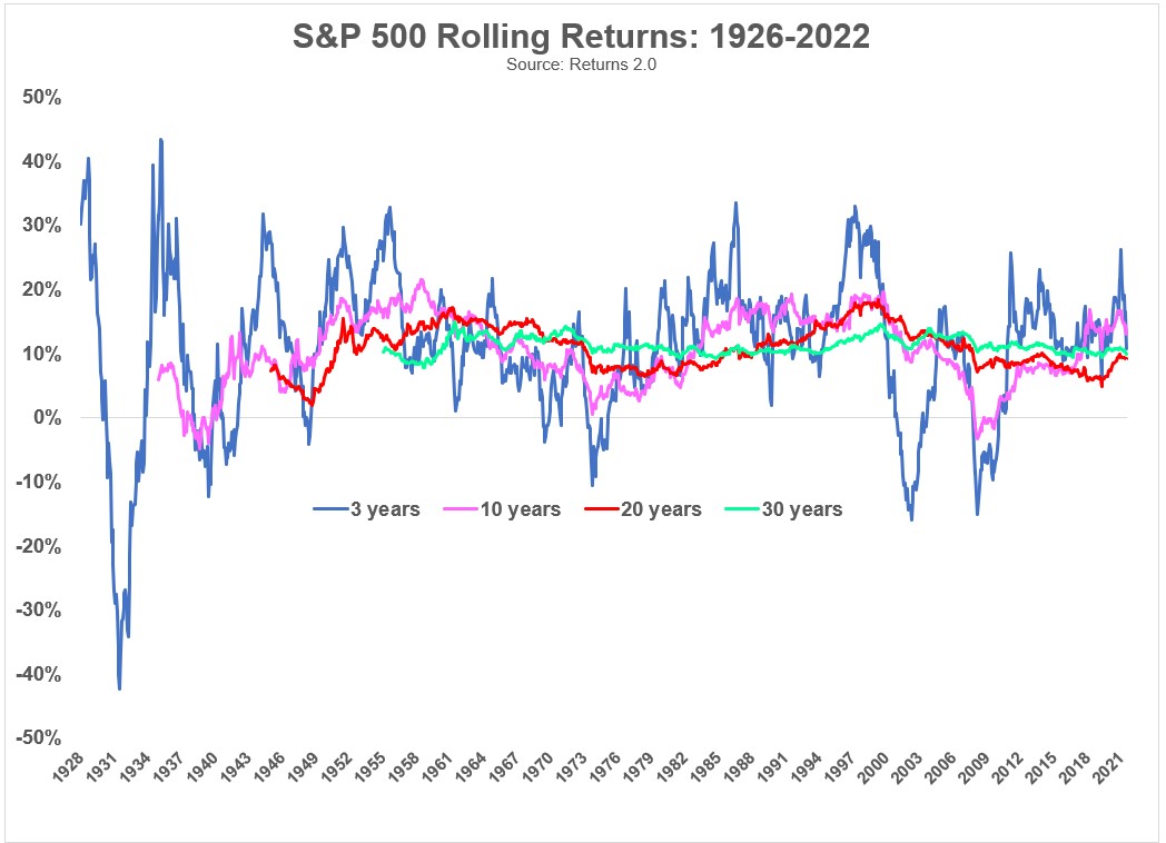
Chart shows rolling returns of S & P 500 from 1926 to 2021. Each period of time is represented by a different color. 3 = blue, 10 = pink, 20 = red, 30 = green.

Rolling, Rolling, Rolling

Today's chart is from Ben Carlson’s “A Wealth of Common Sense” which shows the S&P 500’s rolling returns for 3, 10, 20, and 30 year periods going all..

Read More

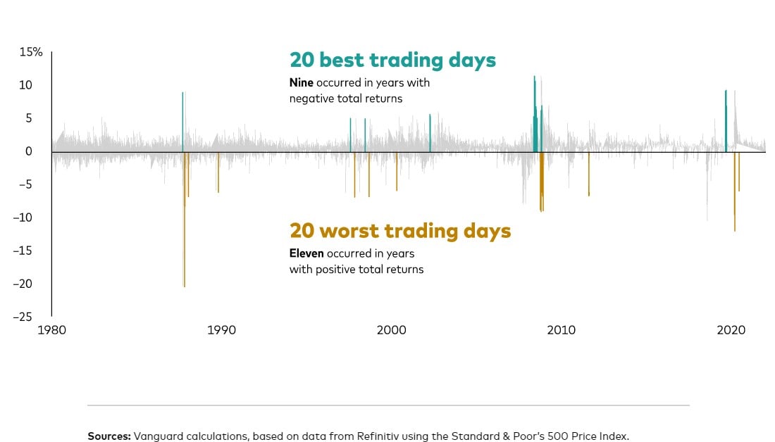
the chart shows that the best and worst trading days are often very close

Best and Worst Days are Close

Today’s Chart of the Day comes again from Vanguard. The best and worst trading days are often very close. Usually, when there is a large swing one..

Read More

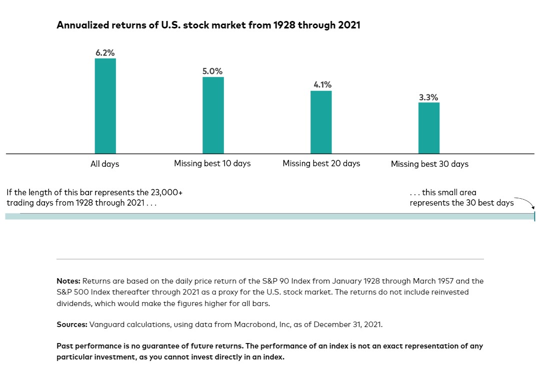
from 1928 through 2021, there were more than 23,300 trading days in the U.S. stock market. Out of those, the 30 best trading days accounted for almost half of the market’s return.

30 Days Equal Half The Return

Today’s chart comes from Vanguard. They wrote a great short article on the difficulties of market timing. In a nutshell, "from 1928 through 2021,..

Read More

No faces, but two people in collared button downs looking at paperwork

Prediction for Year End

When asked to predict where the market will be at year end, here are my thoughts:

Read More

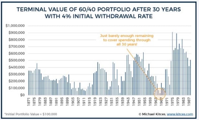
In the first bar chart, the data covers the impact of a 4% withdrawal rate. There is an emphasis put between the years 1963 - 1967 where the value dips. This emphasizes the point that there is just barely enough remaining to cover spending through 30 years.  The second bar chart presents the 5% withdrawal rate. It shows both years with remaining wealth (green) and years of portfolio depletion (red). As mentioned in the article, there are 28 times that the value ended below zero.

1% Makes a Difference

The two Charts of the Day are from Michael Kitces and show the value of a $100,000 portfolio of 60% stocks and 40% bonds after 30 years with a 4% and..

Read More

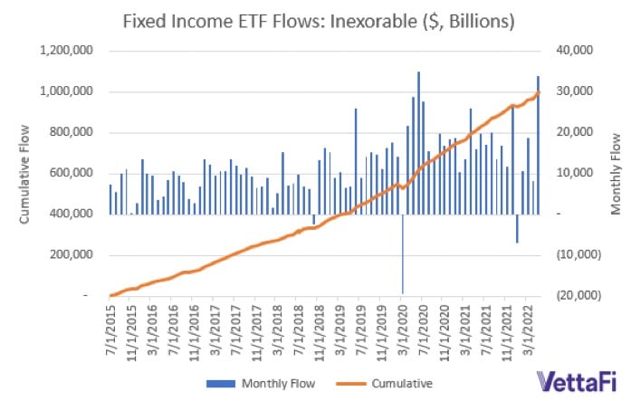
chart shows that Fixed income exchange traded funds (aka ETFs) have taken in over $1 trillion in assets over the last seven years, and only had three months of outflows.

Fixed Income ETFs for the Win

Today’s chart comes from VettaFi. Fixed income exchange traded funds (aka ETFs) have taken in over $1 trillion in assets over the last seven years,..

Read More

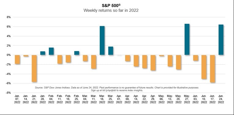
Chart shows the weekly return for the S&P 500 so far in 2022. The weeks of March 18, May 27, and June 24 had 6%+ gains.

Hold On To Catch the Upside

Today's Chart of the Day is from S&P Global, and it shows the weekly returns of the S&P 500 year to date. Yes, cumulatively the market is down, but..

Read More

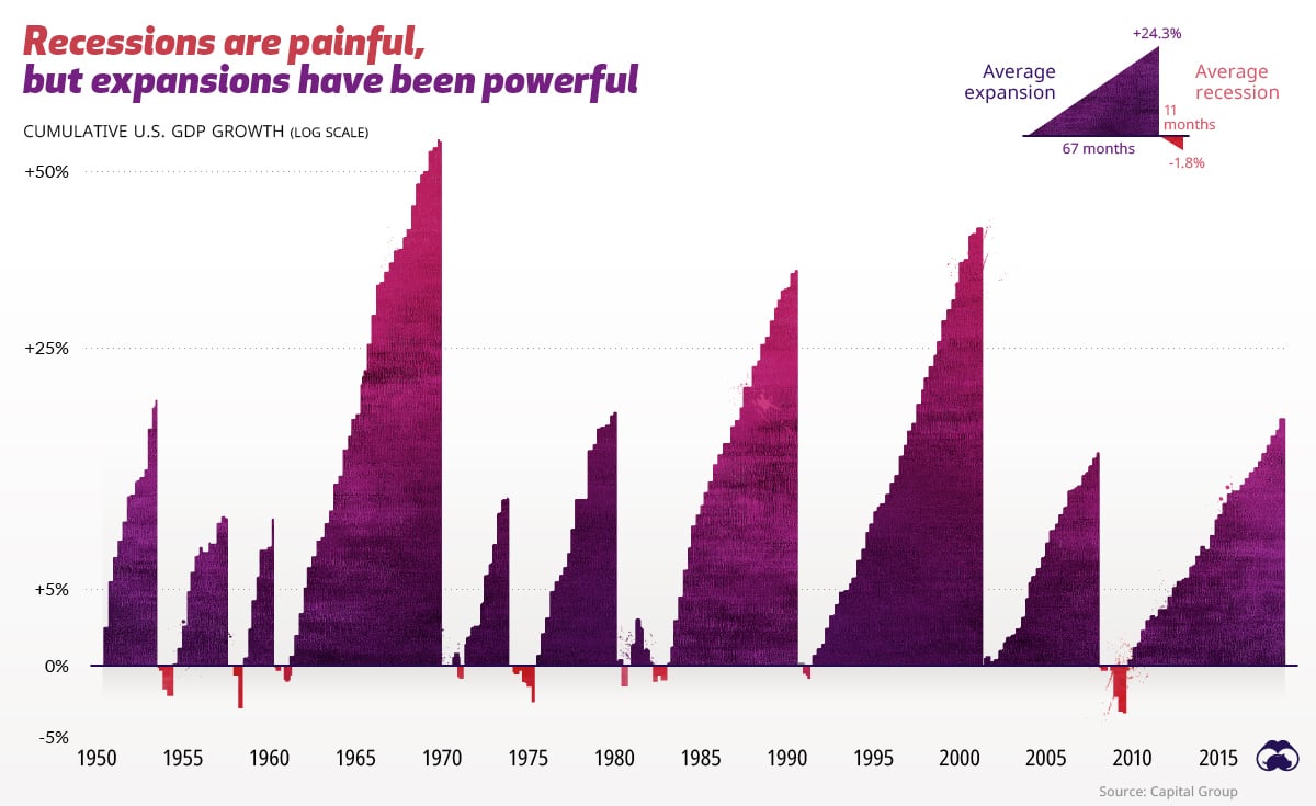
Since 1950, the average economic expansion lasts 67 months. The average recession, though painful, only lasts 11 months.

Recessions are Painful; Expansions are Powerful

This chart comes from the Visual Capitalist. Since 1950, the average economic expansion lasts 67 months. The average recession, though painful, only..

Read More

Samuel A. Kiburz, Senior Vice President, Chief Investment Officer

Samuel serves as Senior Vice President, Chief Investment Officer for the Crews family of banks. He manages the individual investment holdings of his clients, including individuals, families, foundations, and institutions throughout the State of Florida. Samuel has been involved in banking since 1996 and has more than 20 years experience working in wealth management.

Investments are not a deposit or other obligation of, or guaranteed by, the bank, are not FDIC insured, not insured by any federal government agency, and are subject to investment risks, including possible loss of principal.

Find me on:

Recent Posts

Seven Steps to Manage Your Retirement

You made it to retirement! Now what?

How do you plan to pay all the expenses you’ll have for the rest of your life? This can be a daunting task. Many retirees simply open their monthly statements, check the balance, and hope that it’s enough. Hope is not a plan. Those with a plan will have better options and more choices regardless of what happens in the next twenty or thirty years. The outcome will be impacted by many known and unknown variables between the beginning and end. An effective retirement plan will require some time, effort, optimism, and a realistic view of the future. Most importantly, you’ll need to stick to the plan to make it effective and be prepared to adjust along the way. So, where to begin?

More

The Shying Away from ESG

Today's chart is from Bloomberg Intelligence, which shows the money flows into ESG (Environmental, Social, and Governance) ETFs since they appeared in 2015.

More

No More Heydays for Hedge Funds

People may ask, “Why not use hedge funds?” Today's chart comes from Bloomberg and shows us the reason why.  In addition to their typical expense ratio of 2% and 20% of gains above a benchmark, hedge funds have consistently underperformed the stock market, denoted by the S&P 500 index, every year since 2014. In fact, they haven’t performed well since their heydays in the 1980s, and even less so since 2007.

More

S&P 500 vs. Average Investor

Today's chart comes from OneDigital and shows that the average return for 20-years ending in 2015 was 8.2% for the S&P 500, while the average investor only earned 2.1%. The hypothesis is: Too many investors stop investing when the market is down and/or try to time the market.

More

Total Return Since 1802

The following chart from Brian Ferdoldi shows the ultra long-term history of real returns from various asset classes dating back to 1802. Real returns, the returns after inflation, are important to know due to inflation’s elevated levels.

More

Hard to Hurt Earnings

Today's chart comes from LPL Research and shows the growth of company earnings since 1950. When you buy a stock fund you are purchasing the steam of their combined future earnings. Yes, that stream can temporarily decline during recessions, but over time the economy and that stream of earnings returns and continues to grow.

More

Record Real Estate Prices

Today's Chart of the Day is a Bloomberg chart of the U.S. Median Existing Home Price provided by the National Association of Realtors going all the way back to 1999.

More

Rolling, Rolling, Rolling

Today's chart is from Ben Carlson’s “A Wealth of Common Sense” which shows the S&P 500’s rolling returns for 3, 10, 20, and 30 year periods going all the way back to 1926.

More

Best and Worst Days are Close

Today’s Chart of the Day comes again from Vanguard. The best and worst trading days are often very close. Usually, when there is a large swing one way, more often than not, the next day swings in the opposite direction. This is why we often do not get too excited when it happens. In fact, when cash needs to be invested or raised for spending, these are usually great days to do so.

Vanguard proved this with today's chart.

More

30 Days Equal Half The Return

Today’s chart comes from Vanguard. They wrote a great short article on the difficulties of market timing.  In a nutshell, "from 1928 through 2021, there were more than 23,300 trading days in the U.S. stock market. Out of those, the 30 best trading days accounted for almost half of the market’s return."

More

Prediction for Year End

When asked to predict where the market will be at year end, here are my thoughts:

More

1% Makes a Difference

The two Charts of the Day are from Michael Kitces and show the value of a $100,000 portfolio of 60% stocks and 40% bonds after 30 years with a 4% and 5% initial withdrawal rate. These comments come from Rich Emch, CFP®, Senior Trust Officer.

More

Fixed Income ETFs for the Win

Today’s chart comes from VettaFi. Fixed income exchange traded funds (aka ETFs) have taken in over $1 trillion in assets over the last seven years, and only had three months of outflows.

More

Hold On To Catch the Upside

Today's Chart of the Day is from S&P Global, and it shows the weekly returns of the S&P 500 year to date. Yes, cumulatively the market is down, but if you happen to miss the three 6%+ weekly gains out of the last 26 weeks, your total return for the year could look a whole lot different.

More

Recessions are Painful; Expansions are Powerful

This chart comes from the Visual Capitalist. Since 1950, the average economic expansion lasts 67 months. The average recession, though painful, only lasts 11 months.

More