Chart of the Day: More Professional, Less Individual
Today’s Chart of the Day from S&P Global shows the overall market share owned by individuals.
Learn about our Refer-a-Friend Program. Terms and conditions apply.
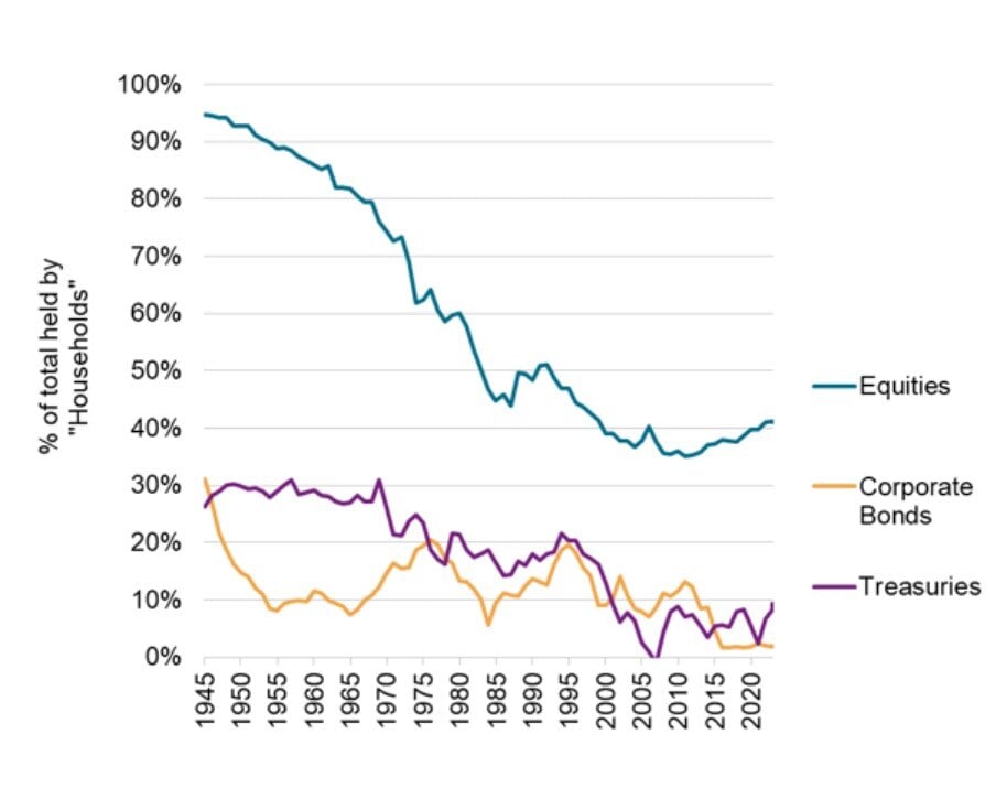
Today’s Chart of the Day from S&P Global shows the overall market share owned by individuals.
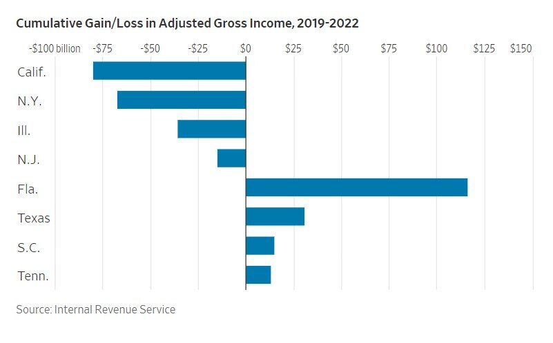
Today’s Chart of the Day is from a Wall Street Journal article recommended by Doug F., a subscriber of Chart of the Day. It is called “The Blue-State..
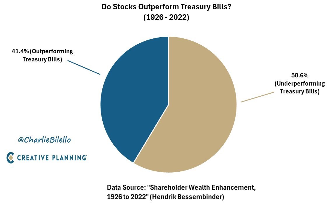
Today’s Chart of the Day was prepared by @CharlieBilello on X using data from a groundbreaking paper in 2022 by Hendrick Bessembinder.
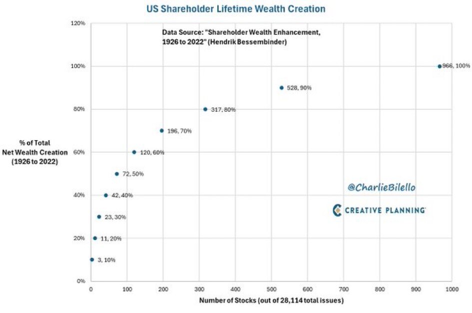
Today’s Chart of the Day is from @CharlieBilello from the Hendrick Bessembinder paper called “Shareholder Wealth Enhancement” published in 2023.
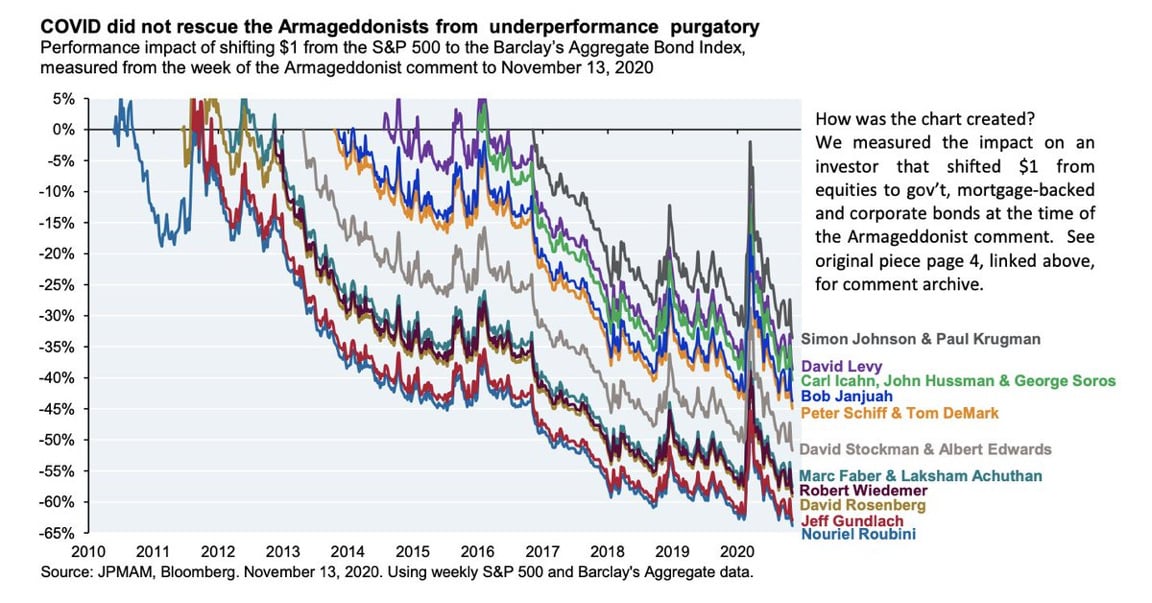
Today’s Chart of the Day from JP Morgan shared by @StevenKelly49 on X shows the results of popular economists who predicted “Doomsday” scenarios and..
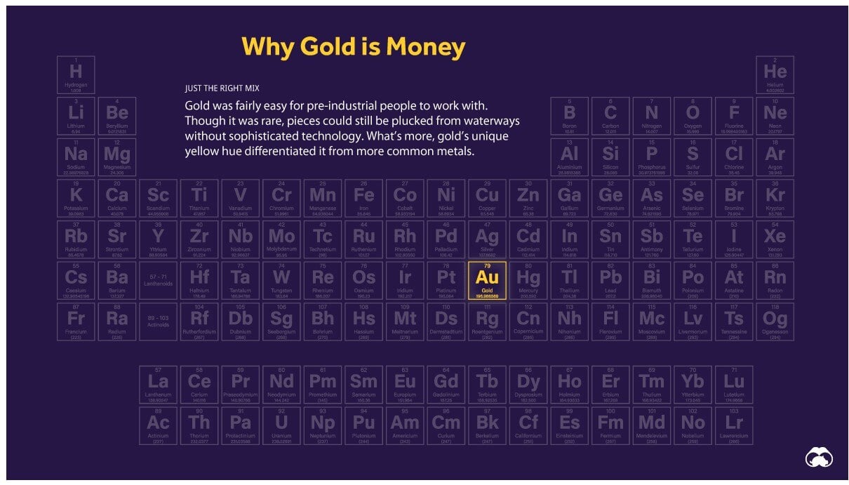
Today’s Chart of the Day is a classic from Visual Capitalist outlining why “Gold is Money” and the other 117 elements are not.
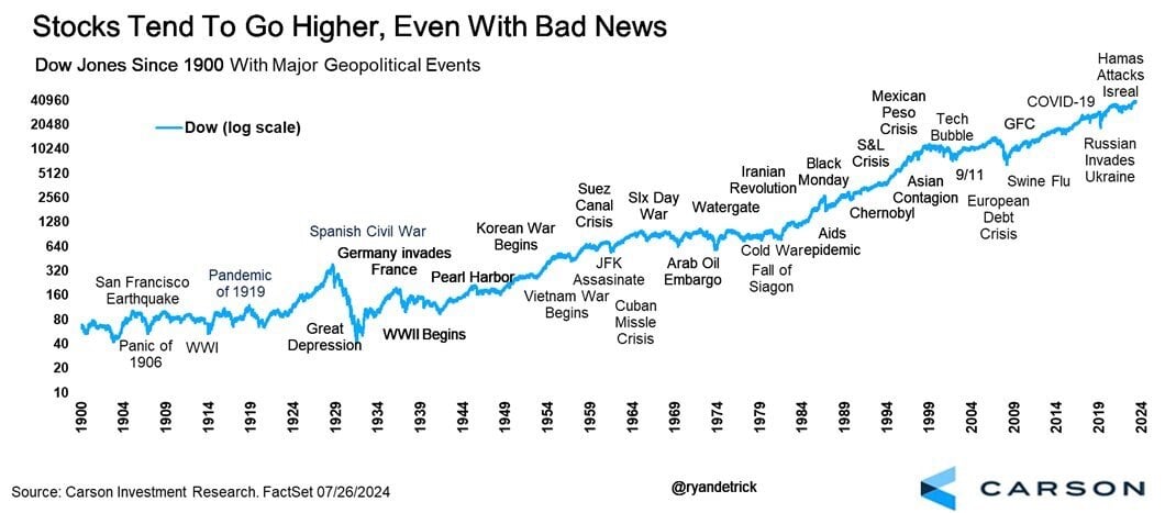
Today’s Chart of the Day from Carson Investment Research shows the 35 major “bad news” events in the stock market going back to 1900.
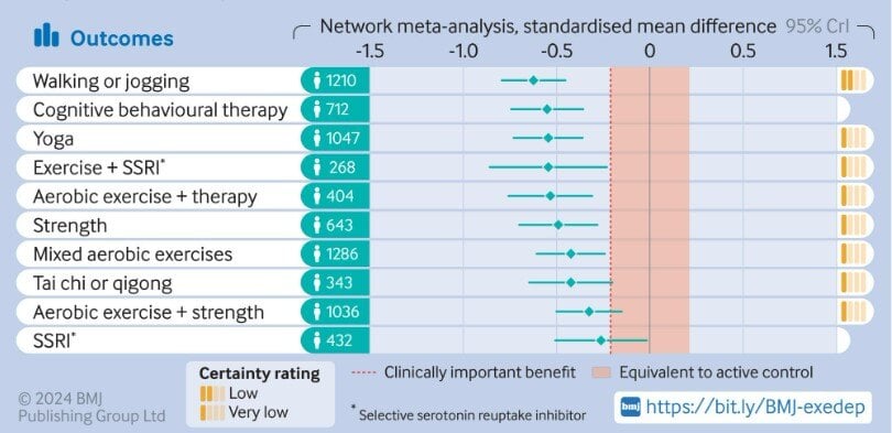
Today's Chart of the Day is from a research article in the British Medical Journal titled “Effect of Exercise for Depression.”
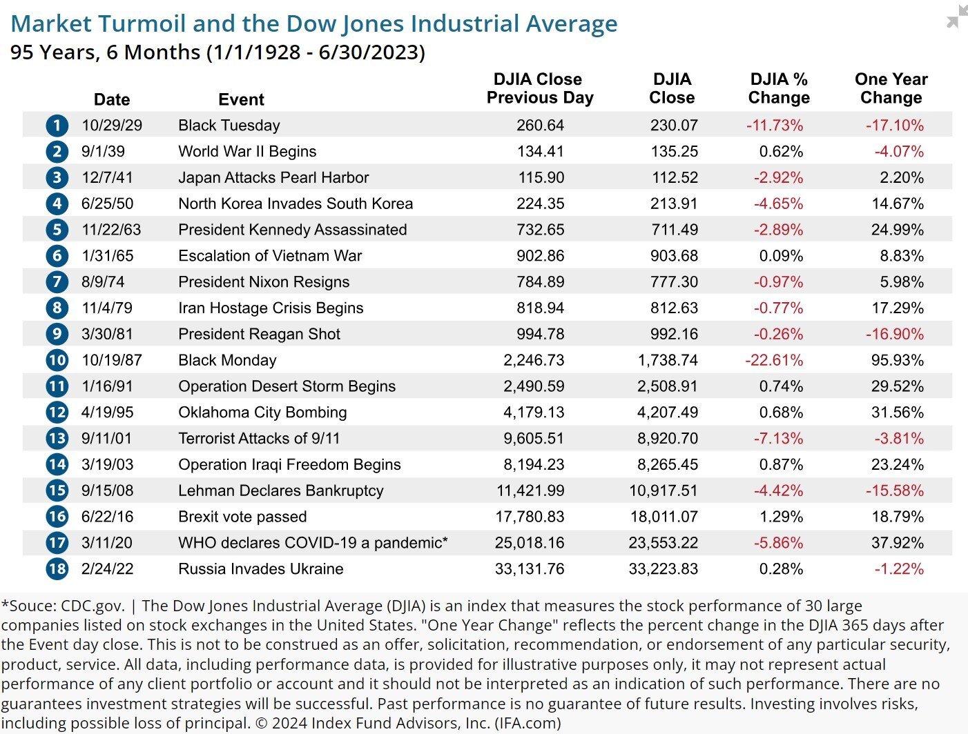
Today’s Chart of the Day, from an article written by Robin Powell with IFA.com, shows the 18 largest market events over the last 95 years.

Today’s Chart of the Day is a slight departure from a typical financial post, and similar to one I shared a few years ago, but has some additional..
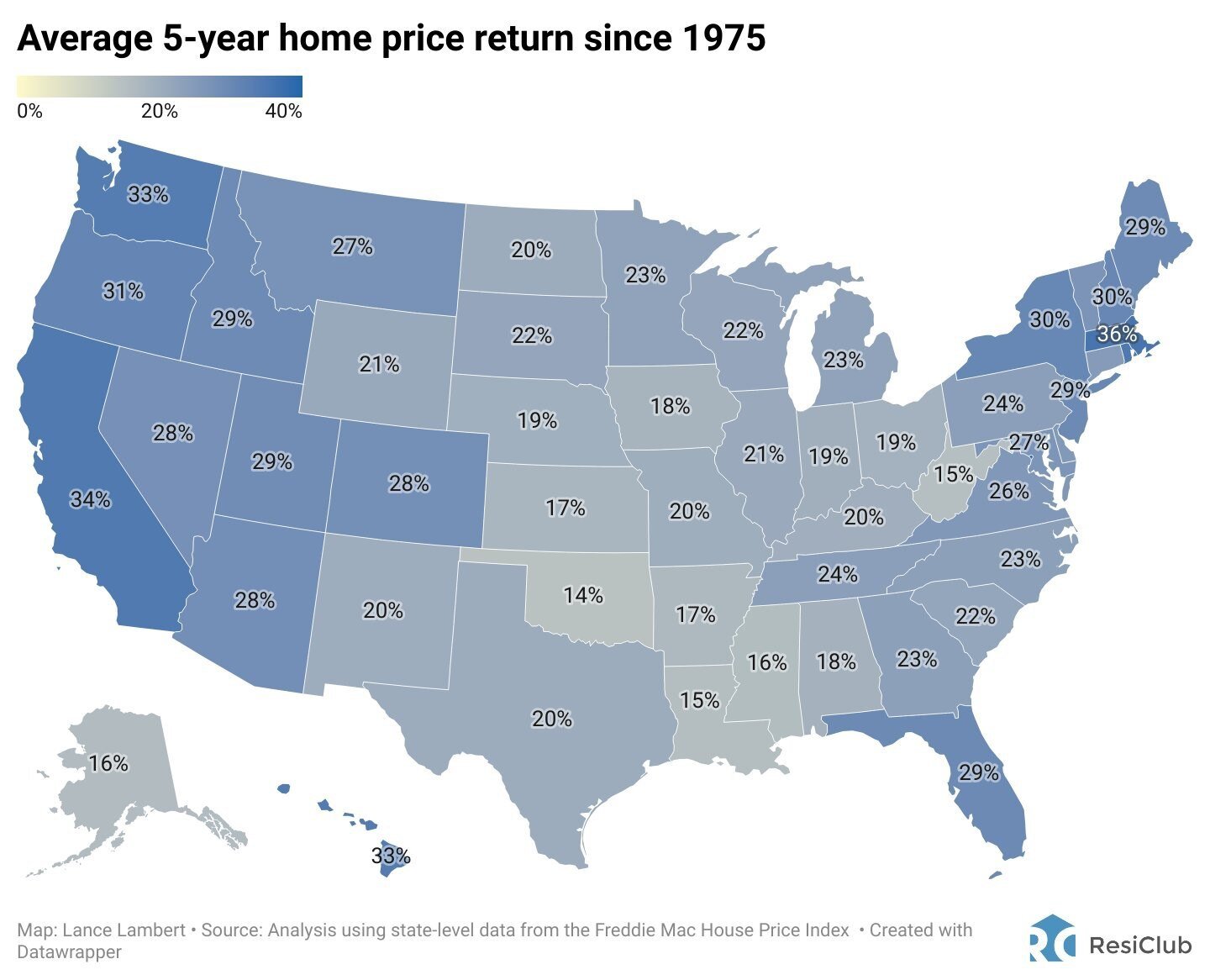
Today’s Chart of the Day from ResiClub shows the average 5-year home price return has averaged 26% per state since 1975.

Investing can be complex, but one principle that stands the test of time is diversification. Diversification involves spreading your investments..
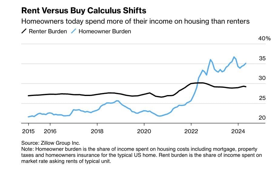
Today’s Chart is from Zillow showing that typically the share of income spent on housing costs for homeowners, such as mortgage, taxes, and..
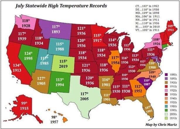
As we all walk outside this month and think, “It is hot!", remember today’s Chart of the Day from the Statewide High Temperature Records set during..
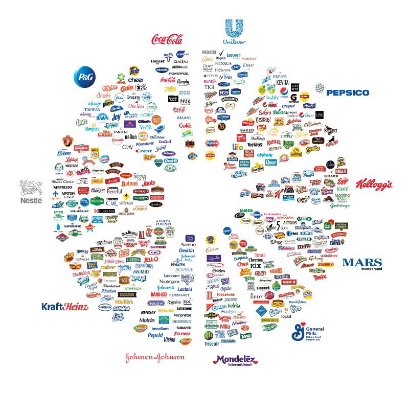
Today’s Chart of the Day is from Jon Erlichman and shows what I like to call the “Brand Wheel".
Samuel serves as Senior Vice President, Chief Investment Officer for the Crews family of banks. He manages the individual investment holdings of his clients, including individuals, families, foundations, and institutions throughout the State of Florida. Samuel has been involved in banking since 1996 and has more than 20 years experience working in wealth management.
Investments are not a deposit or other obligation of, or guaranteed by, the bank, are not FDIC insured, not insured by any federal government agency, and are subject to investment risks, including possible loss of principal.
Today’s Chart of the Day from S&P Global shows the overall market share owned by individuals.
Today’s Chart of the Day was prepared by @CharlieBilello on X using data from a groundbreaking paper in 2022 by Hendrick Bessembinder.
Today’s Chart of the Day is from @CharlieBilello from the Hendrick Bessembinder paper called “Shareholder Wealth Enhancement” published in 2023.
Today’s Chart of the Day from JP Morgan shared by @StevenKelly49 on X shows the results of popular economists who predicted “Doomsday” scenarios and the return of selling stock and buying bonds at their suggestion.
Today’s Chart of the Day is a classic from Visual Capitalist outlining why “Gold is Money” and the other 117 elements are not.
Today’s Chart of the Day from Carson Investment Research shows the 35 major “bad news” events in the stock market going back to 1900.
Today's Chart of the Day is from a research article in the British Medical Journal titled “Effect of Exercise for Depression.”
Today’s Chart of the Day, from an article written by Robin Powell with IFA.com, shows the 18 largest market events over the last 95 years.
Today’s Chart of the Day is a slight departure from a typical financial post, and similar to one I shared a few years ago, but has some additional information from Robert Rohde (@rarohde).
Today’s Chart of the Day from ResiClub shows the average 5-year home price return has averaged 26% per state since 1975.
Investing can be complex, but one principle that stands the test of time is diversification. Diversification involves spreading your investments across various types of assets in different classes, industries, and geographies. It is so important that Nobel Prize laureate Harry Markowitz, who is the founder of the Modern Portfolio Theory published in 1952, once said, “Diversification is the only free lunch” in investing.
Today’s Chart is from Zillow showing that typically the share of income spent on housing costs for homeowners, such as mortgage, taxes, and insurance, has been lower than what renters pay for rental units.
As we all walk outside this month and think, “It is hot!", remember today’s Chart of the Day from the Statewide High Temperature Records set during the month of July. The mid- to early- 1930’s, which is noted in dark red and coincides with the Dust Bowl, was a particularly bad time for most states.
Today’s Chart of the Day is from Jon Erlichman and shows what I like to call the “Brand Wheel".
current_page_num+2: 7 -

