Chart of the Day: Manufacturing Decline
Today’s Chart of the Day comes from GlobalData and shows the percentage of manufacturing jobs in the US, from 1948 to 2023.
Plan Today. Protect Tomorrow. Attend an Educational Estate-Planning Seminar
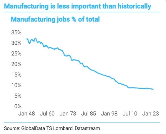
Today’s Chart of the Day comes from GlobalData and shows the percentage of manufacturing jobs in the US, from 1948 to 2023.
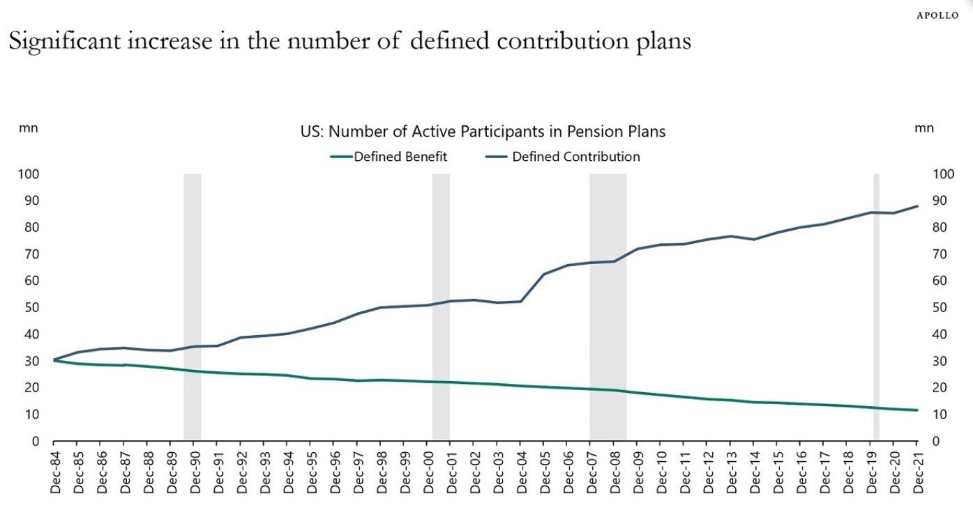
Today’s Chart of the Day comes from Torsten Slok who is the Chief Economist with Apollo. It shows the increase of defined contributions (401K’s and..
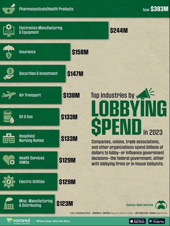
Today’s Chart of the Day is from Open Secrets and shows the amount of money spent in lobbying our federal government in 2023. We have all heard about..
%2011.5.2024.jpg)
Today’s Chart of the Day is a follow up from the previous post and is from an academic paper called “The Risk and Reward of Investing” published by..
.jpg)
Today’s Chart of the Day is from an academic paper called “The Risk and Reward of Investing” by Doeswijk and Swinkel published in July 2024.
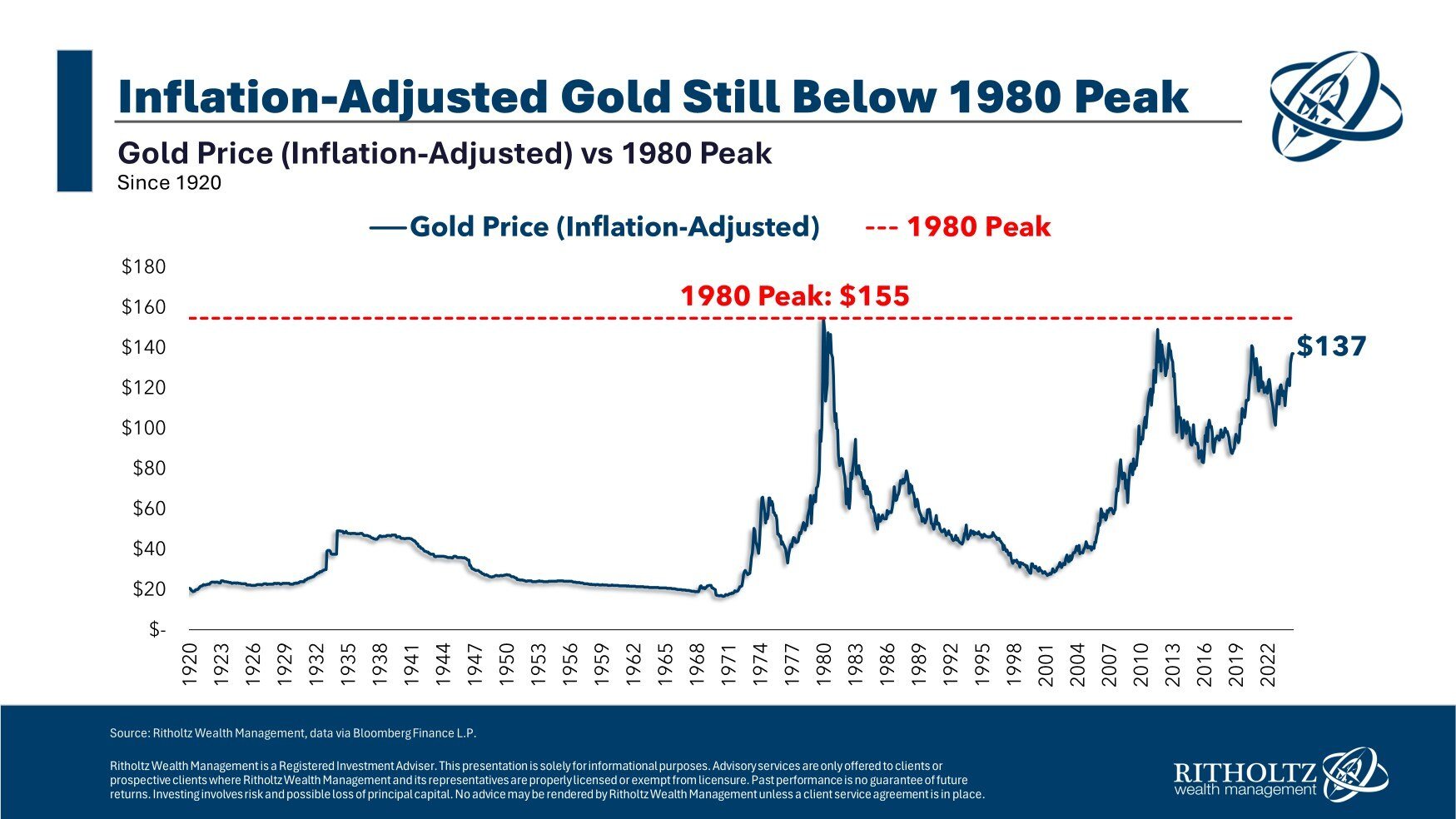
Today's Chart of the Day from Ben Carlson's book "A Wealth of Common Sense" provides an insightful look at gold prices adjusted for inflation dating..

Today’s Chart of the Day from Epic Maps on X which shows the population density of China.
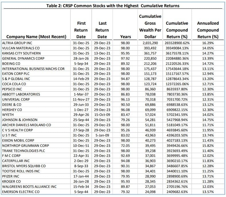
Today’s Chart of the Day is a list by Hendrik Bessembinder from his paper called “Which U.S. Stocks Generated the Highest Long-Term Returns?”..
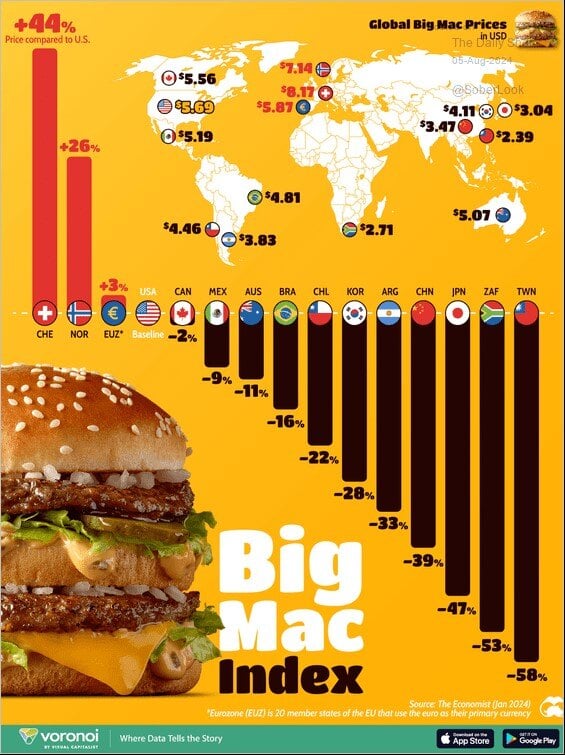
Today’s Chart of the Day from Voronoi shows the “Big Mac Index," a socially popular measure of a concept called Purchasing Power Parity. The concept..
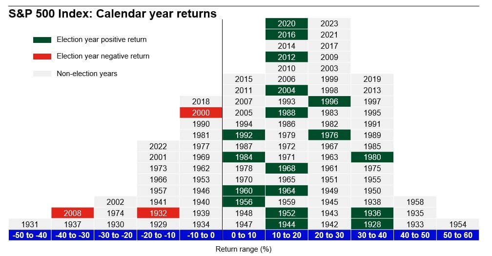
Today’s Chart of the Day was provided by Angie Parsons, a Portfolio Manager at Crews Bank & Trust, after attending a presentation by Brian Levitt..
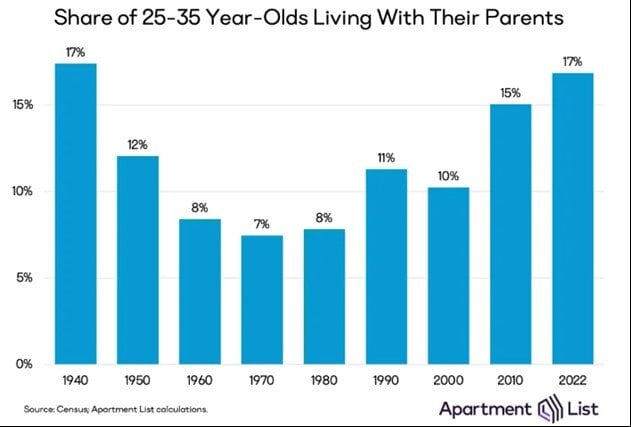
Today’s Chart of the Day from Apartment List shows the share of 25 to 35-year-olds living with their parents.
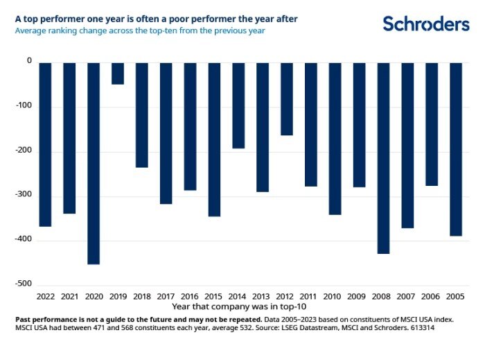
Today’s Chart of the Day is from a Financial Times article called “Past Performance is a Public Enemy” and includes a chart provided by Schroders.
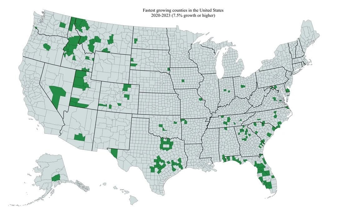
Today’s Chart of the Day is from @Markets4mayhem on X and shows the fastest growing counties in the United States from 2020-2023, which equates 7.5%+..
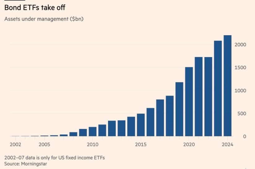
Today’s Chart of the Day from the Financial Times shows the growth of Bond ETFs from 2007 to present.
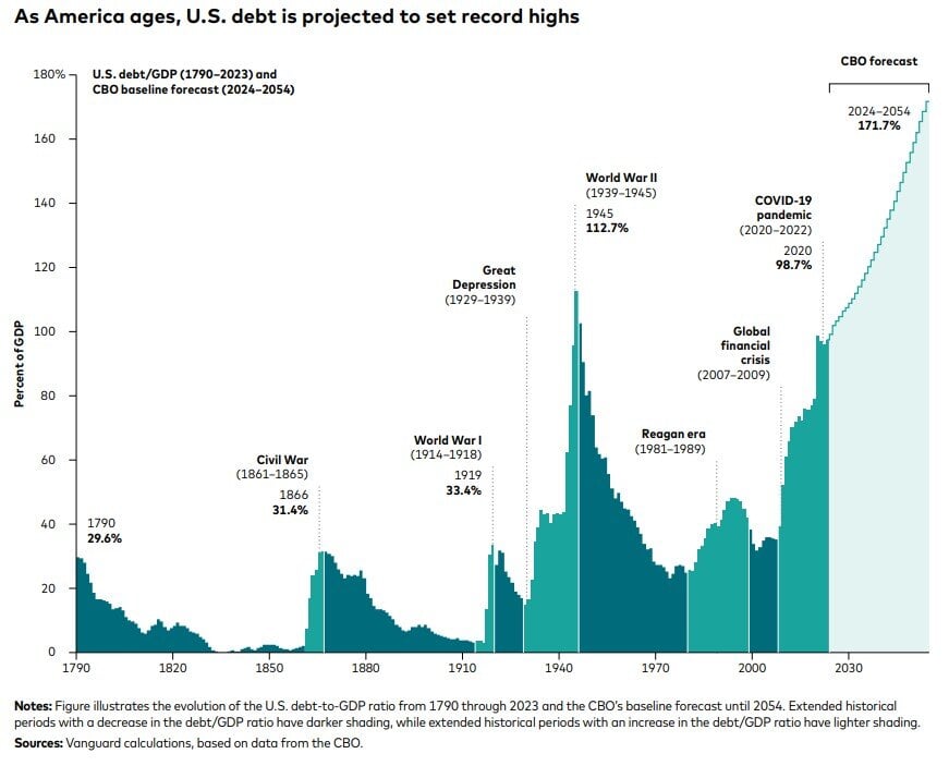
Today’s Chart of the Day from Vanguard shows the US debt as a percentage of GDP (Gross Domestic Product), which is a measure of all the goods and..
Samuel serves as Senior Vice President, Chief Investment Officer for the Crews family of banks. He manages the individual investment holdings of his clients, including individuals, families, foundations, and institutions throughout the State of Florida. Samuel has been involved in banking since 1996 and has more than 20 years experience working in wealth management.
Investments are not a deposit or other obligation of, or guaranteed by, the bank, are not FDIC insured, not insured by any federal government agency, and are subject to investment risks, including possible loss of principal.
Today’s Chart of the Day comes from GlobalData and shows the percentage of manufacturing jobs in the US, from 1948 to 2023.
Today’s Chart of the Day comes from Torsten Slok who is the Chief Economist with Apollo. It shows the increase of defined contributions (401K’s and the like) and decline in defined benefit (aka pensions) since 1984.
Today’s Chart of the Day is from Open Secrets and shows the amount of money spent in lobbying our federal government in 2023. We have all heard about the money spent by the Pharmaceutical Industry, but we never see to what degree versus other industries.
Today’s Chart of the Day is a follow up from the previous post and is from an academic paper called “The Risk and Reward of Investing” published by Doeswijk and Swinkel in July 2024.
Today’s Chart of the Day is from an academic paper called “The Risk and Reward of Investing” by Doeswijk and Swinkel published in July 2024.
Today's Chart of the Day from Ben Carlson's book "A Wealth of Common Sense" provides an insightful look at gold prices adjusted for inflation dating back to 1920.
Today’s Chart of the Day from Epic Maps on X which shows the population density of China.
Today’s Chart of the Day is a list by Hendrik Bessembinder from his paper called “Which U.S. Stocks Generated the Highest Long-Term Returns?” published in July 2024.
Today’s Chart of the Day from Voronoi shows the “Big Mac Index," a socially popular measure of a concept called Purchasing Power Parity. The concept proposes that the costs of goods, in this case a hamburger, should be the same all over the world.
Today’s Chart of the Day was provided by Angie Parsons, a Portfolio Manager at Crews Bank & Trust, after attending a presentation by Brian Levitt with Invesco called, “Is the Second Half of Elections Bad for the Markets?”
Today’s Chart of the Day from Apartment List shows the share of 25 to 35-year-olds living with their parents.
Today’s Chart of the Day is from a Financial Times article called “Past Performance is a Public Enemy” and includes a chart provided by Schroders.
Today’s Chart of the Day is from @Markets4mayhem on X and shows the fastest growing counties in the United States from 2020-2023, which equates 7.5%+ growth rates. Counties in Florida, Idaho, Texas, and Western Montana dominate the list.
In Florida, Southwest Florida, north of Tampa, and the I-4 corridor are all in green. Charlotte County went from 188,000 to 206,00, which was an increase of 18,000 people. Sarasota County went from 436,000 to 469,000, an increase of 33,000.
Today’s Chart of the Day from the Financial Times shows the growth of Bond ETFs from 2007 to present.
Today’s Chart of the Day from Vanguard shows the US debt as a percentage of GDP (Gross Domestic Product), which is a measure of all the goods and services generated by the United States.
current_page_num+2: 10 -

