Chart of the Day: 20 Year 7/10 Rule
Today’s Chart of the Day shows historical 20-year annual returns going back to 1947 compiled by Nicholas Colas with DataTrek.
Learn about our Refer-a-Friend Program. Terms and conditions apply.
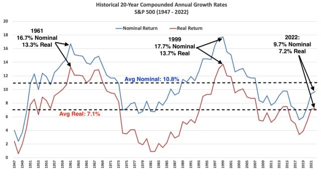
Today’s Chart of the Day shows historical 20-year annual returns going back to 1947 compiled by Nicholas Colas with DataTrek.
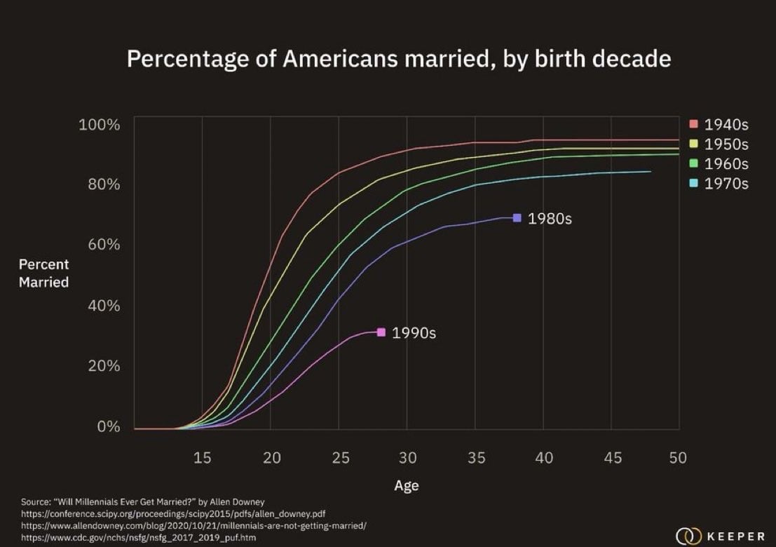
Today’s Chart of the Day from Allen Downey shows the increasing trend of delayed marriages among Millennials.
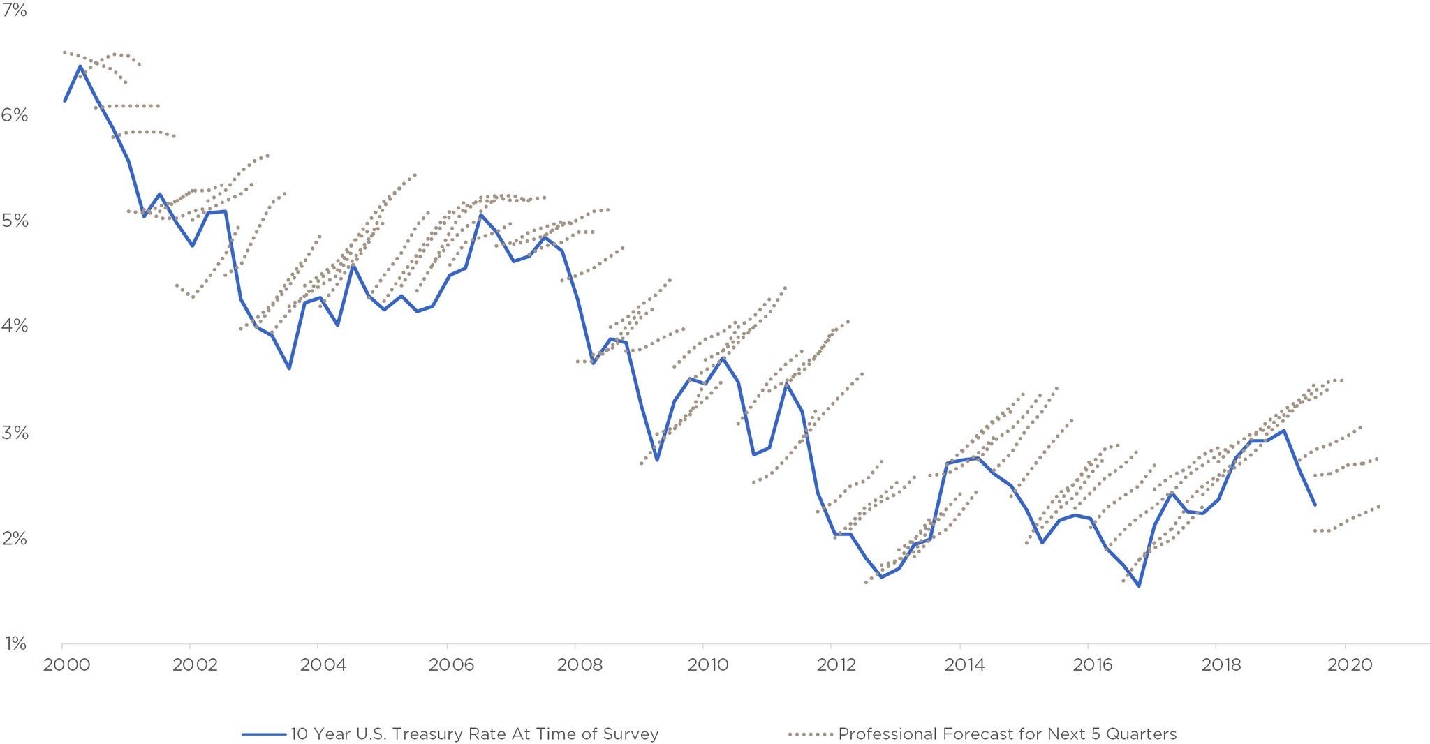
Today’s Chart of the Day has been around a while and is often in the back of my head when we see “forecasts.”
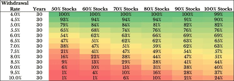
Today’s Chart of the Day was produced by Ofdollarsanddata’s Nick Maggiulli and shows the probability of success between your withdrawal rates, the..
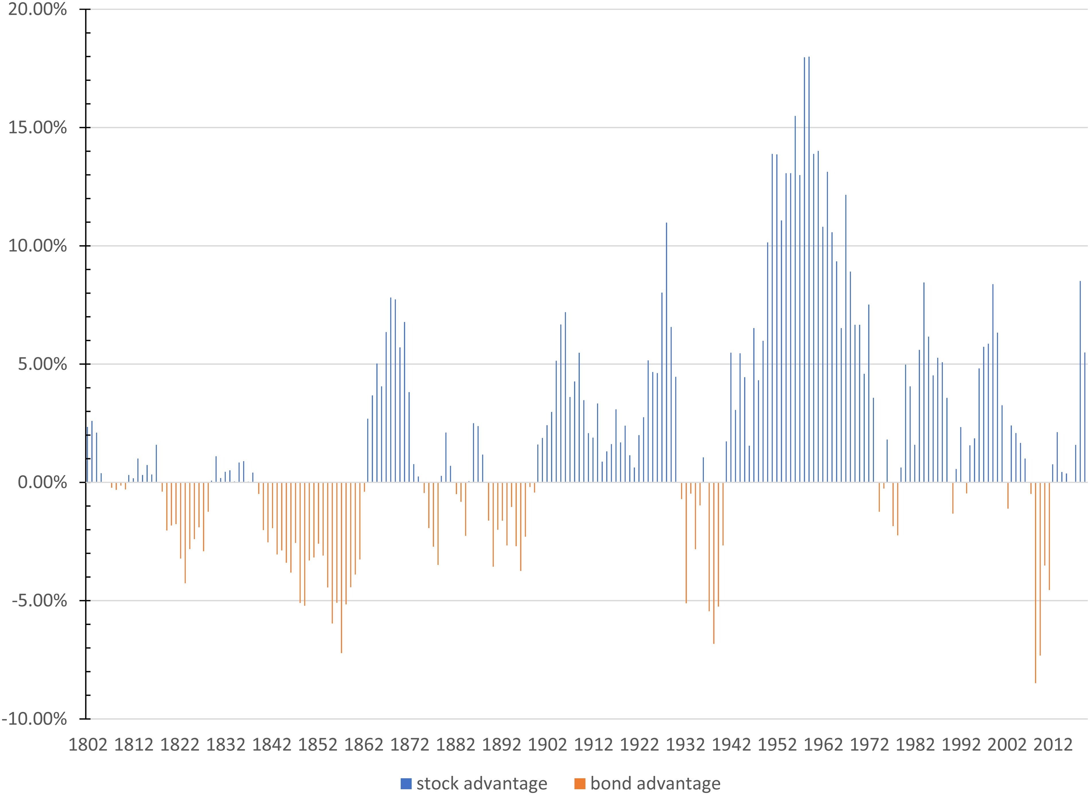
Today’s Chart of the Day is from an article called, “Stocks for the Long Run? Sometimes Yes, Sometimes, No.” by Edward McQuarrie from Santa Clara..
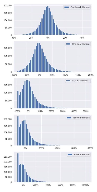
Today’s Chart of the Day was sourced by my Crews Bank & Trust colleague, Jackson Garner, Trust Relationship Associate, from a research paper called,..
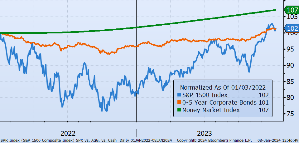
Financial theory says that when there is unexpected inflation, monetary assets (things that use dollars to satisfy contractual obligations, such as..

Today’s Chart of the Day shows how much American families have saved for retirement. Notably, 50% have $0 saved and just under 80% have less than..
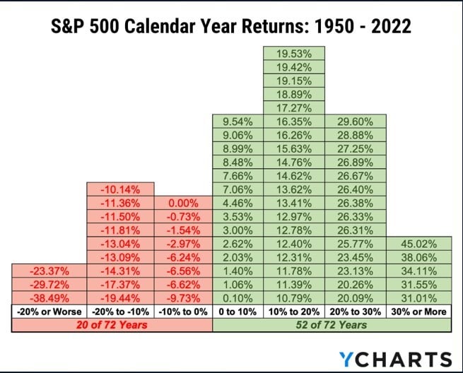
Today’s Chart of the Day was sourced by my Crews Bank & Trust colleague Jackson Garner, Trust Relationship Associate. The chart is from YCharts, an..
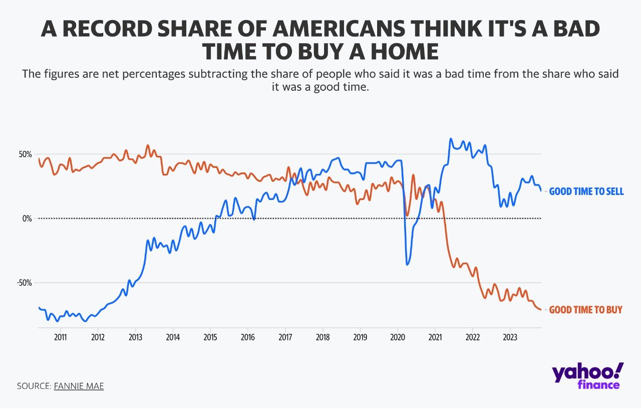
Today’s Chart of the Day was prepared by Yahoo Finance with data from Fannie Mae, a government-sponsored agency that allows mortgages to be traded..
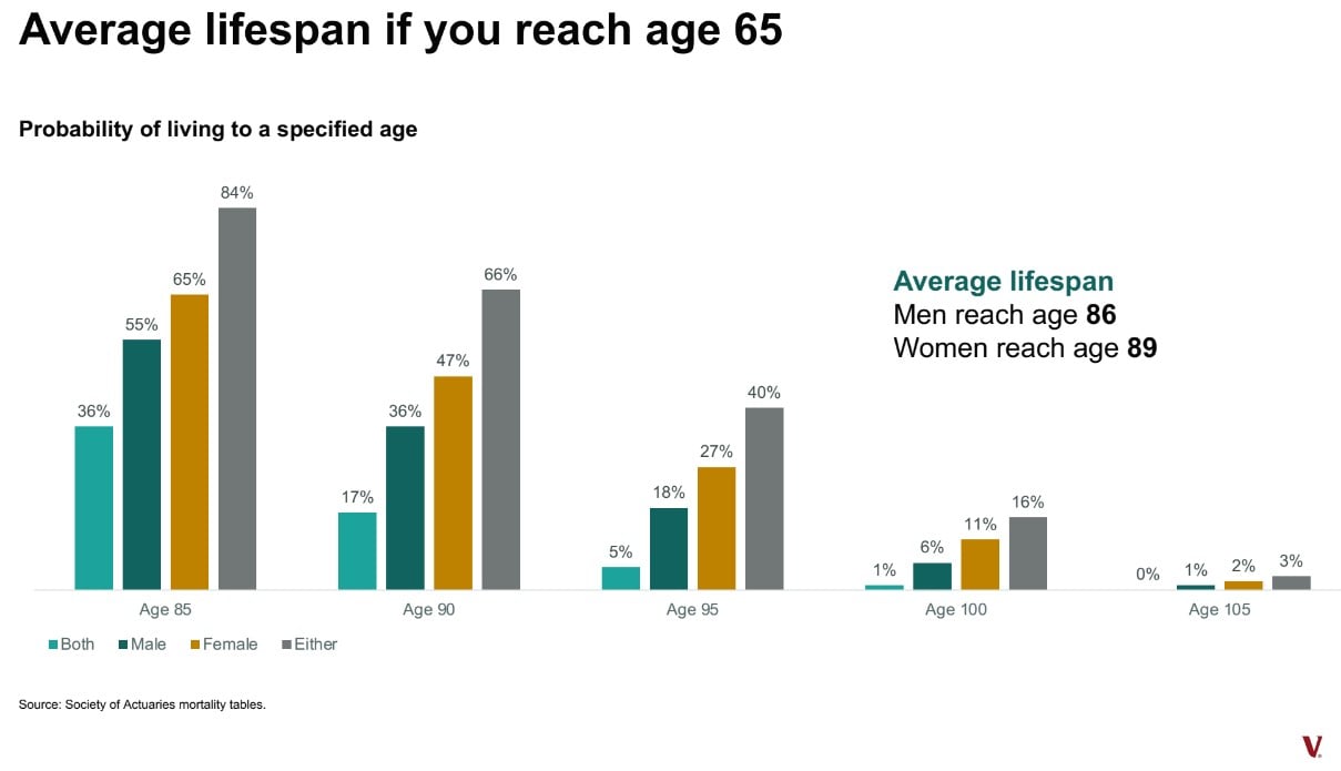
Today’s Chart of the Day from Vanguard shows that the average lifespan once someone reaches the age of 65 is 86 for men and 89 for women.
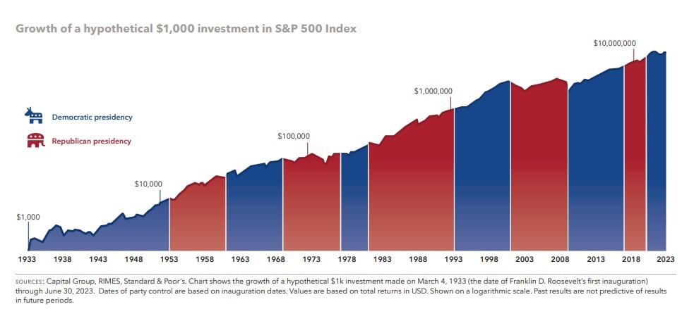
Happy New Year! With 2024 being a presidential election year, today’s Chart of the Day is from Capital Group and shows the hypothetical growth of..

Today’s Chart of the Day is from Dimensional Advisors
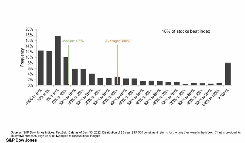
Today’s Chart of the Day comes from S&P Dow Jones, which just celebrated 20 years of tracking market metrics, and shows only 18% of stocks..
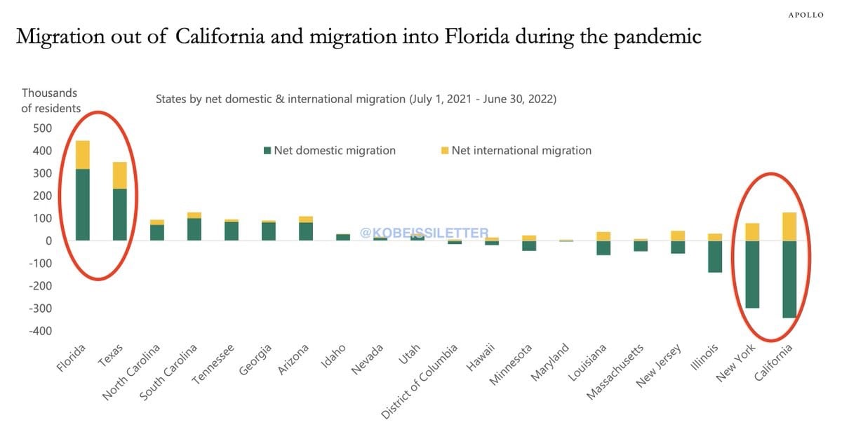
Today’s Chart of the Day from Apollo shows migration during the pandemic. Florida and Texas gained 800,000 people, including 750,000 who moved from..
Samuel serves as Senior Vice President, Chief Investment Officer for the Crews family of banks. He manages the individual investment holdings of his clients, including individuals, families, foundations, and institutions throughout the State of Florida. Samuel has been involved in banking since 1996 and has more than 20 years experience working in wealth management.
Investments are not a deposit or other obligation of, or guaranteed by, the bank, are not FDIC insured, not insured by any federal government agency, and are subject to investment risks, including possible loss of principal.
Today’s Chart of the Day shows historical 20-year annual returns going back to 1947 compiled by Nicholas Colas with DataTrek.
Today’s Chart of the Day from Allen Downey shows the increasing trend of delayed marriages among Millennials.
Today’s Chart of the Day has been around a while and is often in the back of my head when we see “forecasts.”
Today’s Chart of the Day was produced by Ofdollarsanddata’s Nick Maggiulli and shows the probability of success between your withdrawal rates, the percentage you withdraw from your portfolio each year, versus the allocation between stocks and bonds.
Today’s Chart of the Day is from an article called, “Stocks for the Long Run? Sometimes Yes, Sometimes, No.” by Edward McQuarrie from Santa Clara University in November 2023. It shows the stocks, blue, versus bonds, orange, advantage over 10-year holding periods going back to 1802.
Today’s Chart of the Day was sourced by my Crews Bank & Trust colleague, Jackson Garner, Trust Relationship Associate, from a research paper called, “Underperformance of Concentrated Stock Positions” written by Antti Petajisto at MIT in 2023.
Financial theory says that when there is unexpected inflation, monetary assets (things that use dollars to satisfy contractual obligations, such as bonds, loans, and cash) are going to decline in value. The theory also states
Today’s Chart of the Day shows how much American families have saved for retirement. Notably, 50% have $0 saved and just under 80% have less than $100,000.
Today’s Chart of the Day was sourced by my Crews Bank & Trust colleague Jackson Garner, Trust Relationship Associate. The chart is from YCharts, an investment monitoring software we use.
Today’s Chart of the Day was prepared by Yahoo Finance with data from Fannie Mae, a government-sponsored agency that allows mortgages to be traded between investors.
Today’s Chart of the Day from Vanguard shows that the average lifespan once someone reaches the age of 65 is 86 for men and 89 for women.
Happy New Year! With 2024 being a presidential election year, today’s Chart of the Day is from Capital Group and shows the hypothetical growth of $1,000 invested in March 1933, when Franklin D. Roosevelt was first inaugurated.
Today’s Chart of the Day comes from S&P Dow Jones, which just celebrated 20 years of tracking market metrics, and shows only 18% of stocks outperformed the average during that time.
Today’s Chart of the Day from Apollo shows migration during the pandemic. Florida and Texas gained 800,000 people, including 750,000 who moved from Illinois, New York, and California.
current_page_num+2: 11 -

