Chart of the Day: Safe Withdrawal Rates

Learn about our Refer-a-Friend Program. Terms and conditions apply.

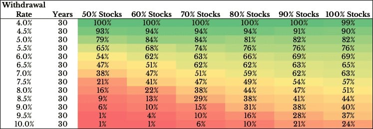
Today’s Chart of the Day was produced by Ofdollarsanddata’s Nick Maggiulli and shows the probability of success between your withdrawal rates, the percentage you withdraw from your portfolio each year, versus the allocation between stocks and bonds. It covers the results of the last 68 full 30-year periods from 1926 to 2022.
Though the past is no predictor of the future, the concept of taking out too much with too little risk versus not taking out enough with too much risk is important. Also, since outcomes can be impacted significantly by minor changes. For example, the chart highlights the risks of losing 1-2% annually from paying too high of fees for underperforming investments.

Samuel serves as Senior Vice President, Chief Investment Officer for the Crews family of banks. He manages the individual investment holdings of his clients, including individuals, families, foundations, and institutions throughout the State of Florida. Samuel has been involved in banking since 1996 and has more than 20 years experience working in wealth management.
Investments are not a deposit or other obligation of, or guaranteed by, the bank, are not FDIC insured, not insured by any federal government agency, and are subject to investment risks, including possible loss of principal.

