
Chart of the Day: Holding Period
Today’s Chart of the Day is from Dresdner Kleinwort Macro Research and notes the average holding period of stocks since 1920.
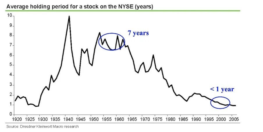
Today’s Chart of the Day is from Dresdner Kleinwort Macro Research and notes the average holding period of stocks since 1920.
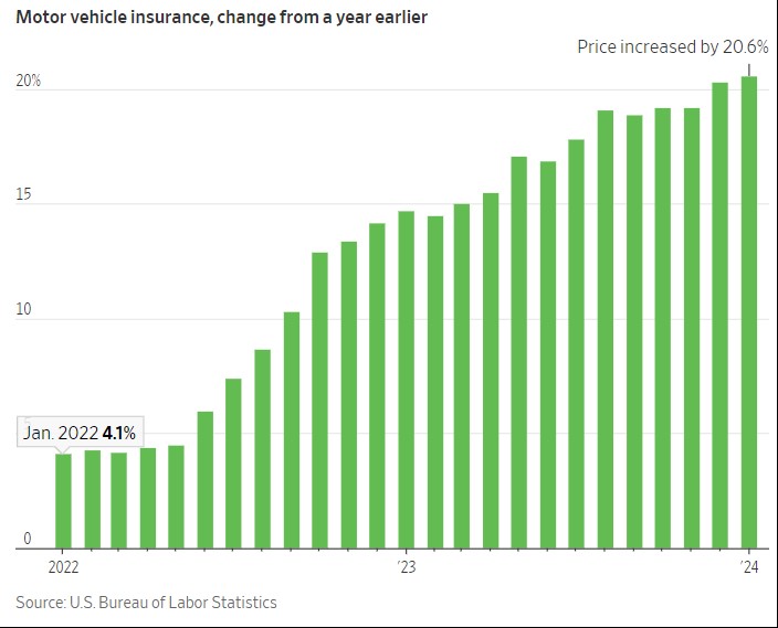
Today’s Chart is from Charlie Bilello, with data from the US Bureau of Labor, showing that auto insurance has increased more than 20% from last year.
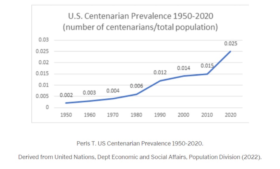
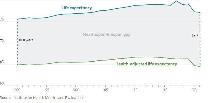
Today’s Chart of the Day shows the percentage of people who have reached the age of 100.

When it comes to housing options, there’s a diverse array to choose from: multi-family homes, single-family houses, townhouses, co-ops, manufactured..
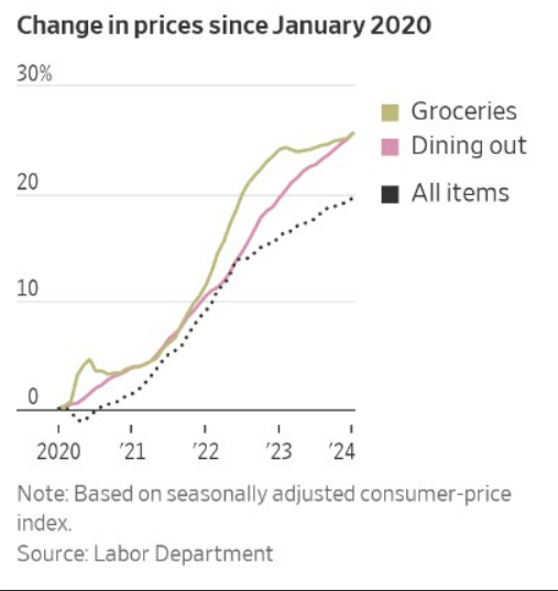
Today’s Chart of the Day is from the Wall Street Journal utilizing data from the Labor Department, showing that you are not imagining things; there..
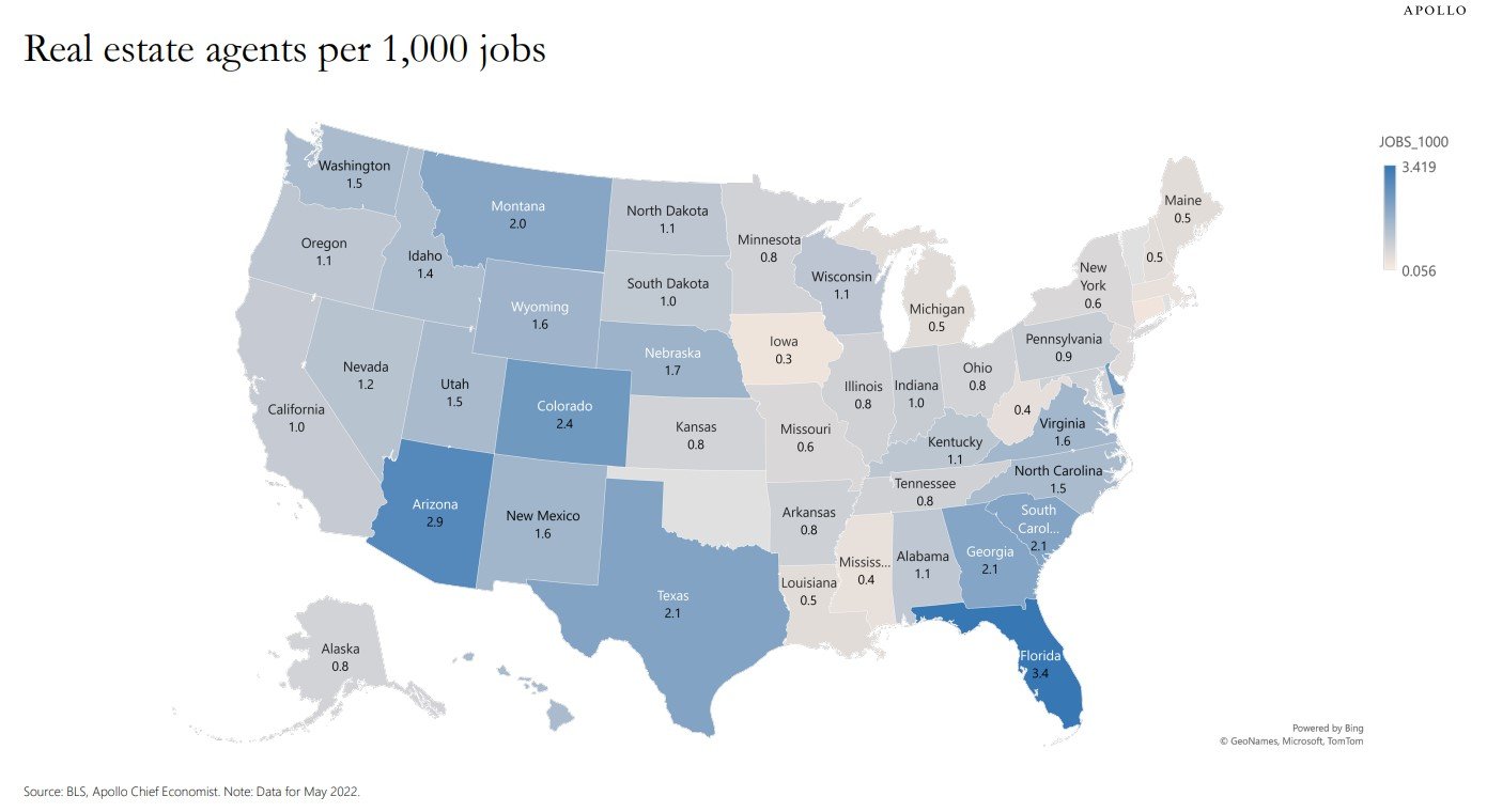
Today’s Chart of the Day comes from Dr. Torsten Slok from Apollo and shows the number of real estate agents per 1,000 jobs.
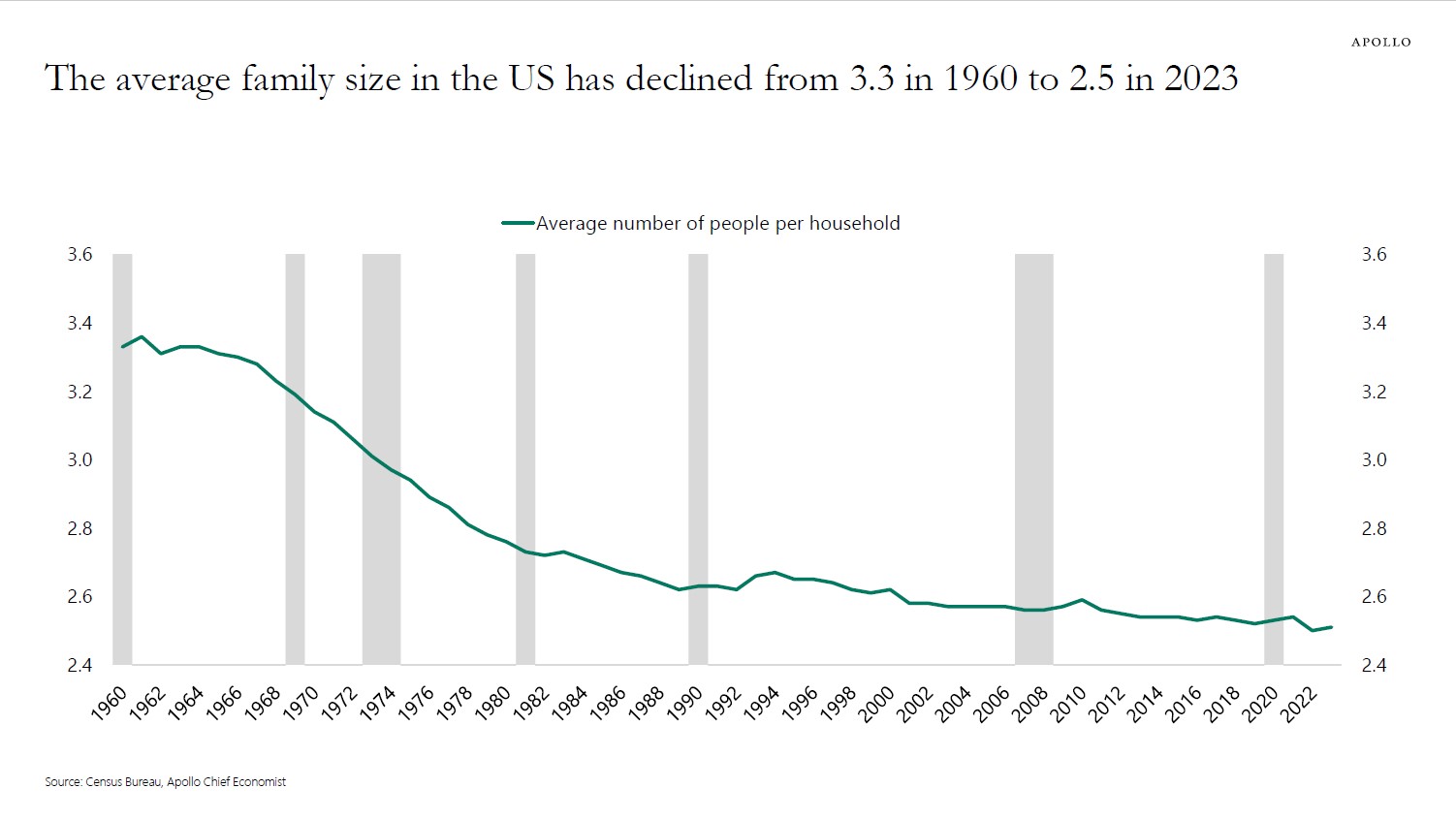
Today's chart, sourced from Apollo and the Census Bureau data, illustrates a decline in the average family size from 3.3 members per household in..
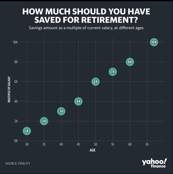
Today’s Chart of the Day comes from Yahoo Finance with estimates by Fidelity. It shows a general rule of thumb for financial planning for how much..
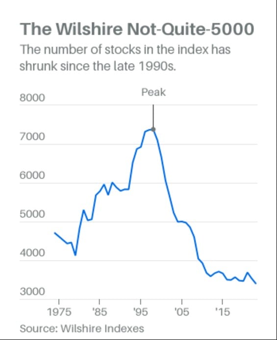
Today’s Chart comes from an article in Barron’s with information from Wilshire Indexes. The “Wiltshire 5000” is an index similar to the S&P 500, with..
Today’s Chart of the Day is from A Teachable Moment by Tony Isola and one to keep in the back of your mind.
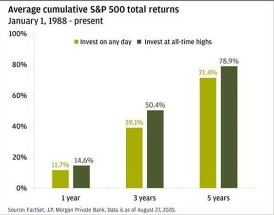
Today’s Chart, from Peter Mallouk via the Chart Report, shows the average cumulative S&P 500 returns from 1998 to 2020.
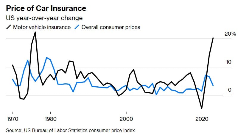
Today’s Chart of the Day from Bloomberg with data from the US Bureau of Labor shows the inflation of car insurance (black) vs. everything else (blue)..
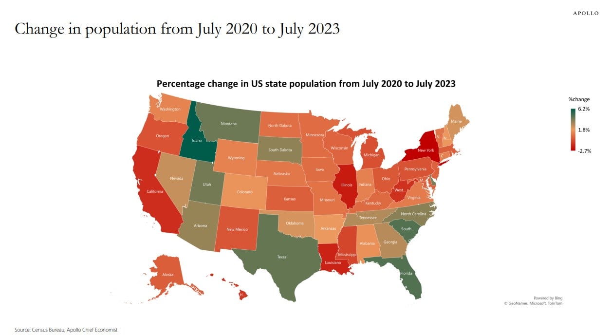
Today’s Chart of the Day comes from Apollo Global Management with data from the Census Bureau showing the change in population by state from July..
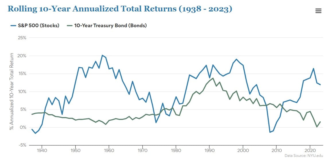
Today’s Chart of the Day from Creativeplanning.com with data from NYE.edu shows the rolling 10-year return of the market going back 85 years.
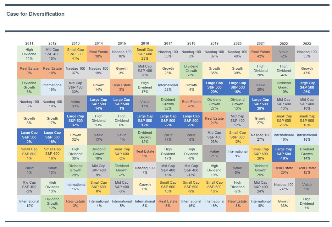
Today’s Chart of the Day is a perennial favorite for some clients and shows the annual stock market performance of several factors. "Factors" is the..