
Chart of the Day: Dollar Reign
Today’s Chart of the Day comes from the Financial Times and shows the dominance of the US dollar in central bank reserves globally, represented in dark blue.
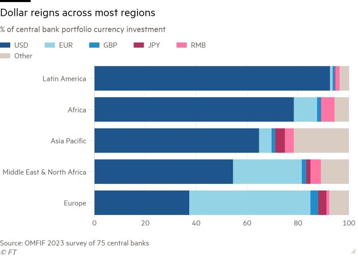
Today’s Chart of the Day comes from the Financial Times and shows the dominance of the US dollar in central bank reserves globally, represented in..
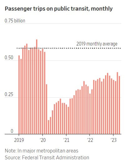
Today’s Chart of the Day is from the Wall Street Journal. Some things have not gone back to “pre-pandemic” days. One is the percentage of those who..
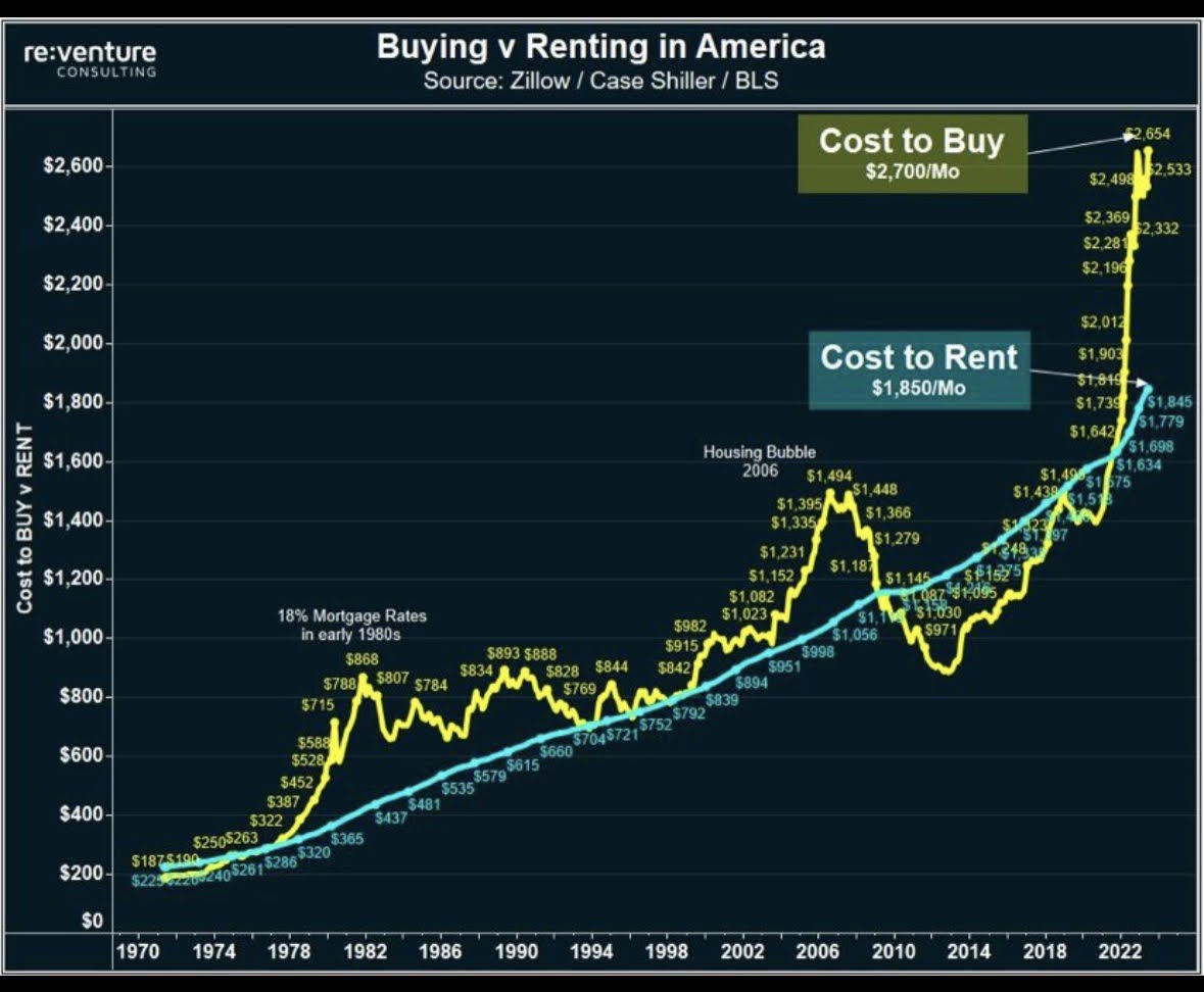
Today’s Chart of the Day comes from re:venture in a discussion on Reddit. It's important to remember that the monthly cost to buy (yellow) is usually..

When it comes to securing the future of a disabled child, establishing a trust is a powerful and proactive step that parents should consider. A..
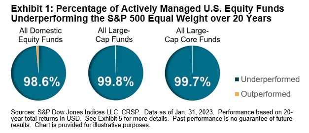
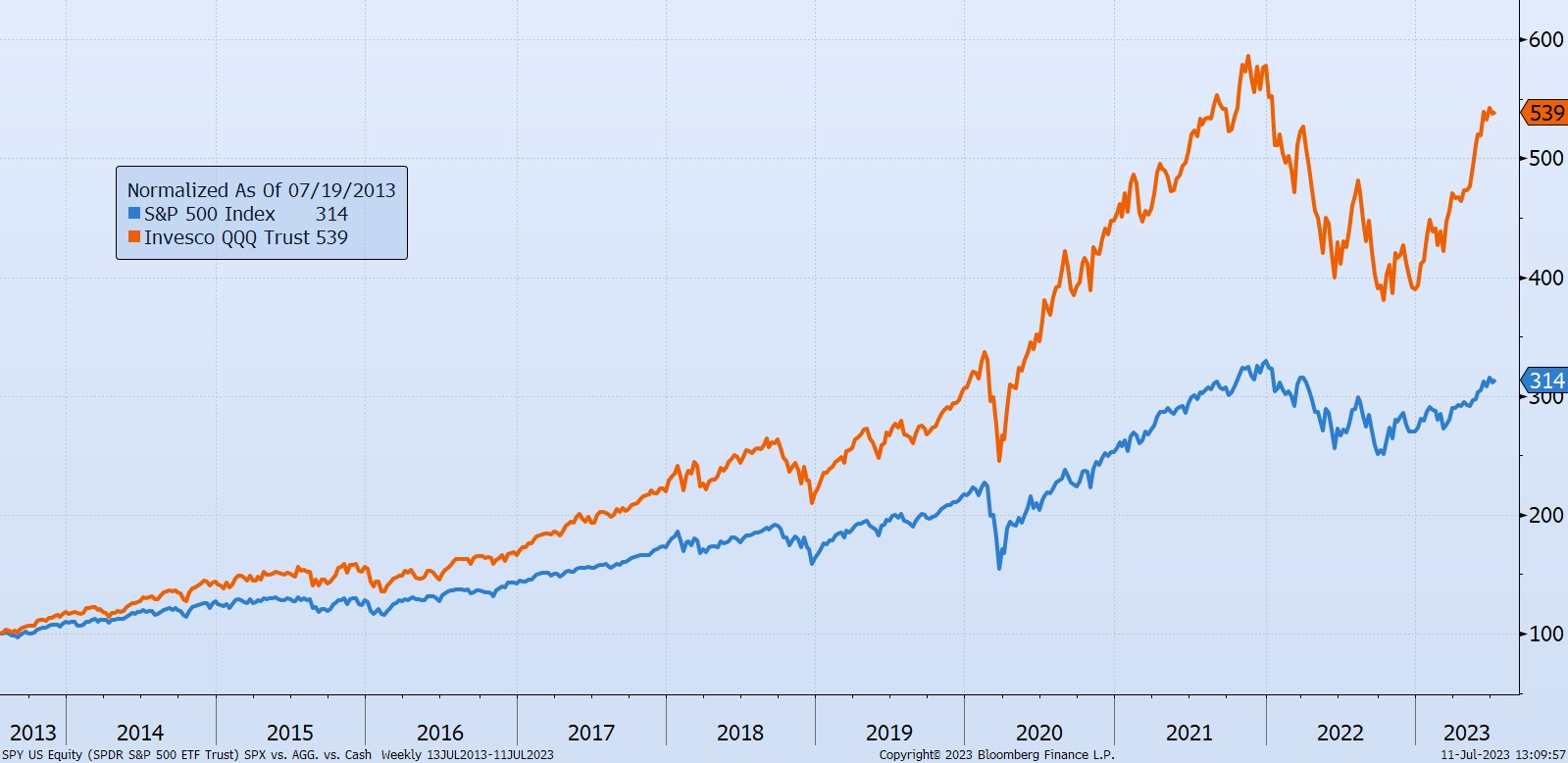
Today’s Chart of the Day is from S&P Global. If you follow my posts, you will not be surprised that over the last 20 years the S&P 500 index, where..
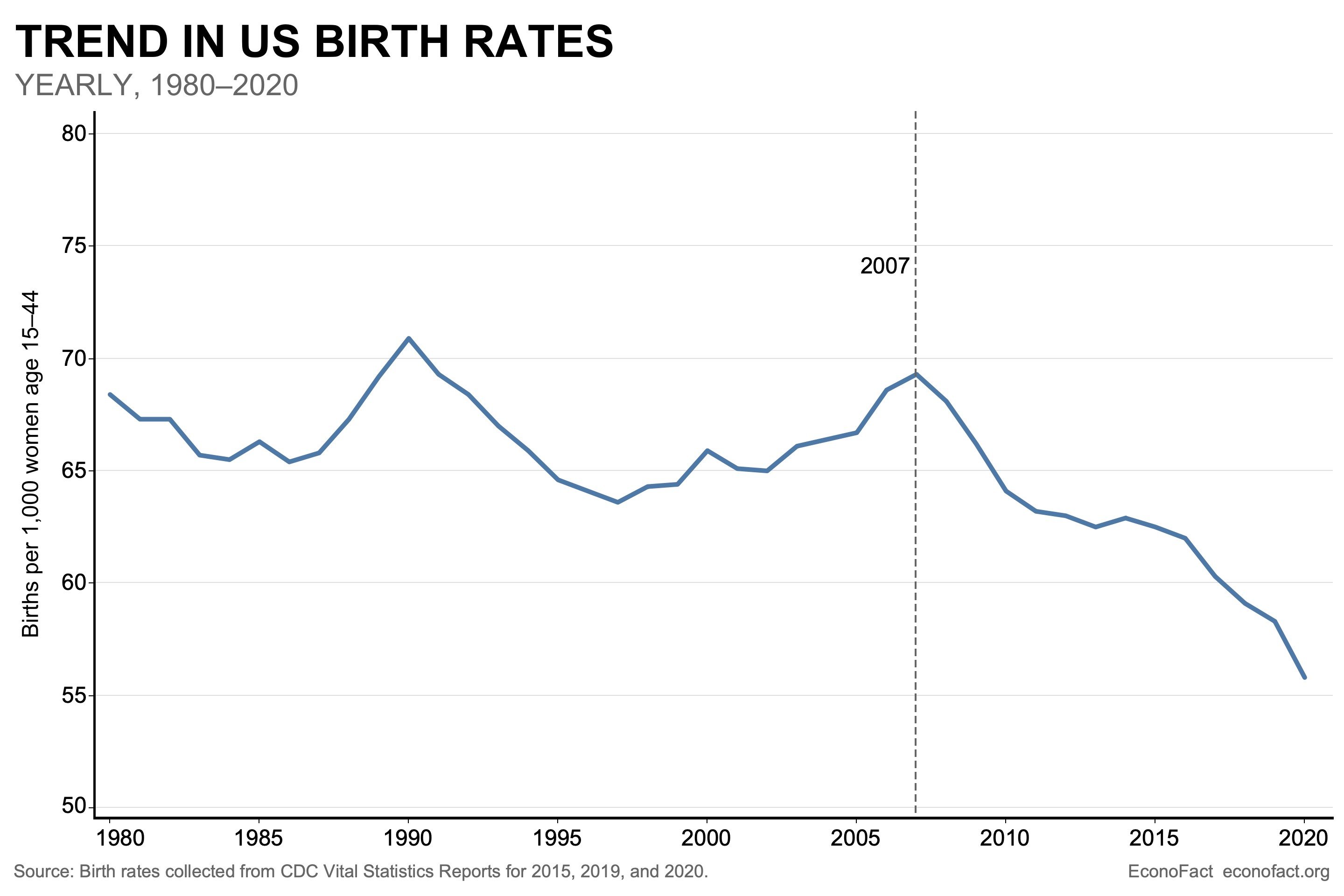
Today’s Chart of the Day from Econofact.org shows the trend in US birth rates which peaked in 2007 and is now 20% less.
Today’s Chart of the Day is a comment about a unique risk that can occur in successful index funds. For instance, we often hear about what many call..
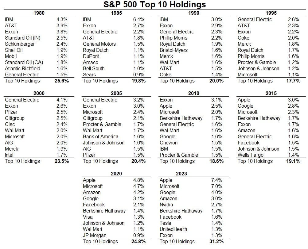
Today’s Chart of the Day comes from A Wealth of Common Sense and shows the top 10 companies in the stock market going back to 1980.
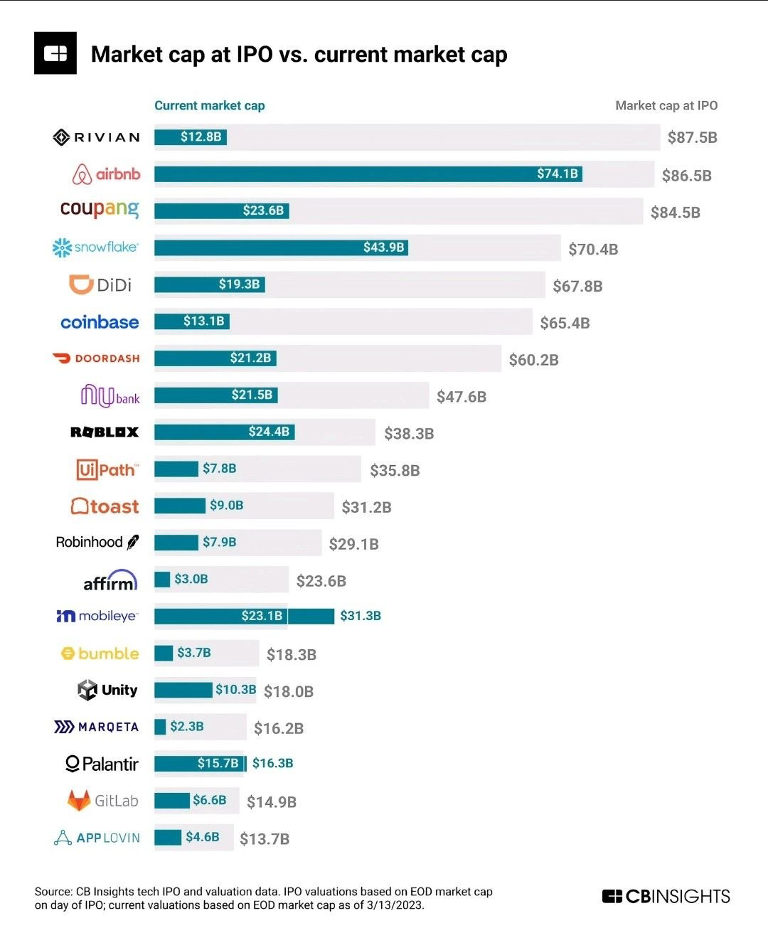
Today’s Chart of the Day comes from @QCompounding on Twitter and shows the value of some well-known companies now vs. when they became publicly owned.
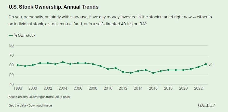
Today’s Chart of the Day from an article called “Best Time to Buy Stocks” shows the percentage of households that own stocks of any form. Besides a..

If you’re a real estate investor hoping to expand your portfolio, you may want to consider a 1031 exchange. A 1031 can be a great way to purchase..
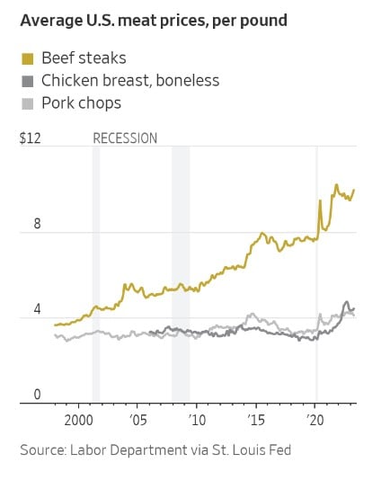
Today’s Chart of the Day from the Wall Street Journal shows that you aren’t imagining that beef prices have gone up. Beef prices have increased..
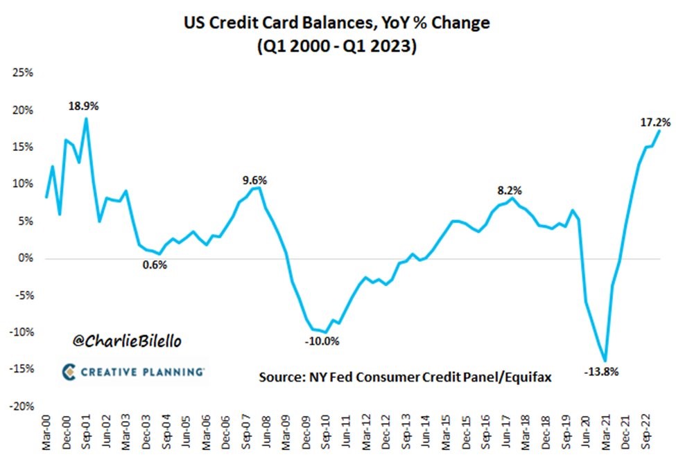
Today’s Chart of the Day from @CharlieBiello on Twitter shows the annual change in credit card balances dating back to 2000. The latest data shows a..

Election years can be unsettling times, as political campaigns dominate headlines and uncertainty looms in the air. It's common for individuals and..
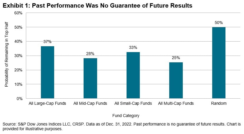
Today’s Chart of the Day comes from Craig Lazzara's article “Persistently Disappointing.” It asks if top fund managers outperform due to skill or..