
Chart of the Day: Declining Cancer Death Rates
Today’s Chart of the Day from Our World in Data shows the death rate from cancer per 100,000 people going back to 1950.
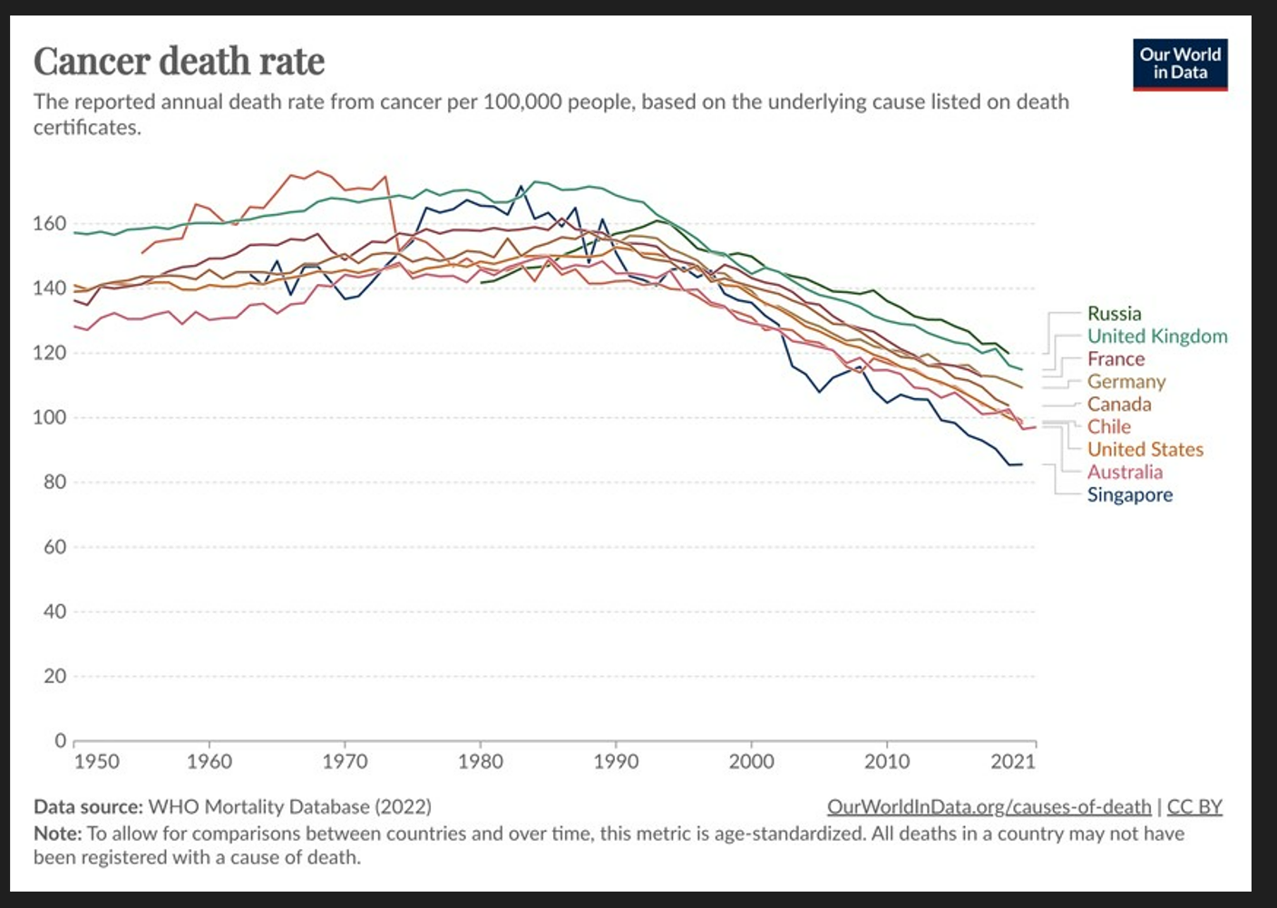
Today’s Chart of the Day from Our World in Data shows the death rate from cancer per 100,000 people going back to 1950.
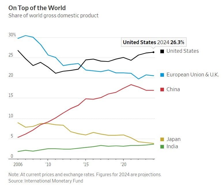
Today’s Chart of the Day is from the Wall Street Journal and shows the percentage of the World’s Gross Domestic Product (GDP) provided by the largest..

VA Home Loans are a benefit earned by our nation's veterans, active-duty service members, and eligible surviving spouses to help them realize the..
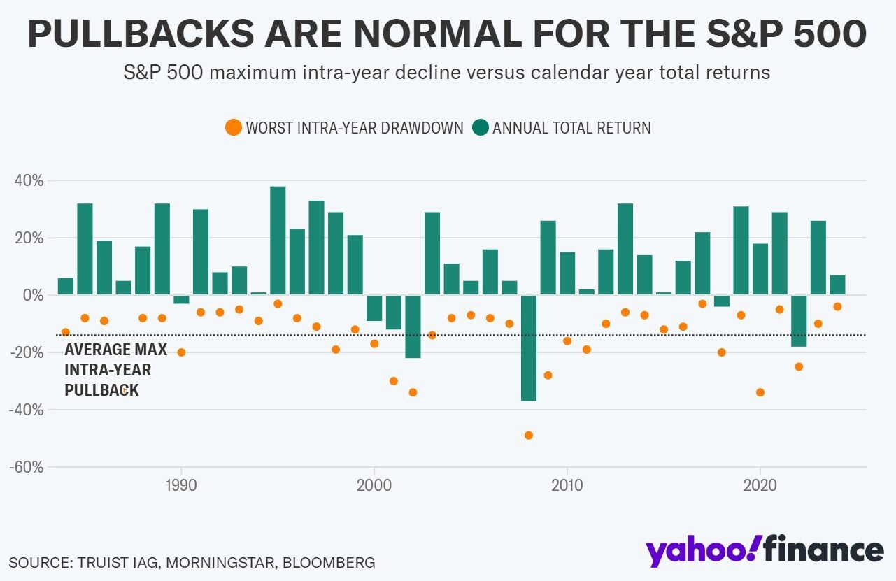
Today’s Chart of the Day from Yahoo Finance shows the annual returns of the stock market by year for the last 40 years, which resulted in an average..
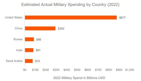
Today’s Chart of the Day from Global X, with data provided by Stockholm International Peace Research, shows that the United States spends almost 2x..

As a small business owner, you wear all the hats – sales, marketing, accounting, human resources – and you arebusy.
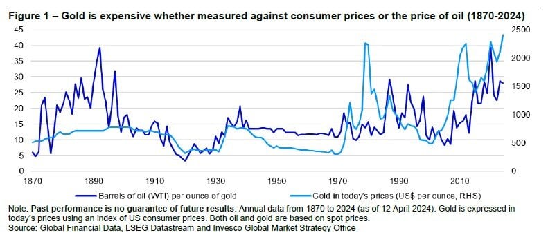
Today’s Chart of the Day is for my gold bugs. It is provided by Invesco and shows one way that investors use to value gold is to compare it to the..
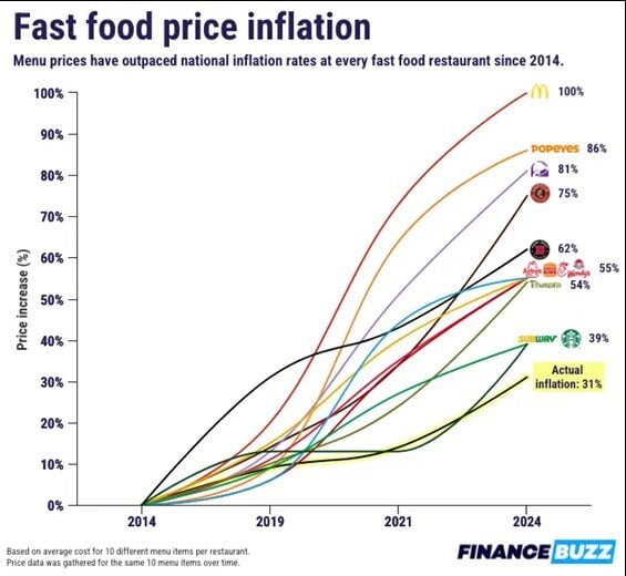
Today’s Chart of the Day is from Charlie Bilello with data from FinanceBuzz. It shows the inflation of fast-food prices over the last of 10 years vs...

You may have heard the adage, “sell in May and go away,” which essentially comes from the poor performance that the markets experience during the..
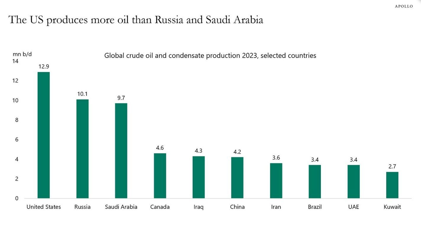
Today’s Chart of the Day is from Dr. Torsten Slok of Apolo Global Management with data from the International Energy Statistics.
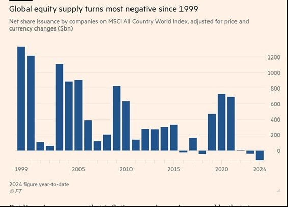
Today’s Chart of the Day is from the Financial Times with a note from Callum Thomas. The chart shows that there is a shrinking level of publicly held..
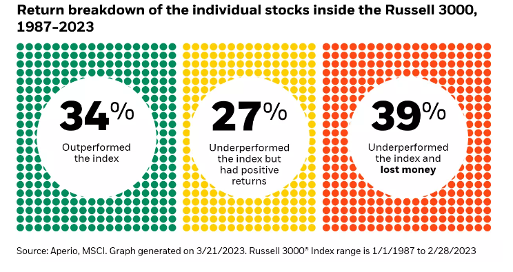
Today’s Chart of the Day from Aperio shows the percentage of individual stocks in the Russell 3000, which represents the 3,000 largest stocks in the..
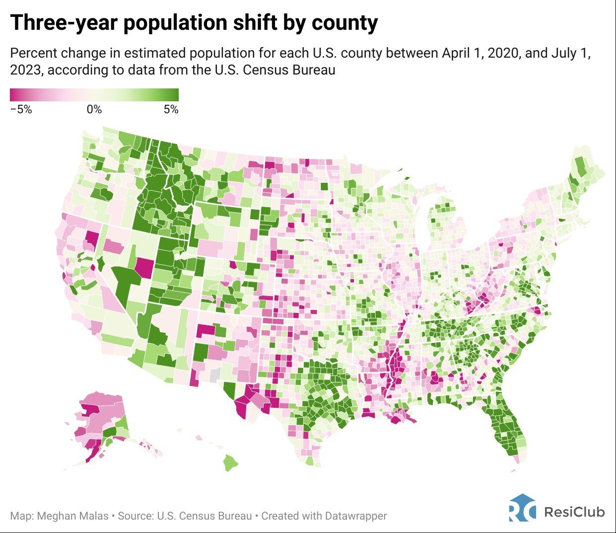
Today’s Chart of the Day is from Meghan Malas with data from the US Census Bureau.

In an act of desperation, Terry* frantically picked up the phone and called his Personal Banker at Crews Bank & Trust. Minutes before, when he logged..
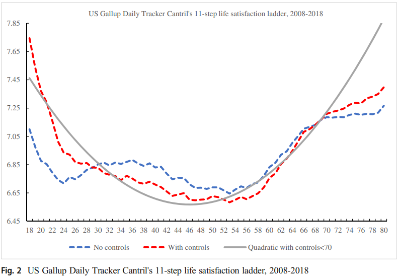
Today’s Chart of the Day is from an article discussed in "A Wealth of Common Sense" by Ben Carlson with data from a research paper by David..