Chart of the Day: 25 to 35-Year-Olds
Today’s Chart of the Day from Apartment List shows the share of 25 to 35-year-olds living with their parents.
Learn about our Refer-a-Friend Program. Terms and conditions apply.
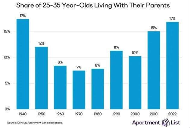
Today’s Chart of the Day from Apartment List shows the share of 25 to 35-year-olds living with their parents.
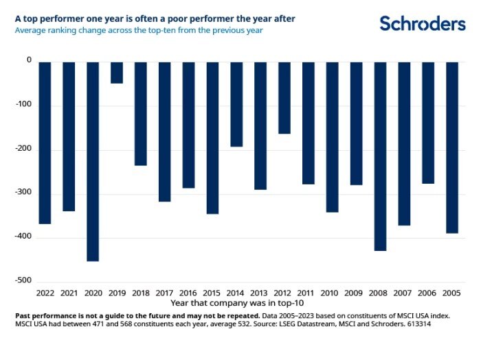
Today’s Chart of the Day is from a Financial Times article called “Past Performance is a Public Enemy” and includes a chart provided by Schroders.
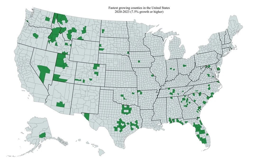
Today’s Chart of the Day is from @Markets4mayhem on X and shows the fastest growing counties in the United States from 2020-2023, which equates 7.5%+..

Estate planning is a crucial step in securing your financial future and ensuring that your wishes are carried out after you pass. Whether you’re..
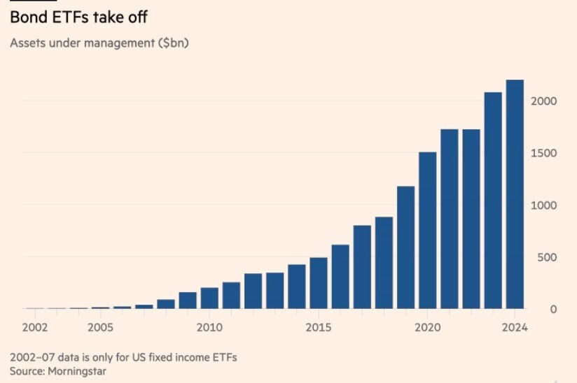
Today’s Chart of the Day from the Financial Times shows the growth of Bond ETFs from 2007 to present.
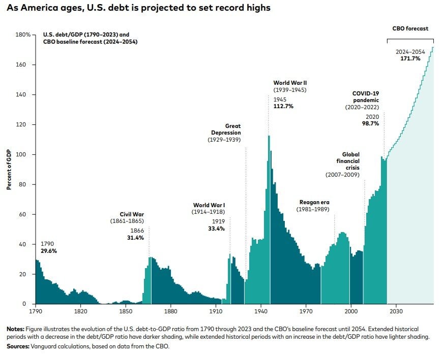
Today’s Chart of the Day from Vanguard shows the US debt as a percentage of GDP (Gross Domestic Product), which is a measure of all the goods and..

You know your business needs money but what is the best option? Would a traditional business loan or a business line of credit be better for your..
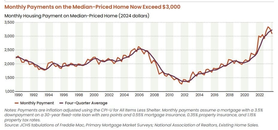
Today’s Chart of the Day is from the 2024 State of the Nation's Housing Report from the Joint Center for Housing Studies at Harvard University.

Today’s Chart of the Day from Bank of America is more of a “buyer beware” to those oversaturated in AI. It's important to understand the risks that..
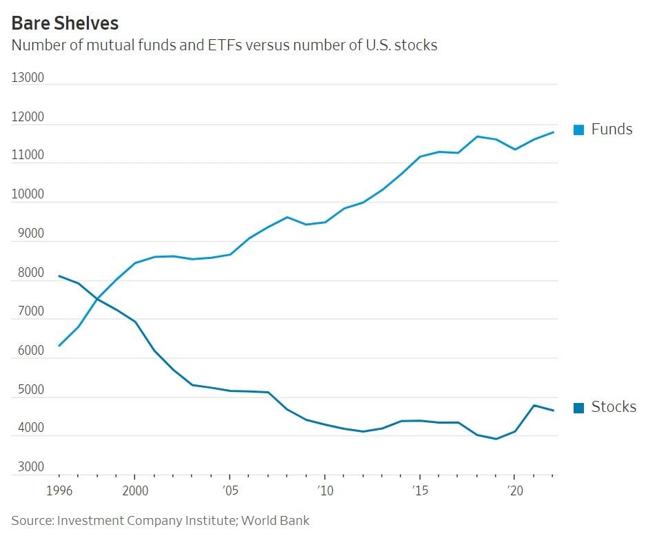
Today’s Chart of the Day is from a Wall Street Journal article titled “Where Have All the Good Stocks Gone?” and shows the amount of investment funds..

Mixed use properties are becoming increasingly popular, offering investors a versatile and strategic way to diversify their portfolios. These..
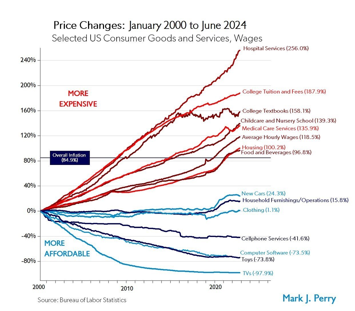
Today’s Chart of the Day from Mark Perry shows the price changes for various goods and services over the last 24 years, from January 2000 to June..

Securing a commercial real estate loan can be a pivotal step in expanding your business, investing in property, or achieving various financial..
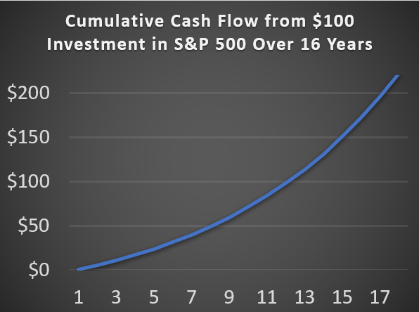
Today’s Chart of the Day is based on calculations I did from discussions with a client. It is important to remember, there are only two ways to get..
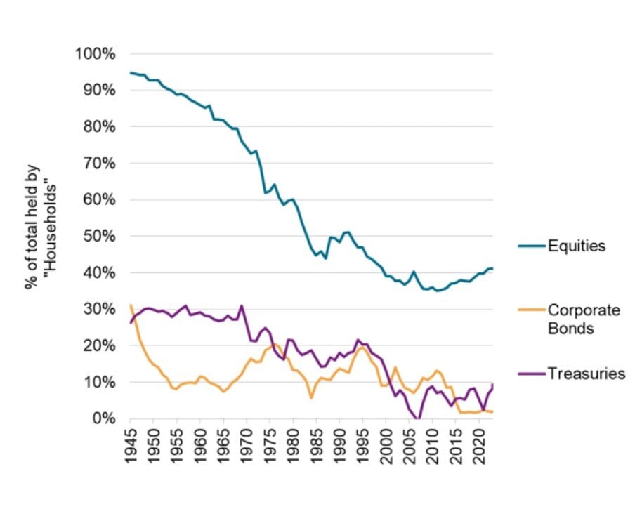
Today’s Chart of the Day from S&P Global shows the overall market share owned by individuals.
Today’s Chart of the Day from Apartment List shows the share of 25 to 35-year-olds living with their parents.
Today’s Chart of the Day is from a Financial Times article called “Past Performance is a Public Enemy” and includes a chart provided by Schroders.
Today’s Chart of the Day is from @Markets4mayhem on X and shows the fastest growing counties in the United States from 2020-2023, which equates 7.5%+ growth rates. Counties in Florida, Idaho, Texas, and Western Montana dominate the list.
In Florida, Southwest Florida, north of Tampa, and the I-4 corridor are all in green. Charlotte County went from 188,000 to 206,00, which was an increase of 18,000 people. Sarasota County went from 436,000 to 469,000, an increase of 33,000.
Estate planning is a crucial step in securing your financial future and ensuring that your wishes are carried out after you pass. Whether you’re beginning to think about your legacy or need to update an existing plan, understanding the basics of estate planning is essential. In this blog post, we'll explore the foundational elements of estate planning, what to expect during the process, and how Crews Bank & Trust can assist you at every step.
Today’s Chart of the Day from the Financial Times shows the growth of Bond ETFs from 2007 to present.
Today’s Chart of the Day from Vanguard shows the US debt as a percentage of GDP (Gross Domestic Product), which is a measure of all the goods and services generated by the United States.
You know your business needs money but what is the best option? Would a traditional business loan or a business line of credit be better for your situation?
Today’s Chart of the Day is from the 2024 State of the Nation's Housing Report from the Joint Center for Housing Studies at Harvard University.
Today’s Chart of the Day from Bank of America is more of a “buyer beware” to those oversaturated in AI. It's important to understand the risks that other new technology experienced.
Today’s Chart of the Day is from a Wall Street Journal article titled “Where Have All the Good Stocks Gone?” and shows the amount of investment funds from 1996 to 2022.
Mixed use properties are becoming increasingly popular, offering investors a versatile and strategic way to diversify their portfolios. These developments combine residential, commercial, and sometimes industrial spaces within a single property, creating vibrant, multi-functional environments that cater to a range of activities and lifestyles. As urban populations grow and the demand for integrated living and working spaces increases, the appeal of mixed use properties continues to soar.
Today’s Chart of the Day from Mark Perry shows the price changes for various goods and services over the last 24 years, from January 2000 to June 2024.
Securing a commercial real estate loan can be a pivotal step in expanding your business, investing in property, or achieving various financial objectives. However, the process can often be complex and overwhelming. Here are seven tips to help you navigate and secure a commercial real estate loan effectively.
Today’s Chart of the Day is based on calculations I did from discussions with a client. It is important to remember, there are only two ways to get your money back from an investment. The first is selling that investment to someone else and the second is receiving distributions in the form of dividends.
Today’s Chart of the Day from S&P Global shows the overall market share owned by individuals.
current_page_num+2: 8 -

