Chart of the Day: Real Estate Over Five Year Spans
Today’s Chart of the Day from ResiClub shows the average 5-year home price return has averaged 26% per state since 1975.
Learn about our Refer-a-Friend Program. Terms and conditions apply.
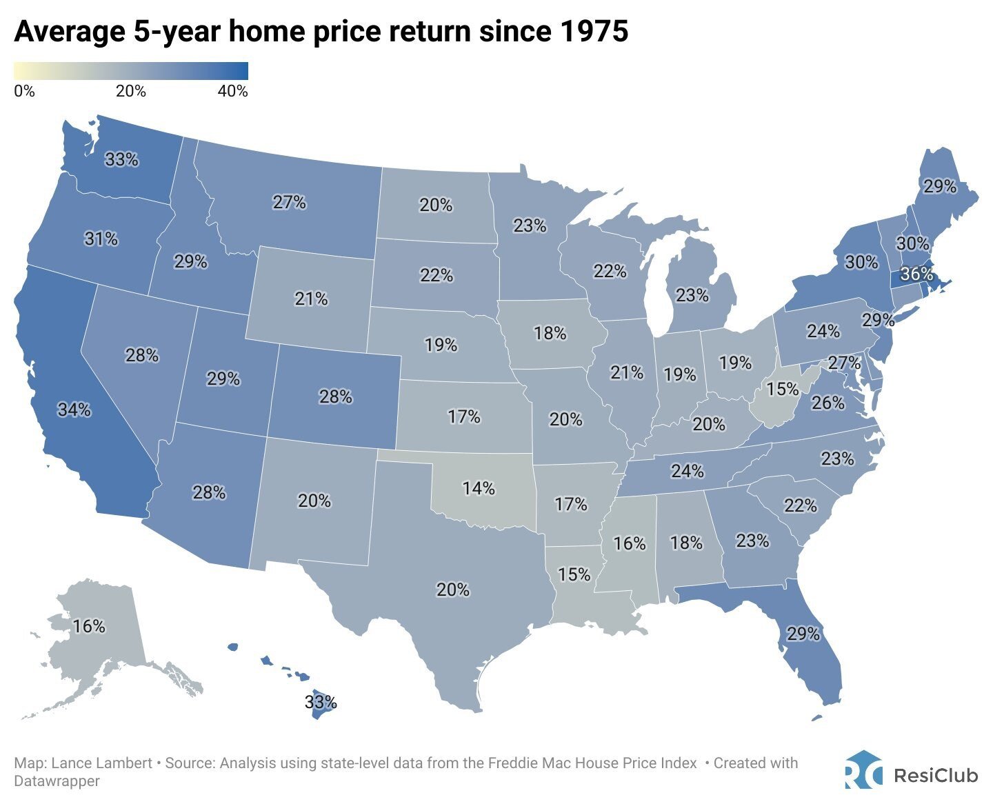
Today’s Chart of the Day from ResiClub shows the average 5-year home price return has averaged 26% per state since 1975.

Investing can be complex, but one principle that stands the test of time is diversification. Diversification involves spreading your investments..
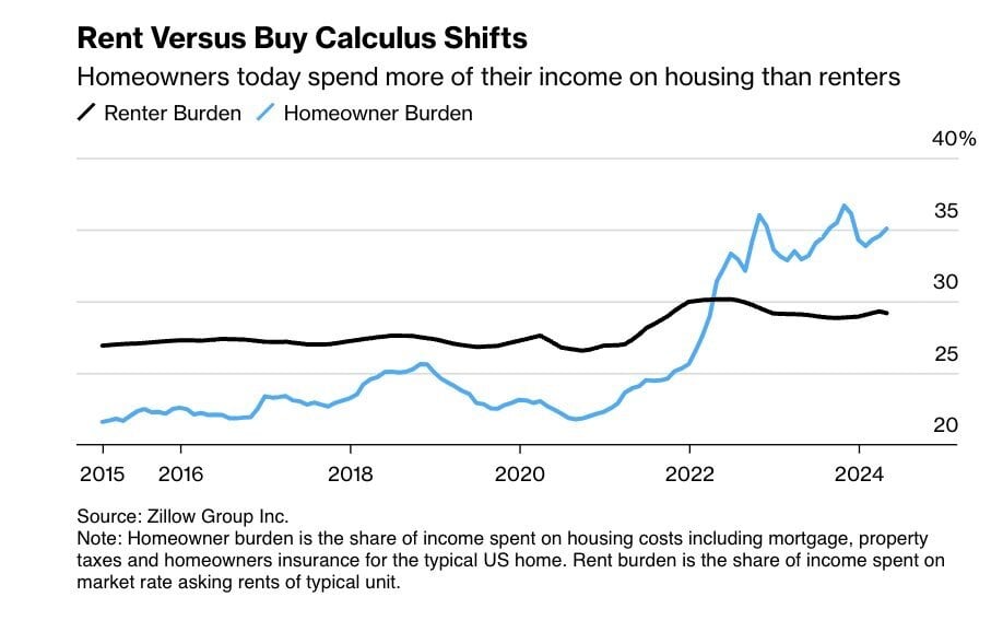
Today’s Chart is from Zillow showing that typically the share of income spent on housing costs for homeowners, such as mortgage, taxes, and..

As we all walk outside this month and think, “It is hot!", remember today’s Chart of the Day from the Statewide High Temperature Records set during..
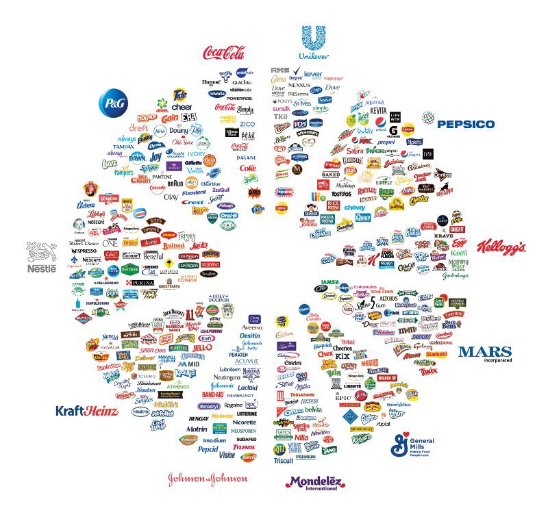
Today’s Chart of the Day is from Jon Erlichman and shows what I like to call the “Brand Wheel".
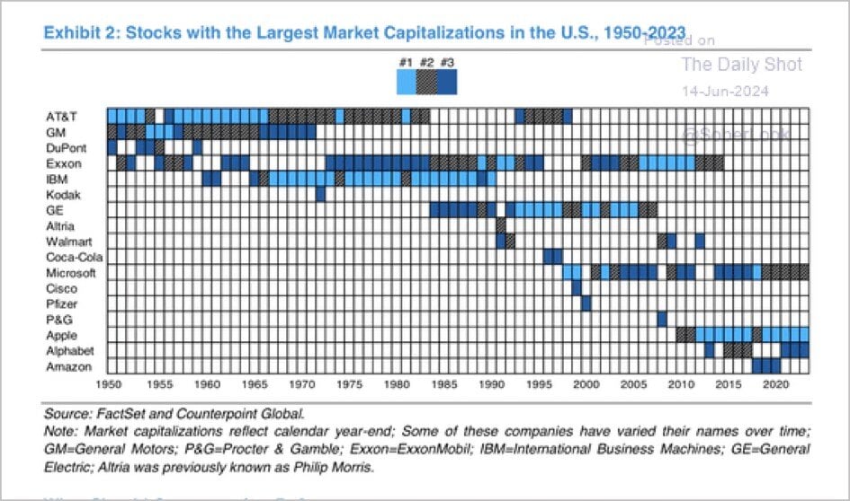
Today’s Chart of the Day is from Counterpoint Global with data from FactSet. It shows the top three largest US companies from 1950 to 2023. AT&T..

Buying your first home is both exciting and intimidating. It's likely the largest amount of money you've ever spent, and you want to ensure you know..

Today’s Chart of the Day is from the Financial Times and shows the number of annual hours worked, per worker, for select economies since 1974.

Owning a business is a significant achievement but with it comes the responsibility of planning for its future. Whether you intend to keep the..
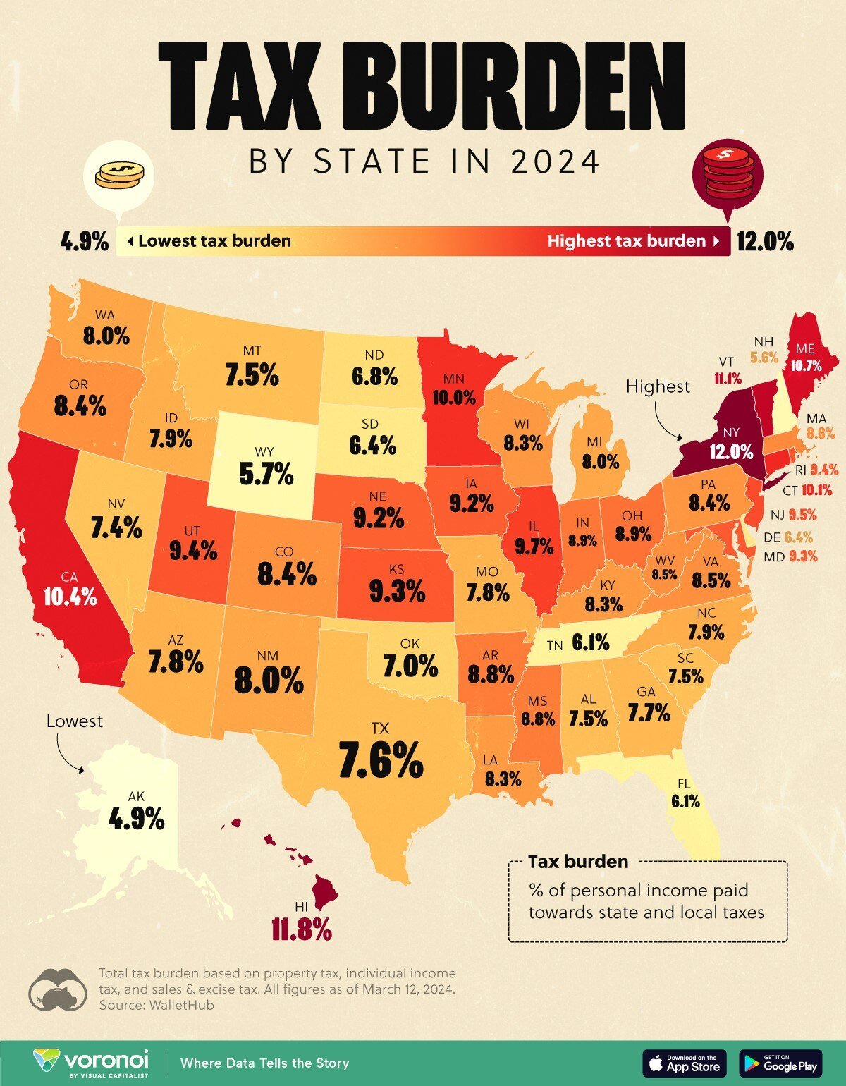
Today’s Chart of the Day is from Visualcapitalist.com and shows the percentage of personal income paid toward state and local taxes by state in 2024.

Summer is a great time to dedicate yourself to your interests. When you have free time, consider making an investment in your greatest asset:..
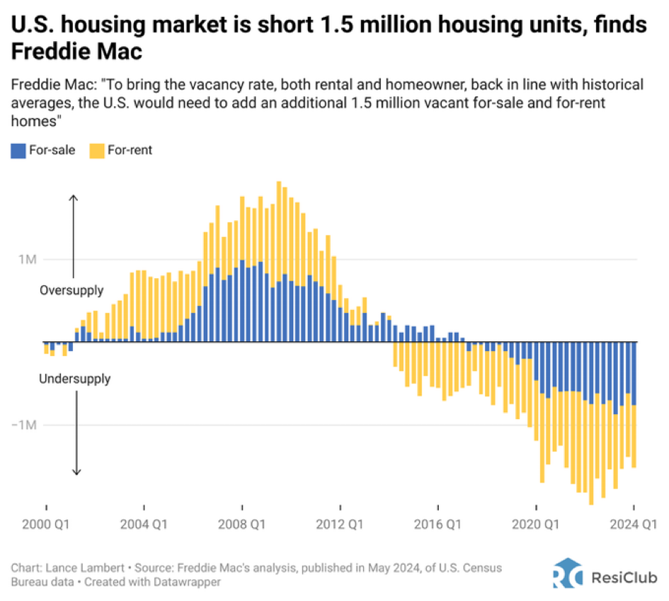
Today’s Chart of the Day from ResiClub shows that the US housing market is short 1.5 million housing units. As with all things, the causes, fixes,..

In the world of banking and finance, safety and security are paramount concerns for individuals and businesses alike. The Federal Deposit Insurance..
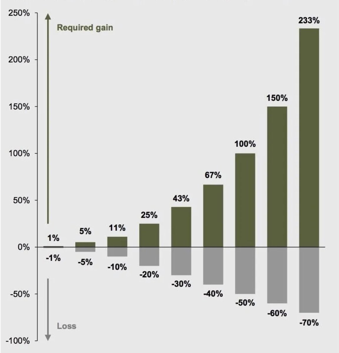
Today’s Chart of the Day is from Compounding Quality ( Compounding Quality (@QCompounding) / X) and shows the percentage gain needed to recover from..

Today’s Chart of the Day with data from the US Census Bureau compiled by Michael Arouet shows that 52% of the US population lives in seven “Mega..
Today’s Chart of the Day from ResiClub shows the average 5-year home price return has averaged 26% per state since 1975.
Investing can be complex, but one principle that stands the test of time is diversification. Diversification involves spreading your investments across various types of assets in different classes, industries, and geographies. It is so important that Nobel Prize laureate Harry Markowitz, who is the founder of the Modern Portfolio Theory published in 1952, once said, “Diversification is the only free lunch” in investing.
Today’s Chart is from Zillow showing that typically the share of income spent on housing costs for homeowners, such as mortgage, taxes, and insurance, has been lower than what renters pay for rental units.
As we all walk outside this month and think, “It is hot!", remember today’s Chart of the Day from the Statewide High Temperature Records set during the month of July. The mid- to early- 1930’s, which is noted in dark red and coincides with the Dust Bowl, was a particularly bad time for most states.
Today’s Chart of the Day is from Jon Erlichman and shows what I like to call the “Brand Wheel".
Today’s Chart of the Day is from Counterpoint Global with data from FactSet. It shows the top three largest US companies from 1950 to 2023. AT&T dominates the list until the early 1980’s but is now 45th. Exxon dominated from 1974 to 2014, but still holds on today at 11th. Microsoft began its run in 1997 and Apple in 2010. This highlights that “winners” don’t hold on forever, and the prudence to trim oversized positions to keep a portfolio balanced.
Buying your first home is both exciting and intimidating. It's likely the largest amount of money you've ever spent, and you want to ensure you know exactly what to expect. Understanding the process and having the right team to assist you will help you embark on this journey with confidence.
Today’s Chart of the Day is from the Financial Times and shows the number of annual hours worked, per worker, for select economies since 1974.
Owning a business is a significant achievement but with it comes the responsibility of planning for its future. Whether you intend to keep the business within your family, sell it, or ensure its smooth operation after you pass away, adequate planning is crucial. Careful estate planning can protect your business from unexpected tax liabilities and ensure its continuity according to your wishes.
Today’s Chart of the Day is from Visualcapitalist.com and shows the percentage of personal income paid toward state and local taxes by state in 2024.
Summer is a great time to dedicate yourself to your interests. When you have free time, consider making an investment in your greatest asset: yourself and your future! At Crews Bank and Trust, we're excited to help you on this journey with our 2024 Summer Seminars.
Today’s Chart of the Day from ResiClub shows that the US housing market is short 1.5 million housing units. As with all things, the causes, fixes, and effect on our economy are part of a long equation, much too long for this post.
In the world of banking and finance, safety and security are paramount concerns for individuals and businesses alike. The Federal Deposit Insurance Corporation (FDIC) has long provided peace of mind by insuring deposits up to $250,000 per depositor, per insured bank. However, what if you have more than $250,000 to protect? This is where the Insured Cash Sweep (ICS) program comes into play.
Today’s Chart of the Day with data from the US Census Bureau compiled by Michael Arouet shows that 52% of the US population lives in seven “Mega Regions” which are made up of only 15% of the total land in the US.
current_page_num+2: 10 -

