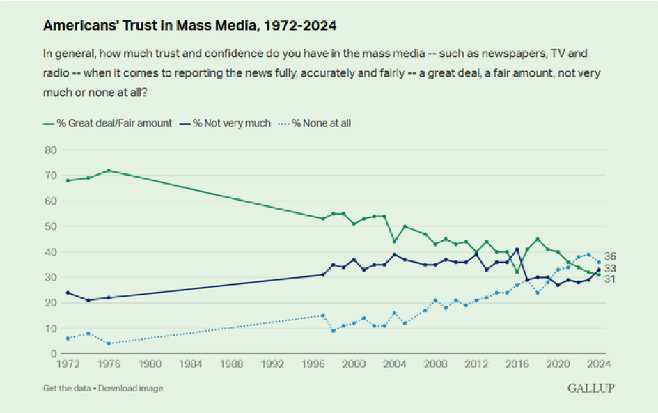
Skip to content

Live for today. Plan for tomorrow. Join us at an estate-planning seminar.

Get Started 863-222-7005

Blog

Your Weekly
Financial Forecast


Stay informed with sound financial know-how

Area chart showing the Tooth Fairy payouts from 2001 to 2025

Chart of the Day - Tooth Fairy Payout

Today’s Chart of the Day is from Delta Dental and shows the average Tooth Fairy payout per lost tooth since 2001. A tongue in cheek survey but also..

Read More

Curve shown in green and pink

Chart of the Day: Tax More/Less Get Less/More

Today’s Chart of the Day highlights The Laffer Curve, an economic theory created by Arthur Laffer in 1974. It proposes that there is a maximum amount..

Read More

Line graph showing Feb funds rate, 30-year mortgage rate and 10-year Treasury bond rates

Chart of the Day - Lower Rates Don't Always Means Lower Mortgage Rates

Today’s Chart of the Day was shared by my colleague, and fellow Portfolio Manger, Angie Parsons. It's a from Bloomberg article showing the changes in..

Read More

The average performance before, during and after a recession shown in pink, yellow and orange respectively. The performance after is much greater than during or before.

Chart of the Day: Positive Returns During Recessions

Today’s Chart of the Day and commentary is from Angie Parsons, my colleague and fellow Portfolio Manager. The chart from BlackRock shows stock..

Read More

Chart illustrating Total Risk, with unsystematic risk noted in light blue and systematic risk in darker blue.

Chart of the Day: More Investments = Less Risk (To a Point)

Today’s Chart of the Day spotlights an important investment concept which was pioneered by Harry Markowitz, a Nobel Prize winner and pioneer of the..

Read More

black bar chart

Chart of the Day: Work from Home Figures Sticky at 30%

Today’s Chart of the Day from Wolfstreet shows that Work from Home, a.k.a. WFH, is getting “sticky” at 30% after peaking at 60% during the pandemic.

Read More

Line graph illustrating the median age of homebuyers from 1981 to 2024

Chart of Day - Median Age of Homebuyers

Today’s Chart of the Day uses data from the National Association of Realtors compiled by Torsten Sølk with Apollo, showing the history of the median..

Read More

 Map of US with orange highlights from light to dark with the darker the shade indicates the higher number of insurance non-renewals. Map of the US with blue highlights from light to dark illustrating the 3-year insurance premium change with the darker the shade indicating the higher the increase.

Chart of the Day: Higher Homeowner Insurance

Today’s two charts illustrate that Florida continues to struggle with increasingly more expensive homeowners' insurance.

Read More

Bar graph illustrating cash vs 60/40 portfolio results over 1, 2, 5, 10, 15 and 20 years. Red bars indicate the percentage of time the 60/40 outperformed cash, while black bars show the percentage of time that cash underperformed during that same time period.

Chart of the Day: Cash Can Cost

Today's Chart of the Day, from BlackRock, illustrates the potential downside of staying in cash for too long. It highlights the excess returns of a..

Read More

bar chart in amazon blue showing growth of use over time

Chart of the Day: 75% Use Prime

Today’s Chart of the Day from Chartr shows that over 75% of American’s are using Amazon Prime as of 2024. Amazon is now the 4th largest company in..

Read More

Graph showing the happiness level of Olympic bronze (red) and silver medalists (yellow) on a scale of 1 (lowest) to 10 (highest)

Chart of the Day: Bronze Happier Than Silver

Today’s Chart of the Day has data from the Journal of Personality and Social Psychology used by our partners at BlackRock (the company that owns..

Read More

percentage of assets shown in blue, percentage of funds in orange

Chart of the Day: Fees go on Forever

Today’s Chart of the Day from Bloomberg shows the percentage of assets and revenue by ETFs (Exchange Traded Funds), which we use extensively in..

Read More

Yellow bar graph by year, from 2020 to 2024, comparing the history of stockholder returns (black line) for Big Oil

Chart of the Day: The Value Stocks of Big Oil

Today’s Chart of the Day, shared by my colleague Angie Parsons, is from an article in Bloomberg which illustrates what a “value” stock is.

Read More

red line chart showing the stark rise in sports betting since 2018

Chart of the Day: Online Sports Betting

As we near the Super Bowl, today’s Chart of the Day is from Chartr and shows the boom in online monthly sports betting.

Read More

Three charts showing returns

Chart of the Day: Return Distributions

Today’s Chart of the Day from Vanguard shows the distribution of returns from 1928 to 2024, for stocks, bonds, and a combined 60% stock/40% bond..

Read More

On Our Minds

List Grid
Browse by topic

Chart of the Day - Tooth Fairy Payout

Today’s Chart of the Day is from Delta Dental and shows the average Tooth Fairy payout per lost tooth since 2001. A tongue in cheek survey but also used by some as a gauge for the state of the economy and inflation.  

More

Chart of the Day: Tax More/Less Get Less/More

Today’s Chart of the Day highlights The Laffer Curve, an economic theory created by Arthur Laffer in 1974. It proposes that there is a maximum amount that tax rates can reach before tax revenues start to decline.

More

Chart of the Day - Lower Rates Don't Always Means Lower Mortgage Rates

Today’s Chart of the Day was shared by my colleague, and fellow Portfolio Manger, Angie Parsons. It's a from Bloomberg article showing the changes in the short-term Fed funds rate, 30-year mortgage rates and 10-year Treasury rates since August 2024.

More

Chart of the Day: Positive Returns During Recessions

Today’s Chart of the Day and commentary is from Angie Parsons, my colleague and fellow Portfolio Manager. 

The chart from BlackRock shows stock returns during recessions dating back to 1929. Surprisingly, the average return is positive and increases to 25% the next year afterwards. This highlights that although market downturns sometimes coincide with recessions, the stock market is not a good indicator of the current state of the economy. The reason is the stock market often looks past the short-term and instead looks well into the future. Therefore, more often than not, the stock market recovers faster than the economy.

More

Chart of the Day: More Investments = Less Risk (To a Point)

Today’s Chart of the Day spotlights an important investment concept which was pioneered by Harry Markowitz, a Nobel Prize winner and pioneer of the Modern Portfolio Theory in 1952. 

More

Chart of the Day: Work from Home Figures Sticky at 30%

Today’s Chart of the Day from Wolfstreet shows that Work from Home, a.k.a. WFH, is getting “sticky” at 30% after peaking at 60% during the pandemic.

More

Chart of Day - Median Age of Homebuyers

Today’s Chart of the Day uses data from the National Association of Realtors compiled by Torsten Sølk with Apollo, showing the history of the median age of all homebuyers. In 1981 the median age was 31 and in 2024 it peaked to a high of 56. 

More

Chart of the Day: Higher Homeowner Insurance

Today’s two charts illustrate that Florida continues to struggle with increasingly more expensive homeowners' insurance.

More

Chart of the Day: Cash Can Cost

Today's Chart of the Day, from BlackRock, illustrates the potential downside of staying in cash for too long. It highlights the excess returns of a 60% stock/40% bond portfolio compared to cash since 1926. The top bars (red) show these returns; for instance, a 10-year holding period yields returns 100% higher than cash.

The black boxes below show the percentage of time cash underperforms; for 10 years, that is 91% of the time.

This highlights the old adage, "It’s not about timing the market, but time in the market." If you have funds that you will not need for more than 10+ years, historically, stocks have been your best bet.

More

Chart of the Day: 75% Use Prime

Today’s Chart of the Day from Chartr shows that over 75% of American’s are using Amazon Prime as of 2024. Amazon is now the 4th largest company in the United States and has an annual return of 27% a year vs. 15% for the S&P 500 over the same time frame.

More

Chart of the Day: Bronze Happier Than Silver

Today’s Chart of the Day has data from the Journal of Personality and Social Psychology used by our partners at BlackRock (the company that owns iShares) for a presentation they recently provided to our clients.

More

Chart of the Day: Fees go on Forever

Today’s Chart of the Day from Bloomberg shows the percentage of assets and revenue by ETFs (Exchange Traded Funds), which we use extensively in portfolios.

More

Chart of the Day: The Value Stocks of Big Oil

Today’s Chart of the Day, shared by my colleague Angie Parsons, is from an article in Bloomberg which illustrates what a “value” stock is.

More

Chart of the Day: Online Sports Betting

As we near the Super Bowl, today’s Chart of the Day is from Chartr and shows the boom in online monthly sports betting.

More

Chart of the Day: Return Distributions

Today’s Chart of the Day from Vanguard shows the distribution of returns from 1928 to 2024, for stocks, bonds, and a combined 60% stock/40% bond portfolio. It also shows where we have ended up in the last four years.

More