Chart of the Day: Record Car Prices
Today’s Chart of the Day is from a CNBC article titled, “With just 8% of new vehicles costing under $30,000, ‘it’s the least affordable car market in modern history,' expert says.”
Learn about our Refer-a-Friend Program. Terms and conditions apply.
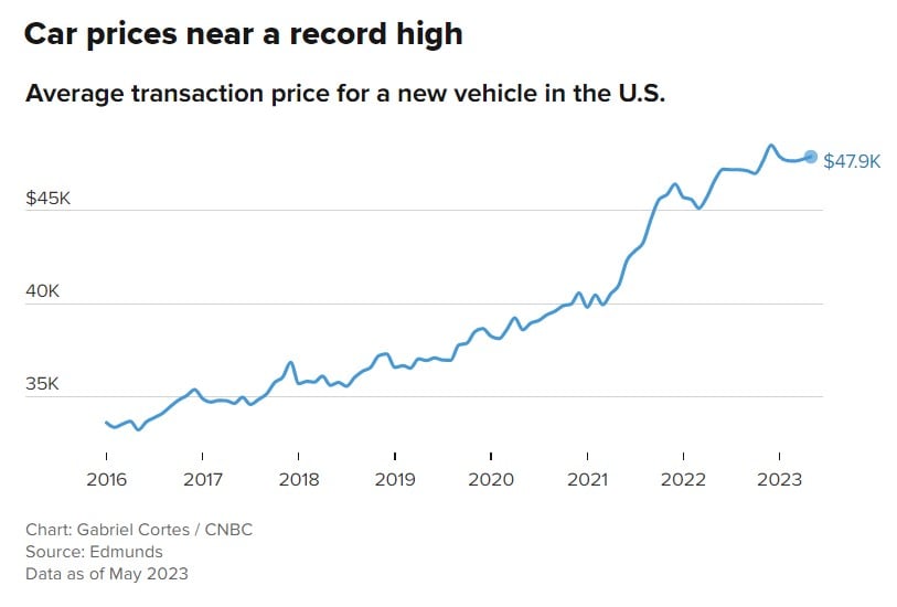
Today’s Chart of the Day is from a CNBC article titled, “With just 8% of new vehicles costing under $30,000, ‘it’s the least affordable car market in..
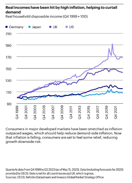
Today’s Chart of the Day from Invesco’s mid-year outlook shows that high inflation is reducing household disposable income. A closer look shows..
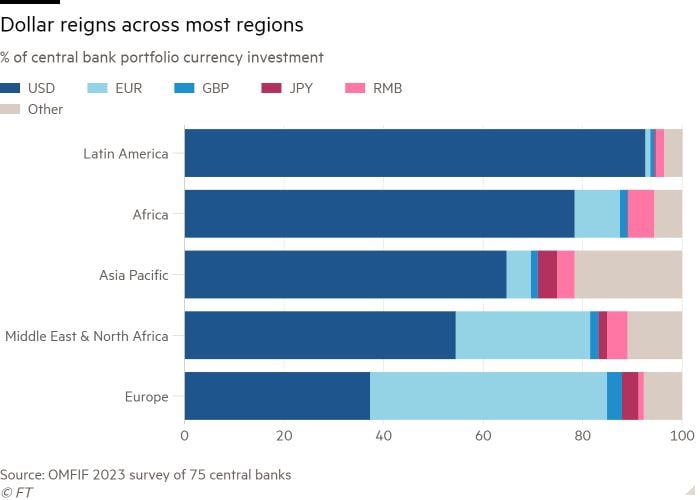
Today’s Chart of the Day comes from the Financial Times and shows the dominance of the US dollar in central bank reserves globally, represented in..
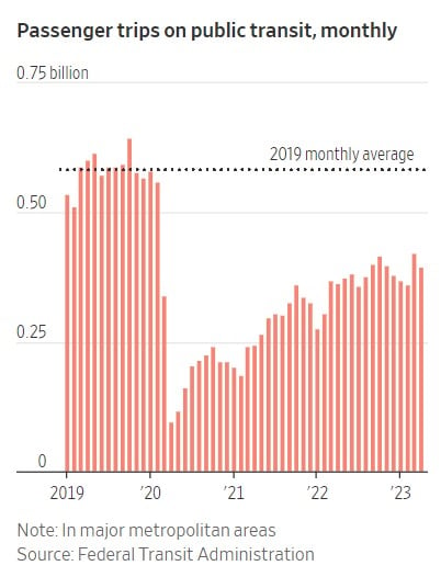
Today’s Chart of the Day is from the Wall Street Journal. Some things have not gone back to “pre-pandemic” days. One is the percentage of those who..
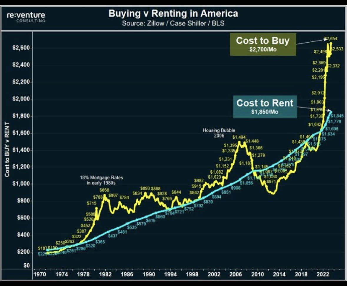
Today’s Chart of the Day comes from re:venture in a discussion on Reddit. It's important to remember that the monthly cost to buy (yellow) is usually..
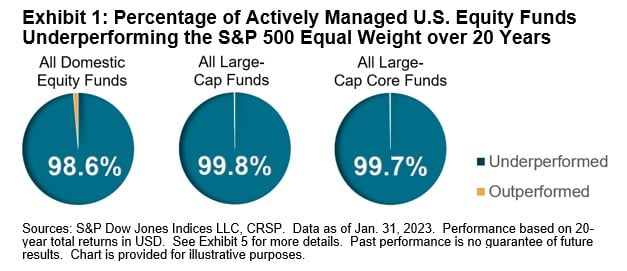
Today’s Chart of the Day is from S&P Global. If you follow my posts, you will not be surprised that over the last 20 years the S&P 500 index, where..
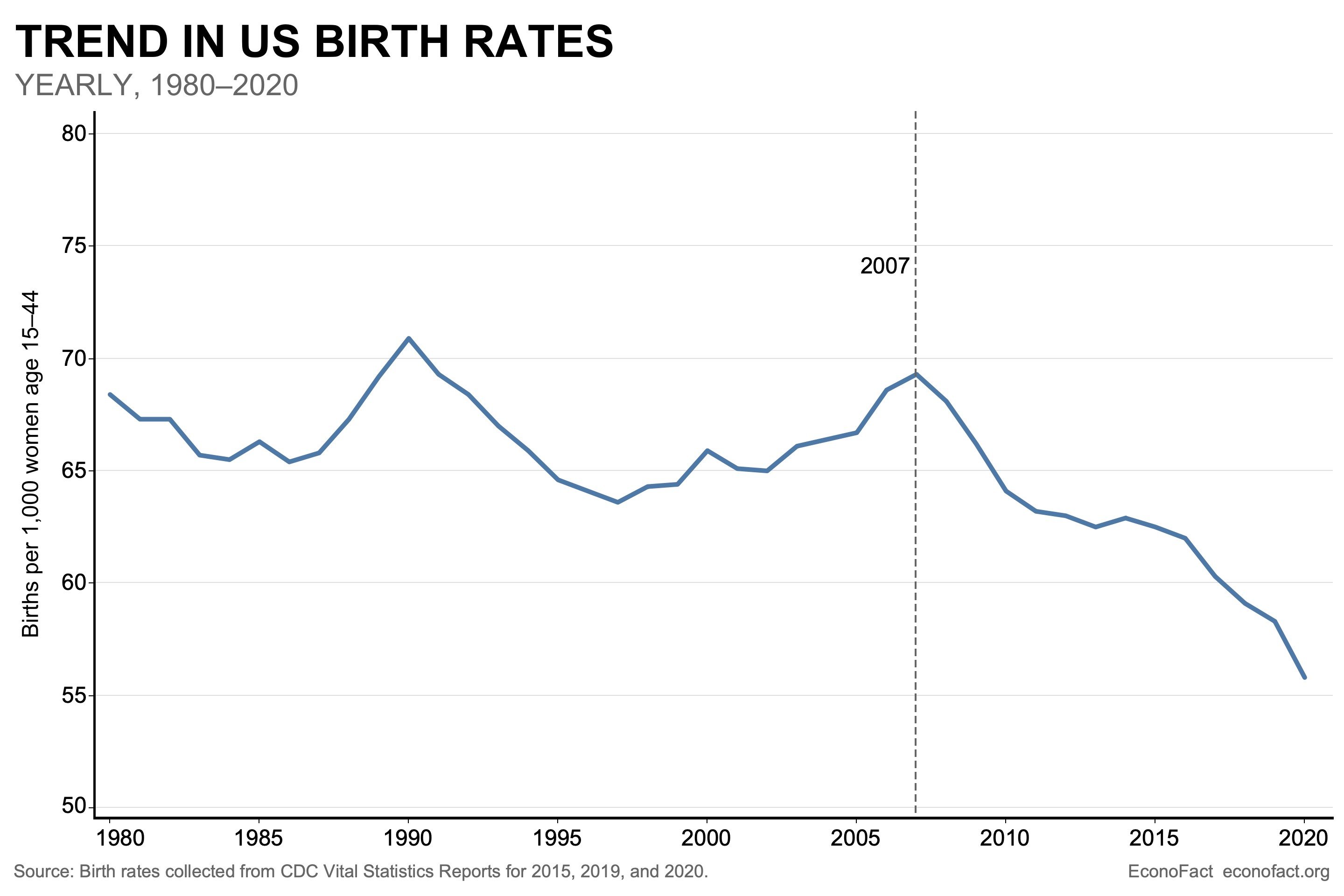
Today’s Chart of the Day from Econofact.org shows the trend in US birth rates which peaked in 2007 and is now 20% less.
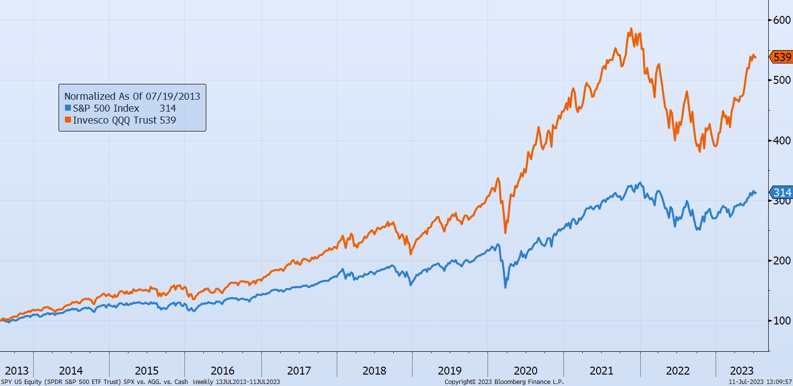
Today’s Chart of the Day is a comment about a unique risk that can occur in successful index funds. For instance, we often hear about what many call..
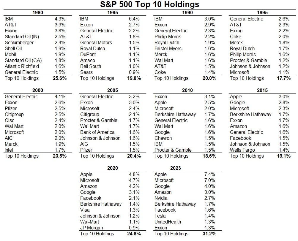
Today’s Chart of the Day comes from A Wealth of Common Sense and shows the top 10 companies in the stock market going back to 1980.
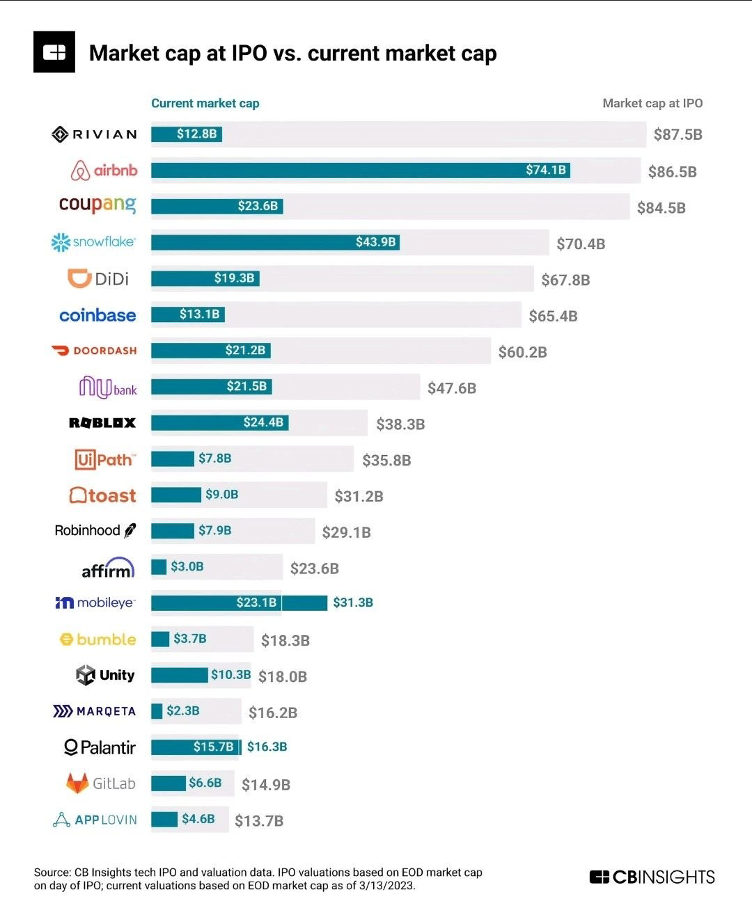
Today’s Chart of the Day comes from @QCompounding on Twitter and shows the value of some well-known companies now vs. when they became publicly owned.
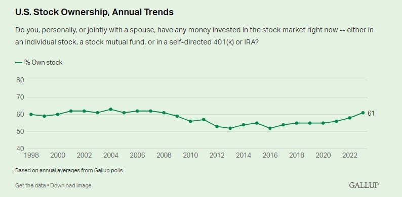
Today’s Chart of the Day from an article called “Best Time to Buy Stocks” shows the percentage of households that own stocks of any form. Besides a..
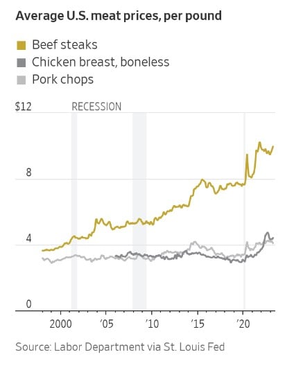
Today’s Chart of the Day from the Wall Street Journal shows that you aren’t imagining that beef prices have gone up. Beef prices have increased..
Today’s Chart of the Day from @CharlieBiello on Twitter shows the annual change in credit card balances dating back to 2000. The latest data shows a..
Today’s Chart of the Day comes from Craig Lazzara's article “Persistently Disappointing.” It asks if top fund managers outperform due to skill or..
Today’s Chart of the Day comes from A Wealth of Common Sense showing the range of annual returns over the last 95 years. The long-term average is 10%..
Today’s Chart of the Day is from a CNBC article titled, “With just 8% of new vehicles costing under $30,000, ‘it’s the least affordable car market in modern history,' expert says.”
Today’s Chart of the Day from Invesco’s mid-year outlook shows that high inflation is reducing household disposable income. A closer look shows another interesting note: $100 worth of income in the United States in 1999 is now $170 in 2022, an impressive 70% increase.
Today’s Chart of the Day comes from the Financial Times and shows the dominance of the US dollar in central bank reserves globally, represented in dark blue.
Today’s Chart of the Day is from the Wall Street Journal. Some things have not gone back to “pre-pandemic” days. One is the percentage of those who continue to work from home.
Today’s Chart of the Day comes from re:venture in a discussion on Reddit. It's important to remember that the monthly cost to buy (yellow) is usually more than the cost to rent (blue), but a large difference between the two is not sustainable.
Today’s Chart of the Day is from S&P Global. If you follow my posts, you will not be surprised that over the last 20 years the S&P 500 index, where larger companies make up more of the index than smaller ones, beat actively managed funds an incredible 92.4% of the time. That is a high bar to beat.
Today’s Chart of the Day from Econofact.org shows the trend in US birth rates which peaked in 2007 and is now 20% less.
Today’s Chart of the Day is a comment about a unique risk that can occur in successful index funds. For instance, we often hear about what many call the “Tech-Heavy NASDAQ” which refers to the Invesco QQQ Trust Exchange Traded Fund (ETF), the 5th largest exchange-traded fund in the US.
Today’s Chart of the Day comes from A Wealth of Common Sense and shows the top 10 companies in the stock market going back to 1980.
Today’s Chart of the Day comes from @QCompounding on Twitter and shows the value of some well-known companies now vs. when they became publicly owned.
Today’s Chart of the Day from an article called “Best Time to Buy Stocks” shows the percentage of households that own stocks of any form. Besides a slight decline after the Great Recession, the percentage has held steady between 50%-60% of the US population and currently stands at 61%.
Today’s Chart of the Day from the Wall Street Journal shows that you aren’t imagining that beef prices have gone up. Beef prices have increased significantly versus chicken and pork since the pandemic.
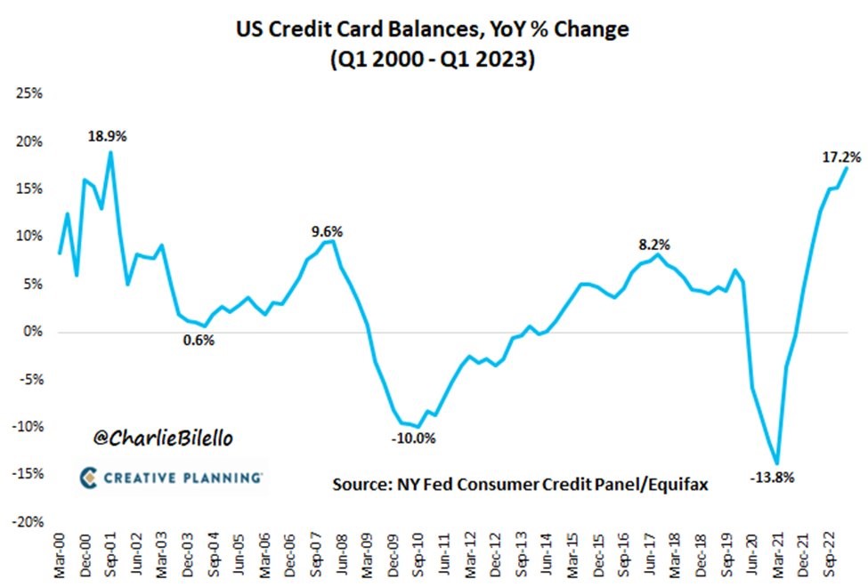
Today’s Chart of the Day from @CharlieBiello on Twitter shows the annual change in credit card balances dating back to 2000. The latest data shows a 17.2% increase, nearing the record set in 2001 at 18.9%. This is another unintended consequence of the COVID-19 pandemic response.
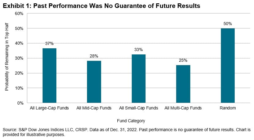
Today’s Chart of the Day comes from Craig Lazzara's article “Persistently Disappointing.” It asks if top fund managers outperform due to skill or good luck. In EVERY fund category and over EVERY time frame, it was found to simply be good luck.
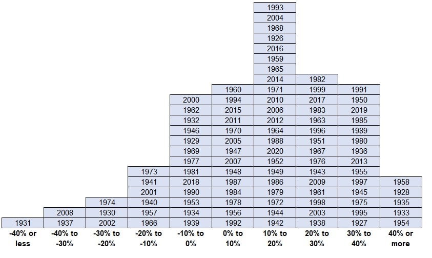
Today’s Chart of the Day comes from A Wealth of Common Sense showing the range of annual returns over the last 95 years. The long-term average is 10% over the entire period.
current_page_num+2: 14 -

