Skip to content
Get Started 863-222-7005

Blog

Your Weekly
Financial Forecast


Stay informed with sound financial know-how

chart showing car prices going down

Car Prices Are Falling

Today’s Chart of the Day is from S&P Dow Jones Indices. Year-to-date, the S&P Composite 1500® Automobiles is down 43%, and is the

Read More

infographic includes comic strip that explains the fence paradox

The Fence Paradox

Today’s Chart of the Day is an infographic from Pasquale Cirillo, @DrCirillo on Twitter. We see this often when investors say, “They wouldn’t be..

Read More

during this time the cumulative return has been an incredible 18,750%, which works out to an annual return of 10.4%

That's a lot of Down Time

Today’s chart comes from Wealthmanagement.com. It shows the drawdowns, which is the percent the market is down from the previous record high, going..

Read More

chart shows the cumulative returns based on 1, 5, 10, and 20 years for all stocks (in green), all bonds (in blue), and a 50/50 mix (in grey) since 1950

Longer Equals Higher Probability

Today’s chart from JP Morgan Asset Management’s Guide to the Markets quarterly presentation shows the cumulative returns based on 1, 5, 10, and 20..

Read More

the yield went from 1.50% to the current 4.00%, which equates to a 166% increase, causing the price to fall an incredible 20%

Worst Since 1788

Today's chart comes from Bank of America’s Global Investment Strategy team. We have all heard that this was a bad year for longer term bonds, but how..

Read More

chart shows that $100 invested 30 years ago is still worth only $100 today

China's Lost 30 Years

Today's chart from Refinitive shows that over the last 30 years, China has delivered a cumulative return of zero dollars, meaning $100 invested 30..

Read More

computer with crypto symbols

Crypto / FTX Bankruptcy

Today we’re taking a quick side note away from the Chart of the Day to make a couple of comments on cryptocurrencies and FTX’s bankruptcy. FTX is a..

Read More

US dollar went from $1.00 to only worth $0.04 and that the value of gold only went up to $4.06

Stocks for The Long Run

This chart shows the value of $1 going all the way back to 1802 and was previously shared as a Chart of the Day. However, I'd like to share it once..

Read More

 Long-term Treasury Bonds noted in orange from 2014 - 2022

The Trouble with Treasuries

It’s been a challenging few years for Long-Term Treasury Bonds, which are defined as bonds that have maturities of 20+ years and are noted in orange..

Read More

Chart shows the growth of total index assets and cumulative savings from 1996 - 2021 index funds

Why Pay More and Earn Less?

Today’s Chart of the Day comes from S&P Dow Jones Indices and shows the cumulative savings from using index funds vs. actively managed funds, as well..

Read More

The rate of 6.81%, previously reached in 2006, and the low of 2.90%, reached two years ago in December 2020, are displayed.

Elevated Premiums in Mortgages

The history of the Mortgage Banker’s 30-Year Home Rate, in blue, going all the way back to when they started the index in 1990 is displayed in..

Read More

United States equivalent investment grade bond index in the US is down 20%, the iBoxx GPB (which stands for the Great Britain Pound) bond index is down 28%

Bondmaggeddon

The Chart of the Day is from S&P Global. As eternal optimists, which has worked for our clients over the last 20+ years, we like to say, “It could..

Read More

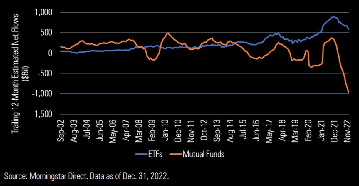
Chart shows so far this year, this is the first time ever the total amount of investments in stocks and bonds shrank.

The Ebb and Flow

The following Chart of the Day from State Street Global Advisors shows the flow of funds in investments going all the way back to 2001.

Read More

chart shows a 10.4% return with a unified government and 10.8% with a split congress.

Washington Makeup

Today's Chart of the Day is a second chart from the Capital Group article called “Can midterm elections move markets?”

Read More

 Chart shows the number of seats in congress gained or lost by the president's party in mid-term election from 1934 to 2018

Midterm Swings

Today’s Chart of the Day comes from a Capital Group article called “Can midterm elections move markets?”

Read More

On Our Minds

List Grid
Browse by topic

Car Prices Are Falling

Today’s Chart of the Day is from S&P Dow Jones Indices.

Year-to-date, the S&P Composite 1500® Automobiles is down 43%, and is the

More

The Fence Paradox

Today’s Chart of the Day is an infographic from Pasquale Cirillo, @DrCirillo on Twitter. We see this often when investors say, “They wouldn’t be allowed to sell this, if it wasn’t safe.” Yes, there needs to be fences, but don’t let their security lull you into forgetting the risks on the other side.

More

That's a lot of Down Time

Today’s chart comes from Wealthmanagement.com. It shows the drawdowns, which is the percent the market is down from the previous record high, going back to 1970. As you would expect, the chart shows most the time the market is “down” and investors spend a lot of time having “lost” money.

More

Longer Equals Higher Probability

Today’s chart from JP Morgan Asset Management’s Guide to the Markets quarterly presentation shows the cumulative returns based on 1, 5, 10, and 20 years for all stocks (in green), all bonds (in blue), and a 50/50 mix (in grey) since 1950.

Essentially, the longer you hold your investments, the higher probability you have of positive returns. In fact, there was never a period over 20 years that any of the options lost money.

The chart also shows the average annual total return for stocks was an impressive 11.5% during last 20 years. It will be interesting to see how the next 20 years look.

More

Worst Since 1788

Today's chart comes from Bank of America’s Global Investment Strategy team. We have all heard that this was a bad year for longer term bonds, but how bad? Well, for the 10-year treasury this is the worst year since 1788, so basically the worst year ever.

The reason is, since the beginning of this year, the yield went from 1.50% to the current 4.00%, which equates to a 166% increase, causing the price to fall an incredible 20%.

More

China's Lost 30 Years

Today's chart from Refinitive shows that over the last 30 years, China has delivered a cumulative return of zero dollars, meaning $100 invested 30 years ago is still worth only $100 today.

More

Crypto / FTX Bankruptcy

Today we’re taking a quick side note away from the Chart of the Day to make a couple of comments on cryptocurrencies and FTX’s bankruptcy. FTX is a popular online cryptocurrency exchange, and its bankruptcy may turn out to be the biggest in history.

More

Stocks for The Long Run

This chart shows the value of $1 going all the way back to 1802 and was previously shared as a Chart of the Day. However, I'd like to share it once again as the figures were updated to include data from 2021. The chart was created by Jeremy Seigel in his book called “Stocks for the Long Run” published in 2014.

More

The Trouble with Treasuries

It’s been a challenging few years for Long-Term Treasury Bonds, which are defined as bonds that have maturities of 20+ years and are noted in orange on today's Chart of the Day. Since 2020, they have lost 42% of their value, erasing all the accumulated value for the last six years.

More

Why Pay More and Earn Less?

Today’s Chart of the Day comes from S&P Dow Jones Indices and shows the cumulative savings from using index funds vs. actively managed funds, as well as the growth of indexed funds since 1996.

Index funds have reached a staggering $7 trillion in total assets. Since active funds costs more vs. indexed funds, investors have saved an equally impressive $400 billon in fees, which is more than the entire market value of Wal-Mart.

The reason for growth in index funds? Since S&P started keeping score 20 years ago, only a paltry 6% of active funds have outperformed them.

As you can see in the chart, more and more are starting to say, “Why pay more and earn less?” and moving their investments accordingly.

More

Elevated Premiums in Mortgages

The history of the Mortgage Banker’s 30-Year Home Rate, in blue, going all the way back to when they started the index in 1990 is displayed in today's Chart of the Day.  

More

Bondmaggeddon

The Chart of the Day is from S&P Global. As eternal optimists, which has worked for our clients over the last 20+ years, we like to say, “It could always be worse.” Though the United States equivalent investment grade bond index in the US is down 20%, the iBoxx GPB (which stands for the Great Britain Pound) bond index is down 28%, which is the worst in 25 years.

They are calling it “the Bondmaggeddon.”

Though we may have some of these US equivalent bond ETFs in the portfolio we manage, they are more than offset by many shorter-term bonds, which in most cases have resulted in a total loss of only 6%. Still not great, but it could have been worse.

More

The Ebb and Flow

The following Chart of the Day from State Street Global Advisors shows the flow of funds in investments going all the way back to 2001.

More

Washington Makeup

Today's Chart of the Day is a second chart from the Capital Group article called “Can midterm elections move markets?

More

Midterm Swings

Today’s Chart of the Day comes from a Capital Group article called “Can midterm elections move markets?

More