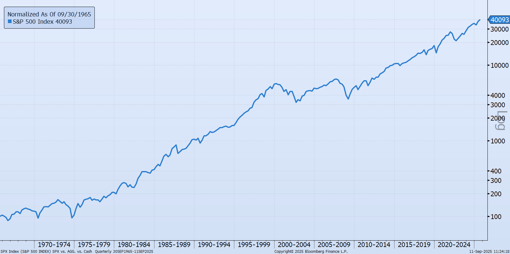
Chart of the Day: Fees go on Forever
Today’s Chart of the Day from Bloomberg shows the percentage of assets and revenue by ETFs (Exchange Traded Funds), which we use extensively in portfolios.
Learn how your business can efficiently manage diverse payment needs and get insight into transactions and balances with Crews Treasury Pro. Easy to-use tools put you in control.
Today’s Chart of the Day from Bloomberg shows the percentage of assets and revenue by ETFs (Exchange Traded Funds), which we use extensively in..
Today’s Chart of the Day, shared by my colleague Angie Parsons, is from an article in Bloomberg which illustrates what a “value” stock is.
As we near the Super Bowl, today’s Chart of the Day is from Chartr and shows the boom in online monthly sports betting.
Today’s Chart of the Day from Vanguard shows the distribution of returns from 1928 to 2024, for stocks, bonds, and a combined 60% stock/40% bond..
Today’s Chart of the Day is a little different than others, but one to think about. It’s from the book Atomic Habits by James Clear written in 2018.
Today’s Chart of the Day, from OfDollarsndData, shows the Shiller inflation-adjusted value for US housing since 1890 and is the longest historical..
Today’s Chart of the Day comes from Bank of America and shows the price of diamonds going back 22 years. After spiking in 2022, diamond prices are..
Today’s Chart of the Day is from Visual Capitalist, looking at the $115 trillion world economy in 2025, broken down by county.
Today’s Chart of the Day comes from Visual Capitalist showing the annual production per person of America’s richest states vs. the rest of the G7..
Today’s Chart of the Day is from Brian Feroldi and talks about the Five Types of Moats.
Today’s Chart of the Day from Nuveen shows that in all the recessions going back to 1953, on average, stocks hit their bottom six months into a..
Today’s Chart of the Day from a Morningstar article about “Buffer” ETFs (aka exchange-traded funds), shows the distribution of returns for rolling..
Today's Chart of the Day, from Our World in Data, shows how the world has improved per 100 people since 1820.
Today’s Chart of the Day is from a Morningstar article named, “Why Investors Missed Out on 15% of Total Funds Returns.” They call it the “gap,” which..
Today’s Chart of the Day is data from Case-Shiller Adjusted Home Price, charted by Mish.
Today’s Chart of the Day from Bloomberg shows the percentage of assets and revenue by ETFs (Exchange Traded Funds), which we use extensively in portfolios.
Today’s Chart of the Day, shared by my colleague Angie Parsons, is from an article in Bloomberg which illustrates what a “value” stock is.
As we near the Super Bowl, today’s Chart of the Day is from Chartr and shows the boom in online monthly sports betting.
Today’s Chart of the Day from Vanguard shows the distribution of returns from 1928 to 2024, for stocks, bonds, and a combined 60% stock/40% bond portfolio. It also shows where we have ended up in the last four years.
Today’s Chart of the Day is a little different than others, but one to think about. It’s from the book Atomic Habits by James Clear written in 2018.
Today’s Chart of the Day comes from Visual Capitalist showing the annual production per person of America’s richest states vs. the rest of the G7 Countries, a group of the seven most industrialized counties in the world.
Today’s Chart of the Day from Nuveen shows that in all the recessions going back to 1953, on average, stocks hit their bottom six months into a recession and broke even again in eight months. It’s been so long, we often forget the pain we feel in a severely depressed market, but they are relatively short lived.
Today’s Chart of the Day from a Morningstar article about “Buffer” ETFs (aka exchange-traded funds), shows the distribution of returns for rolling 12-month periods for the stock market.
Today's Chart of the Day, from Our World in Data, shows how the world has improved per 100 people since 1820.
Today’s Chart of the Day is from a Morningstar article named, “Why Investors Missed Out on 15% of Total Funds Returns.” They call it the “gap,” which is comprised of losses experienced by typical investors from excess trading, buying high-flying funds and conversely, selling low-flying ones.
Today’s Chart of the Day is data from Case-Shiller Adjusted Home Price, charted by Mish.
current_page_num+2: 7 -