
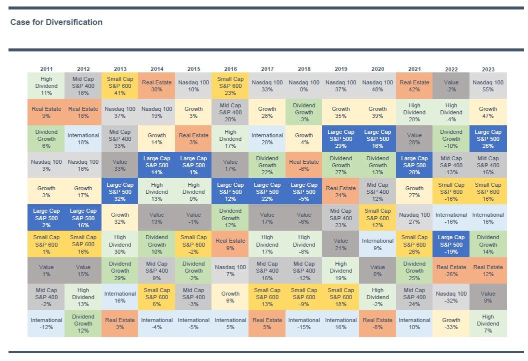
Factors Over Time
Today’s Chart of the Day is a perennial favorite for some clients and shows the annual stock market performance of several factors. "Factors" is the..
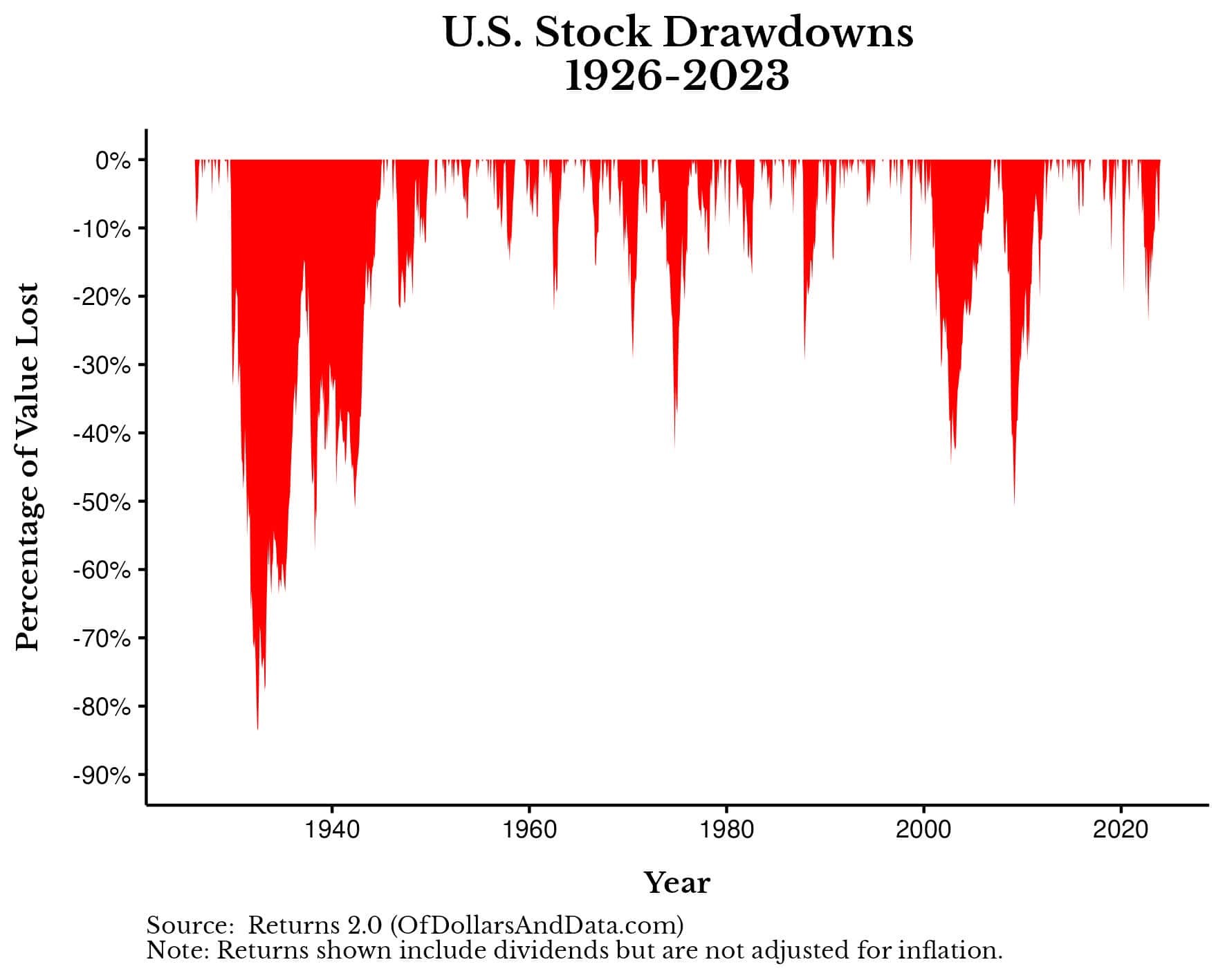
Down Most of the Time
Today’s Chart of the Day is from OfDollarsAndData and shows when the market is “down” after its last record high.

Chart of the Day: Red vs. Grey
Today’s Chart of the Day from Exploredplanet.com shows population density through red and grey areas. When combined, the red areas have a larger..
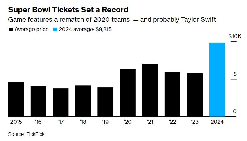
Chart of the Day: Record Super Bowl Tickets
Today’s Chart of the Day from Bloomberg.com shows that ticket prices for Super Bowl LVIII are reaching a record-breaking average of $9,815 each.
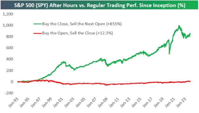
Chart of the Day: After Hours
Today’s Chart of the Day comes from Bespoke Investment Group showing stock market returns since 1993. The green line shows the returns if you only..
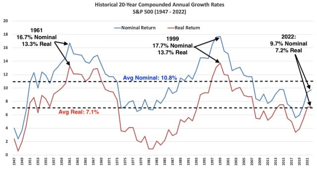
Chart of the Day: 20 Year 7/10 Rule
Today’s Chart of the Day shows historical 20-year annual returns going back to 1947 compiled by Nicholas Colas with DataTrek.
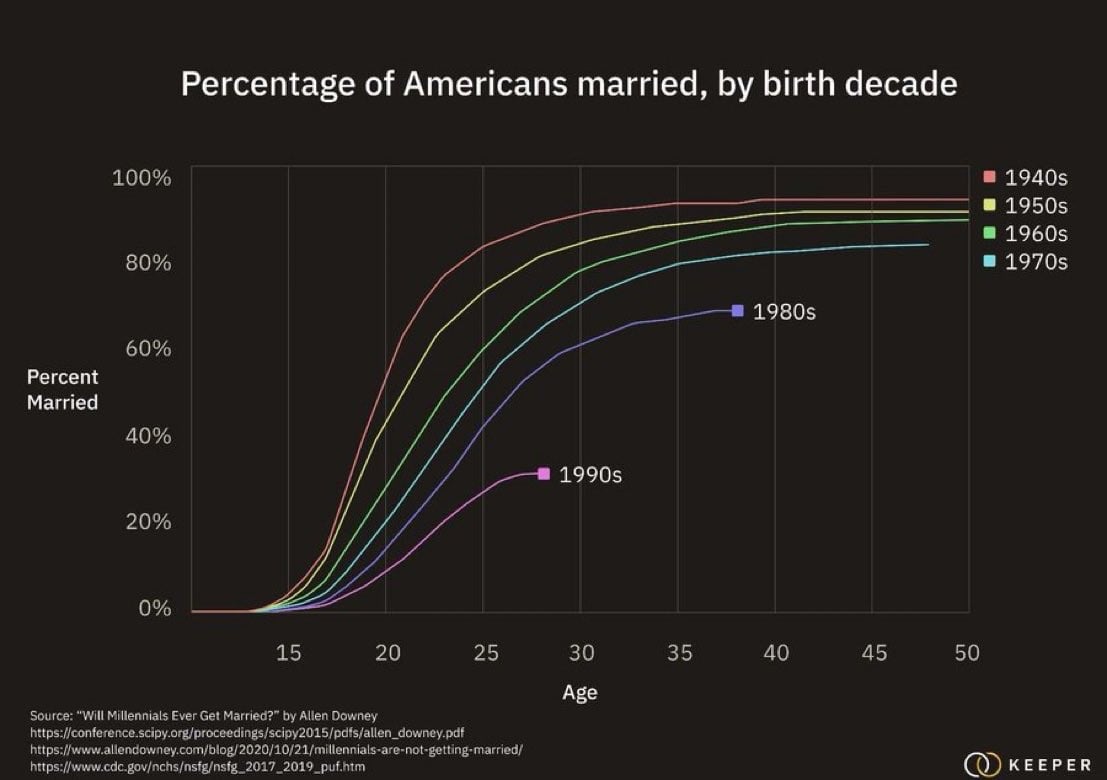
Chart of the Day: Marriage Delay
Today’s Chart of the Day from Allen Downey shows the increasing trend of delayed marriages among Millennials.
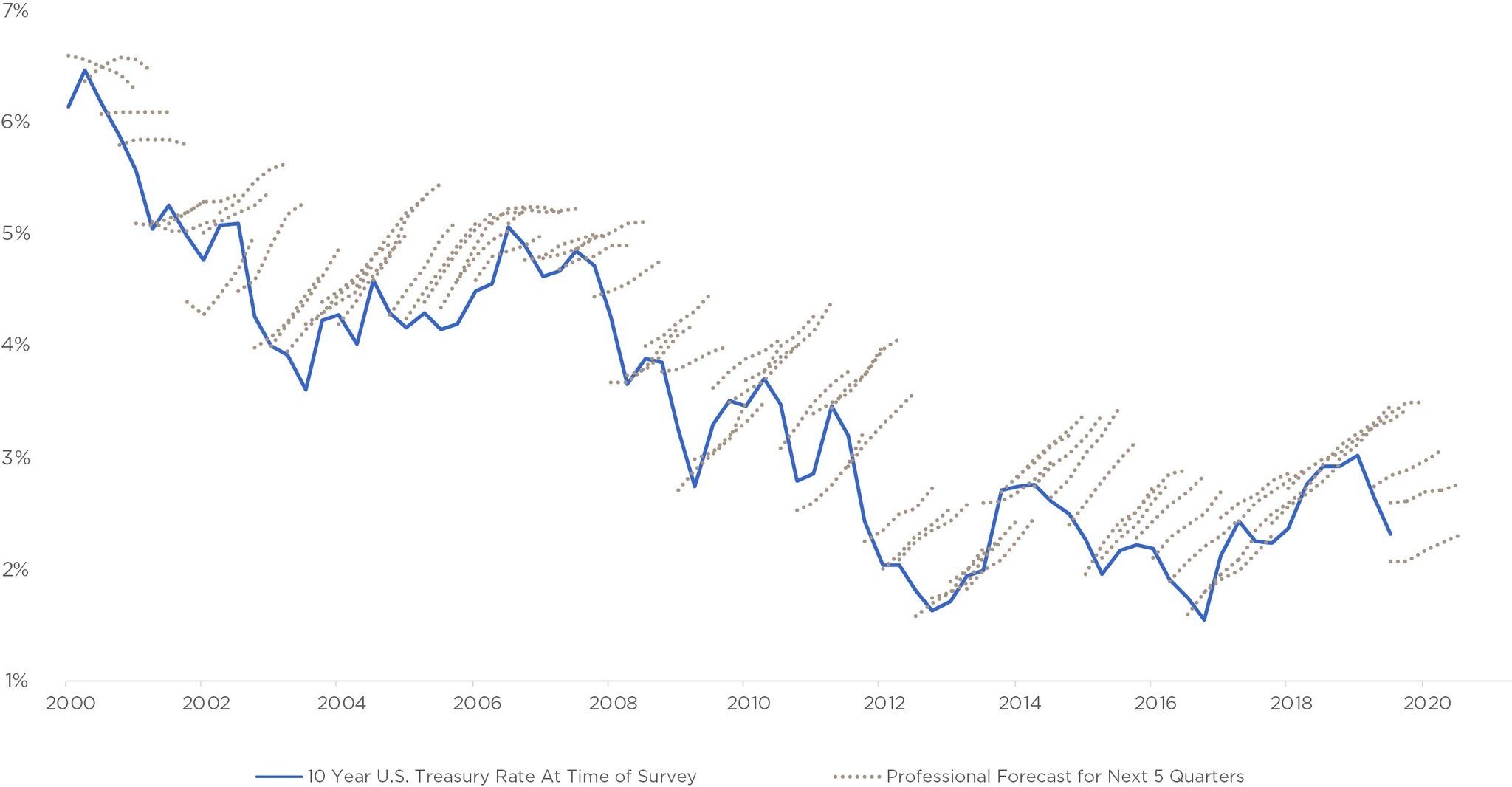
Chart of the Day: Forecasting is Easy, Getting it Right is Hard
Today’s Chart of the Day has been around a while and is often in the back of my head when we see “forecasts.”
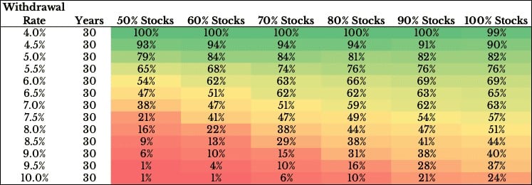
Chart of the Day: Safe Withdrawal Rates
Today’s Chart of the Day was produced by Ofdollarsanddata’s Nick Maggiulli and shows the probability of success between your withdrawal rates, the..