
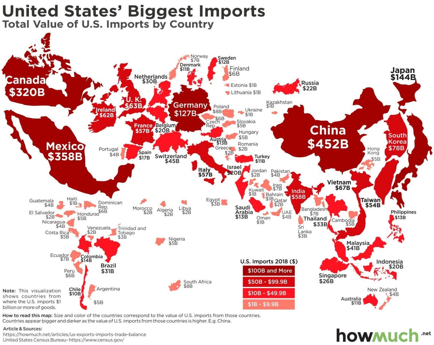
Chart of the Day: Biggest Imports to the US
Today’s Chart of the Day is a chart from howmuch.net shared by ritholz.com showing the biggest imports into the US per country.
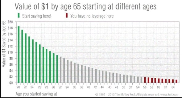
Chart of the Day: Invest Early, Save Often
There are three big factors that influence investments one has by retirement: how much, what investments, and how long. Today’s Chart of the Day from..
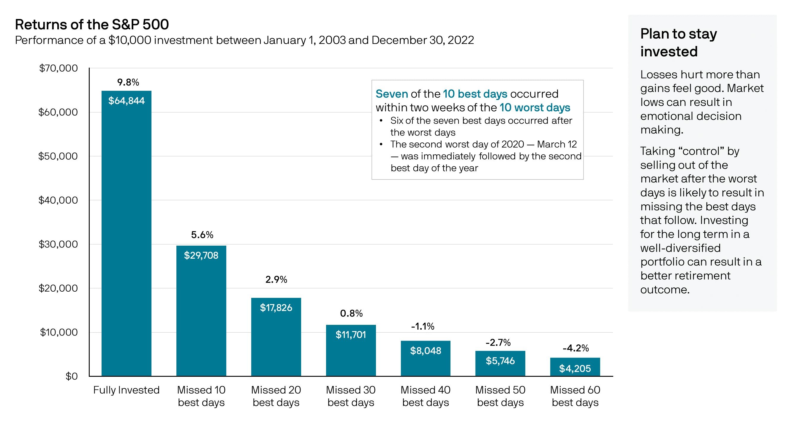
Chart of the Day: Missing Best 20 Days
Today’s Chart of the Day from JP Morgan shows the returns of the stock market if you missed a certain amount of “best days” dating back 20 years.
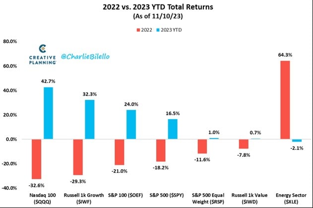
Chart of the Day: This Year's Winners are Last Year's Losers
Today’s Chart of the Day is from @CharlieBilello on X and shows that last year’s losers (in red) are this year’s to-date winners (in blue) and vice..
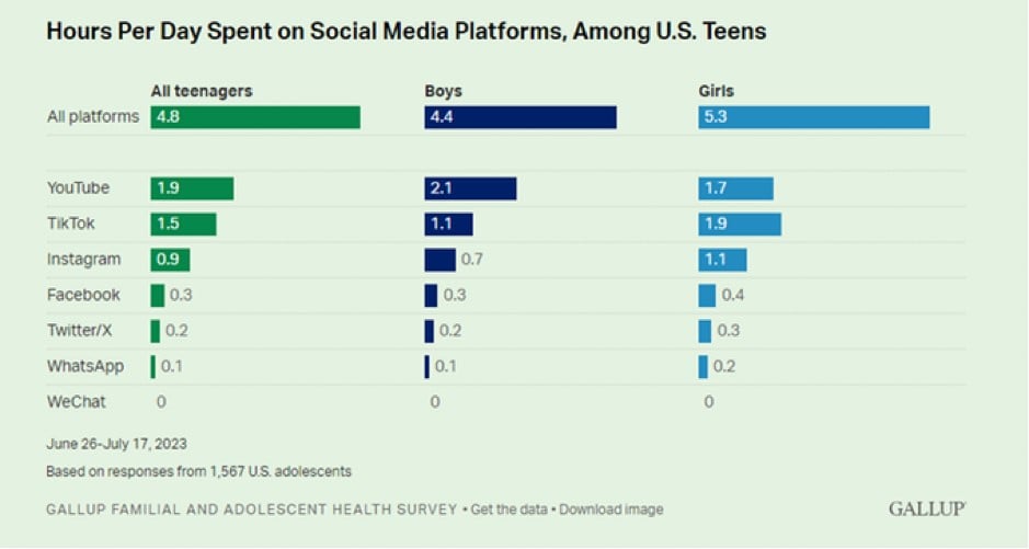
Chart of the Day: US Teens On Their Phones
Today’s Chart of the Day is from Gallup and shows the hours per day spent on social media (aka their phones). The 4.8 hours a day is something to..
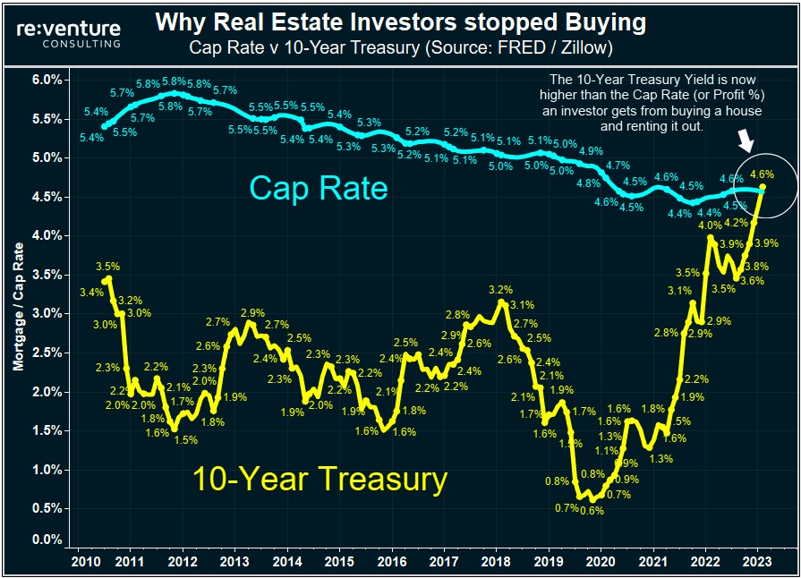
Chart of the Day: Treasury vs. Real Estate
Today’s Chart of the Day comes from Re:venture Consulting and shows the history of the 10-year treasury rate (in yellow) vs. the CAP, Capital Asset..
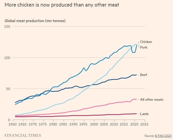
Chart of the Day: Eight Chickens Per Person
Today’s Chart of the Day from the Financial Times shows that chicken meat recently overtook pork as the most produced meat on the planet. Why?
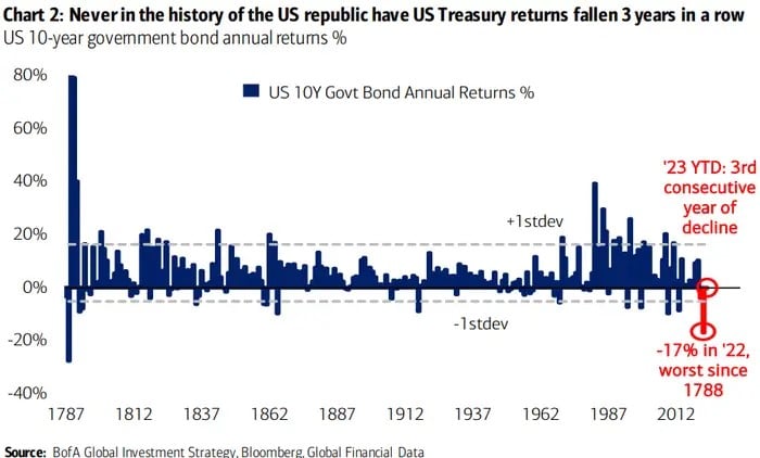
Chart of the Day: Not Since 1788
Today’s Chart of the Day from Bank of America shows that the increase in the 10-year treasury interest rates in 2022 caused the worst price decline..
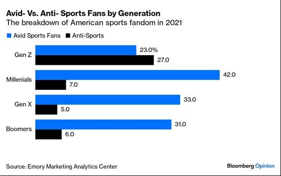
Chart of the Day: Is Gen Z Anti-Sports?
Are sports losing their shine? Today’s Chart of the Day is from Bloomberg and shows that 27% of Gen Z (currently ages 15 to 30) are decidedly..