
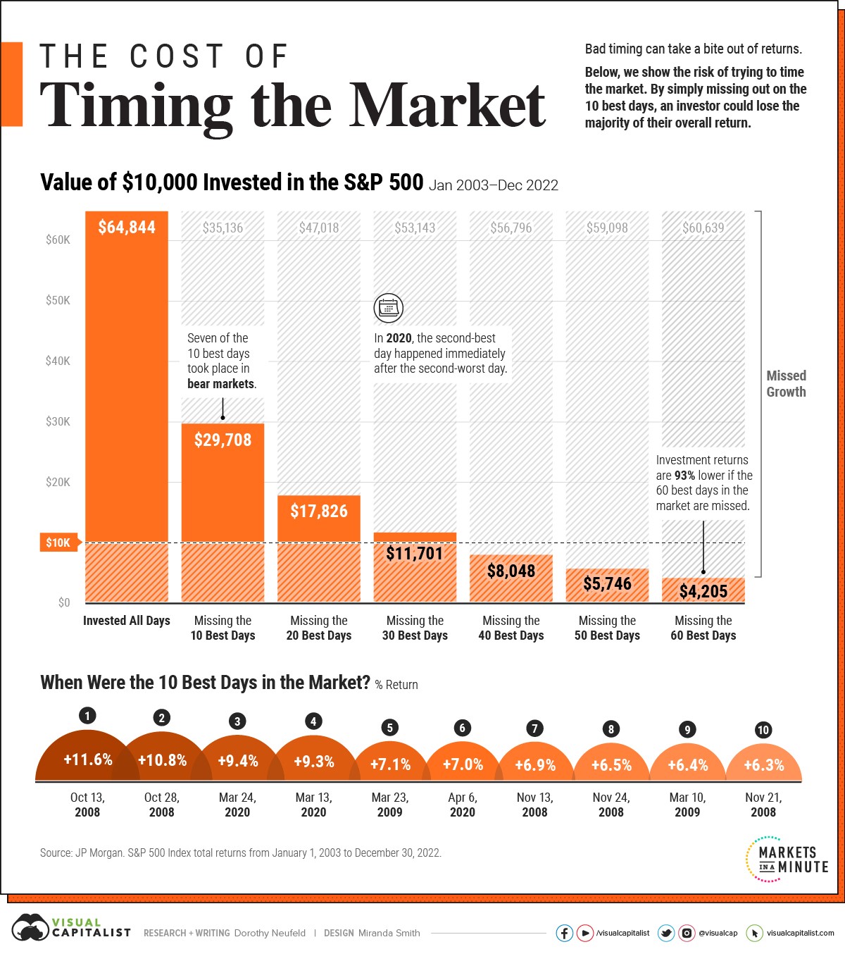
Chart of the Day: Don't Sell When the Market is Down
Today’s Chart of the Day from Visual Capitalist shows the impact of missing just a few positive days over the last 20 years. If you've followed the..
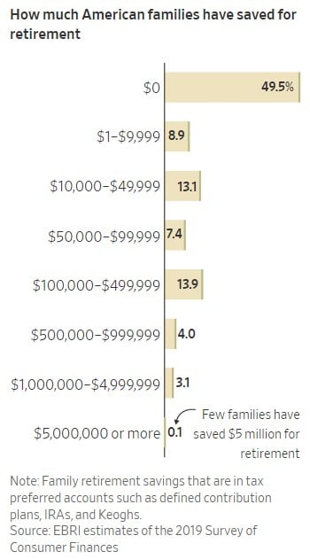
Chart of the Day: Retirement Fall Off
Today’s Chart of the Day shows how much families have saved for retirement. Roughly 50% have ZERO saved, and only 21% have over $100,000.
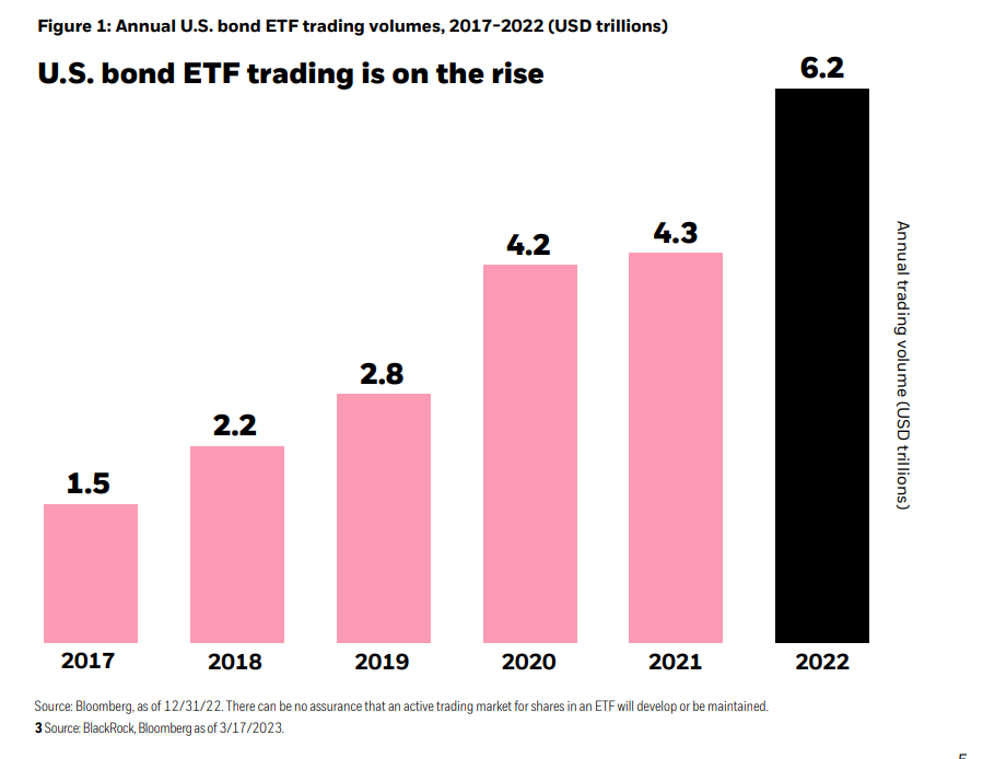
Chart of the Day: Join the Bond ETF Movement
Today’s Chart of the Day from BlackRock shows the increasing use of Bond Exchange Traded Funds (ETFs) in the US. Why? Many investors see them as more..
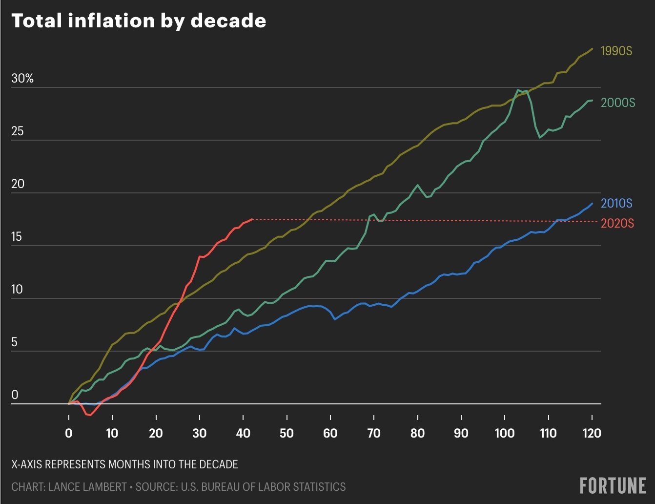
Chart of the Day: Inflation by the Decade/Paradigm Shift
Today’s Chart of the Day comes from Lance Lambert, @NewsLambert on Twitter, who works for Fortune Magazine. The chart shows total inflation by decade..

Comment of the Day: Aretha Franklin's Will
I’m going to take a small detour from my typical Chart of the Day to tell a short story of Aretha Franklin’s will.
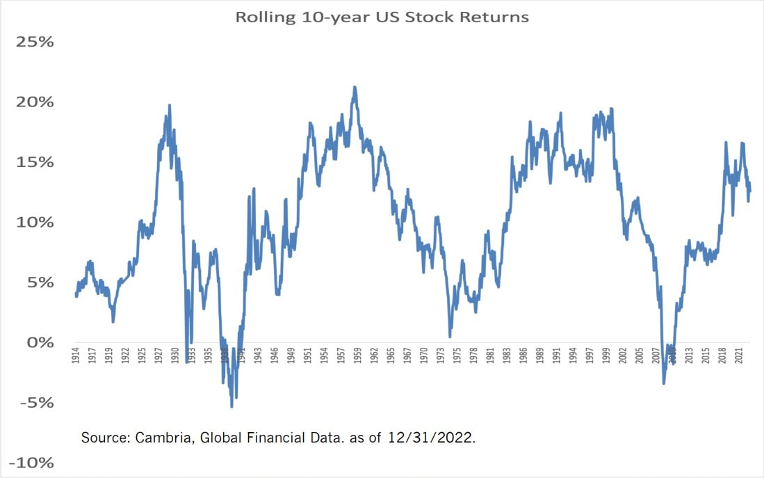
Chart of the Day: Rolling 10-Year Returns
Today’s Chart of the Day from Cambria shows the rolling 10-year US stock return going back 108 years to 1914. There are two general periods where..
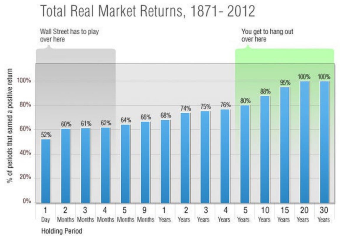
Chart of the Day: Better than 50/50, Especially in the Long Run
Today’s Chart of the Day from @morganhousel on Twitter illustrates the odds that you will have a positive return in the stock market based on how..
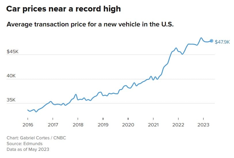
Chart of the Day: Record Car Prices
Today’s Chart of the Day is from a CNBC article titled, “With just 8% of new vehicles costing under $30,000, ‘it’s the least affordable car market in..