
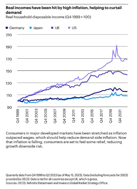
Chart of the Day: A Productive US vs. the UK/Japan
Today’s Chart of the Day from Invesco’s mid-year outlook shows that high inflation is reducing household disposable income. A closer look shows..
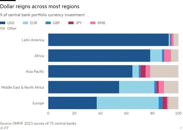
Chart of the Day: Dollar Reign
Today’s Chart of the Day comes from the Financial Times and shows the dominance of the US dollar in central bank reserves globally, represented in..
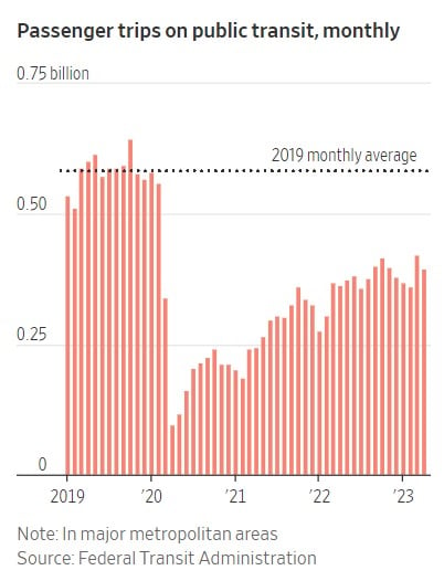
Chart of the Day: Post-Pandemic Trips
Today’s Chart of the Day is from the Wall Street Journal. Some things have not gone back to “pre-pandemic” days. One is the percentage of those who..
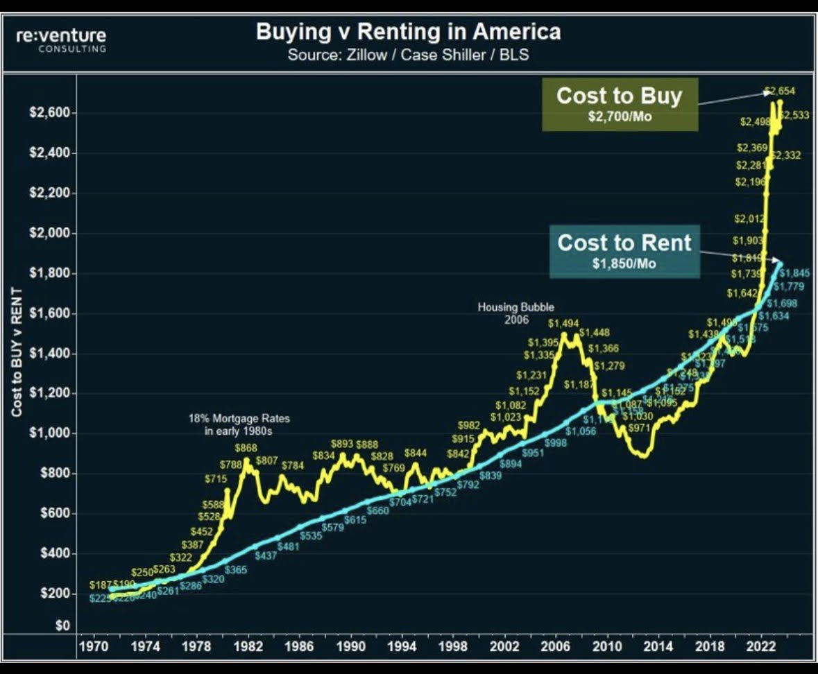
Chart of the Day: Buying vs. Renting
Today’s Chart of the Day comes from re:venture in a discussion on Reddit. It's important to remember that the monthly cost to buy (yellow) is usually..
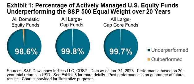
Chart of the Day: Equal Weight for an Even More Incredible Win
Today’s Chart of the Day is from S&P Global. If you follow my posts, you will not be surprised that over the last 20 years the S&P 500 index, where..
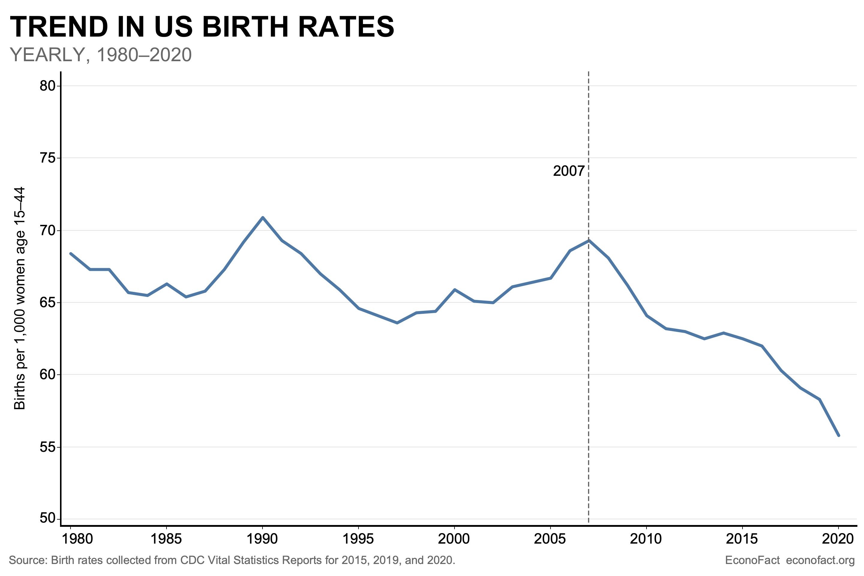
Chart of the Day: US Birth Rates
Today’s Chart of the Day from Econofact.org shows the trend in US birth rates which peaked in 2007 and is now 20% less.
Commentary of the Day: NASDAQ 100 Concentration
Today’s Chart of the Day is a comment about a unique risk that can occur in successful index funds. For instance, we often hear about what many call..
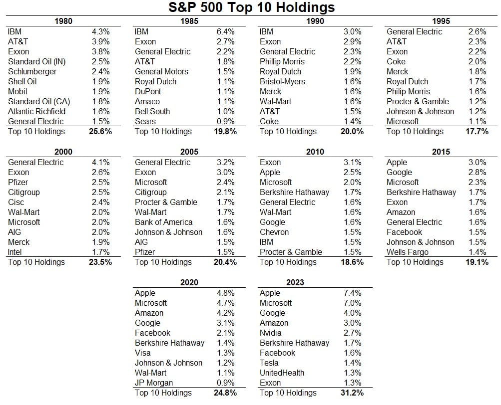
Chart of the Day: Winners May Not Always be Winners
Today’s Chart of the Day comes from A Wealth of Common Sense and shows the top 10 companies in the stock market going back to 1980.
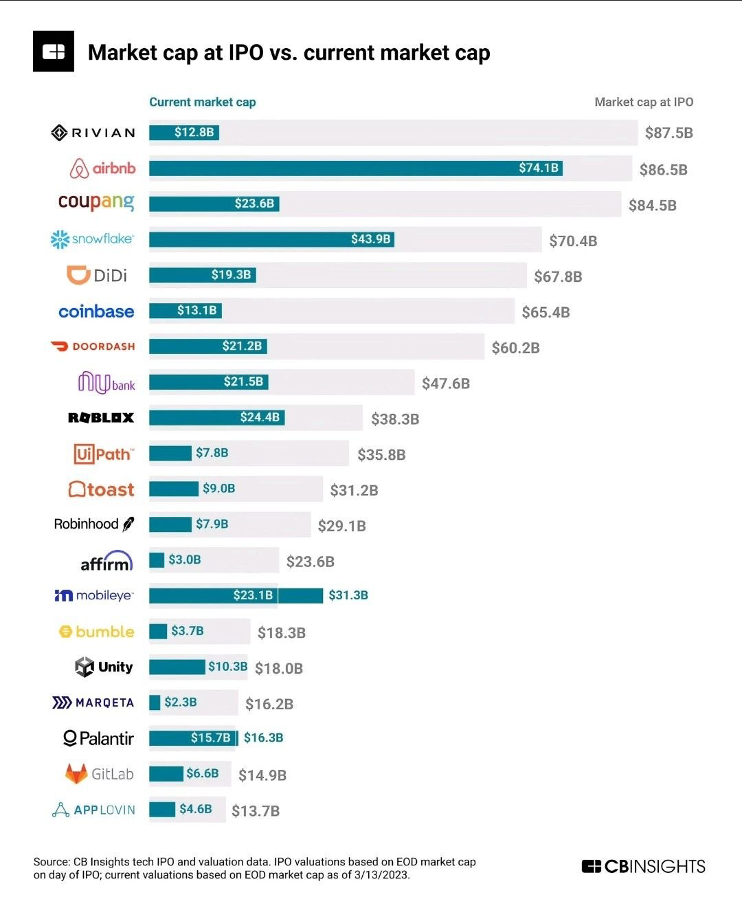
Chart of the Day: Invest from the Start
Today’s Chart of the Day comes from @QCompounding on Twitter and shows the value of some well-known companies now vs. when they became publicly owned.