
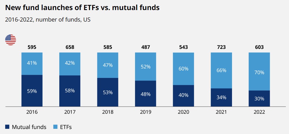
Chart of the Day: ETFs Win Again
Today’s Chart of the Day from OliverWyman shows the number of new funds being created each year in the U.S. since 2016.
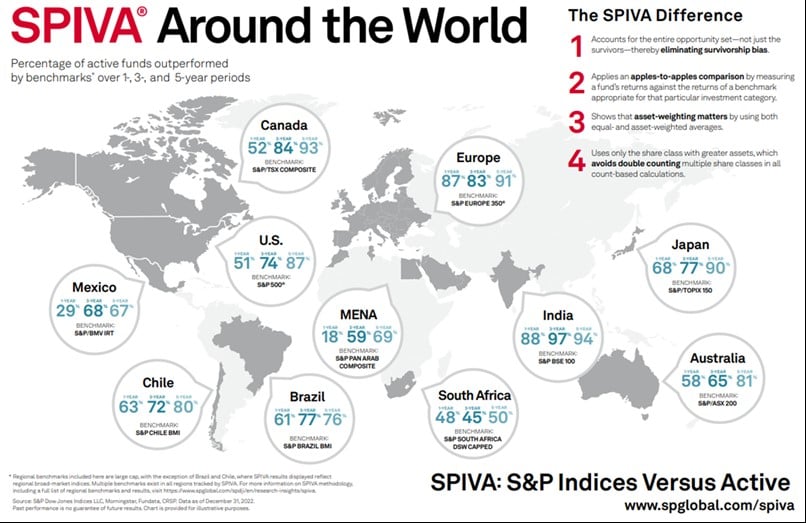
Chart of the Day: Index vs. The World
Over the last five years, 87% of actively managed funds in the US underperformed their index. Today’s Chart of the Day from S&P Global shows this..
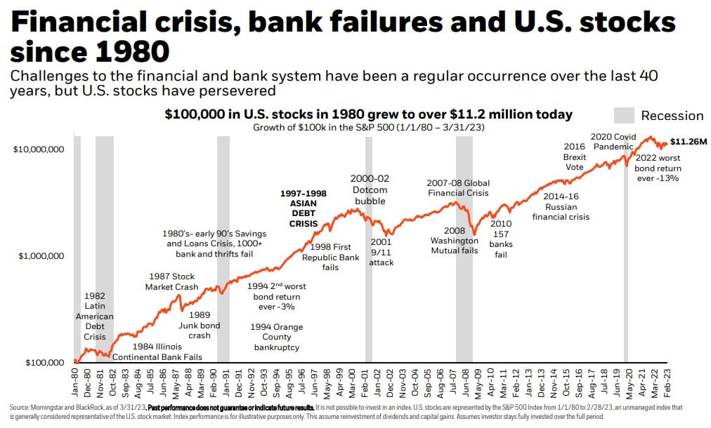
Chart of the Day: Stocks since 1980
Today’s Chart of the Day from iShares by BlackRock shows that, even though we've experienced numerous financial problems along the way, $100,000..
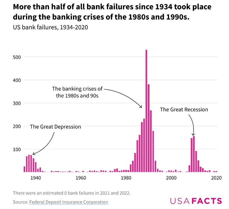
Chart of the Day: History of Bank Failure
Today's Chart of the Day is the history of bank failures from USAFacts. The year 1989 was the height with 531 banks failing from a savings and loan..
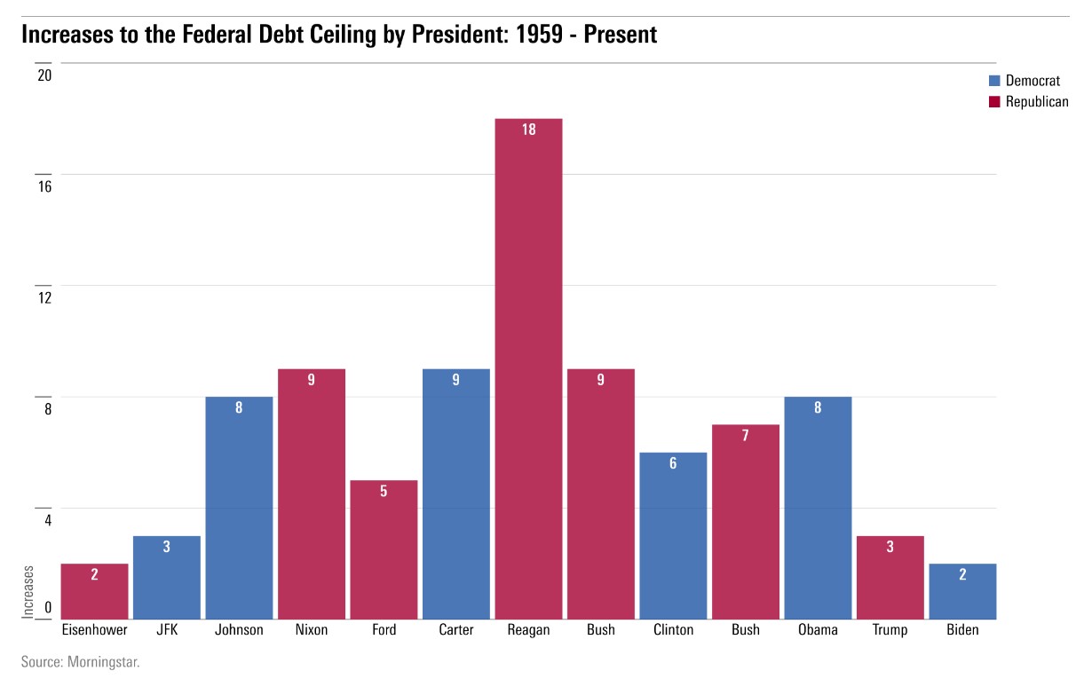
Chart of the Day: Debt Ceiling
Today’s Chart of the Day comes from Morningstar.com. In the last 40 years, the debt ceiling has gone up 53 times.
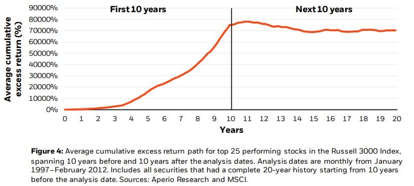
Chart of the Day: First 10 Years vs. Next 10 Years
Today’s Chart of the Day is from a BlackRock research paper on concentrated portfolio risks. In it, they graph the top 25 performing stocks over the..
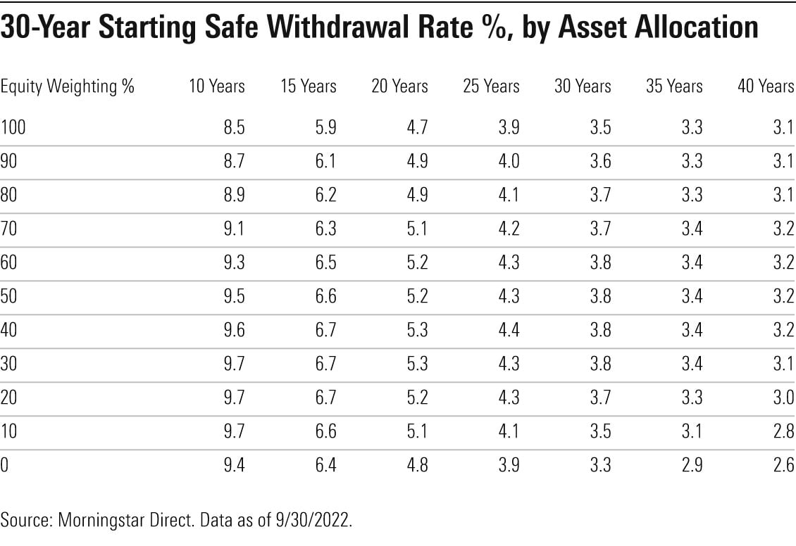
Chart of the Day: 4.2% Withdrawal Rule
Today's chart from Morningstar shows there is a 90% chance you would not run out of money during your life following these projected safe withdrawal..
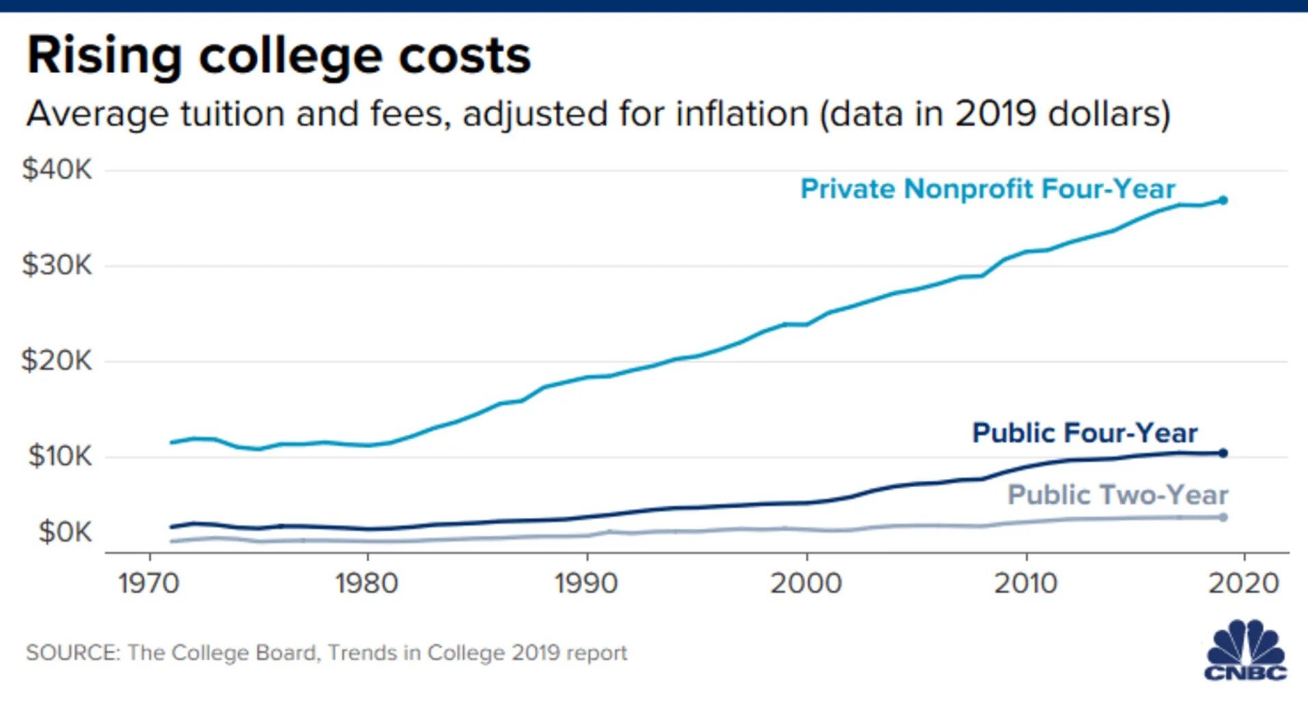
Chart of the Day: 50 Year Cost of College
Today’s Chart of the Day provided from CNBC with data from The College Board shows the average cost of college adjusted for inflation since 1970.
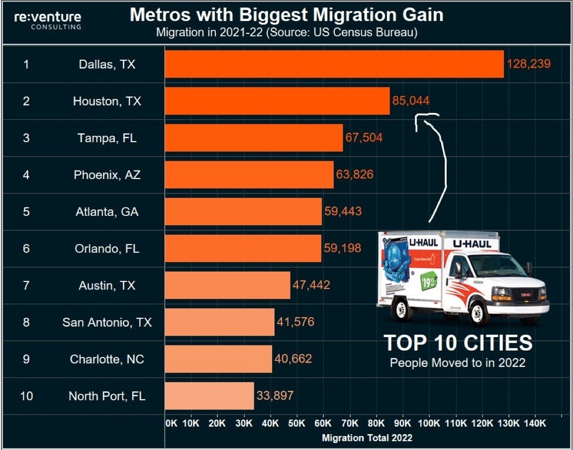
Chart of the Day: North Port Made the List
Today's Chart of the Day includes the top 10 cities people moved to in 2022 according to Re:Venture Consulting, with data from the US Census Bureau...