
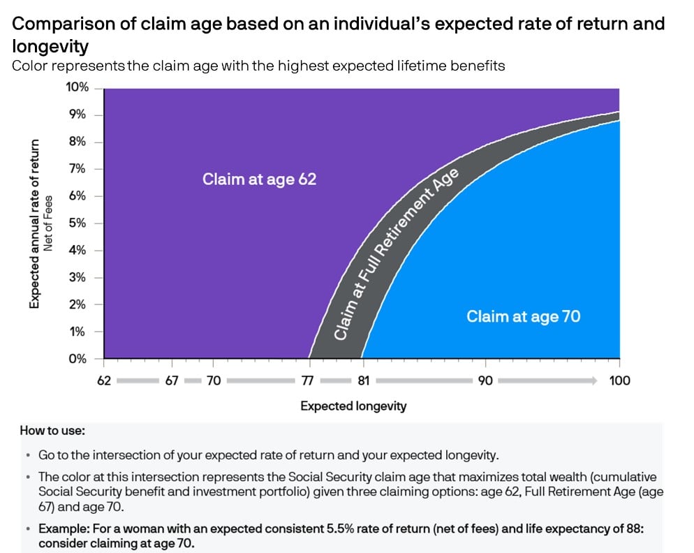
Chart of the Day: When to Take Social Security
Today’s Chart of the Day from J.P. Morgan shows when to take social security to maximize benefits.

Chart of the Day: Motorcycles vs. Cars vs. Planes
Today's Chart of the Day looks at the statistics of transportation safety. I think everyone already suspects this, but I was surprised by the scale...
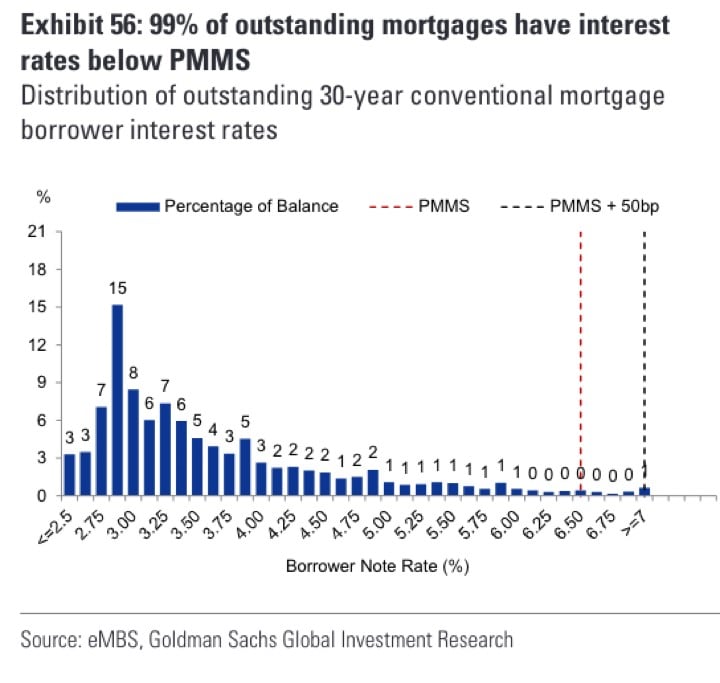
Chart of the Day: 99% are Under Current Rate
Today's Chart is from the Primary Mortgage Market Survey (PMMS) from Freddie Mac, the government agency that provides mortgage loans.

Chart of the Day: History of Nuclear Arsenals
Today's Chart of the Day looks at the number of nuclear stockpiles in the United States and the USSR/Russia dating back to the 1950s.
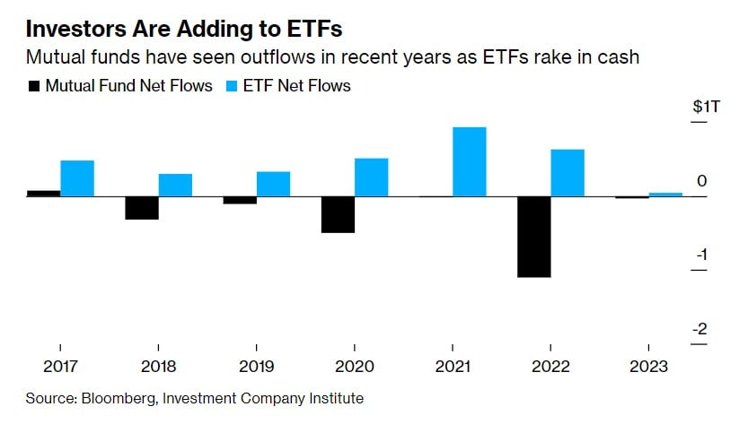
Chart of the Day: The Great Exodus Continues
Today’s Chart of the Day from Bloomberg shows the net growth of Exchange Trade Funds (ETFs), in blue, versus the loss from Mutual Funds, in black...
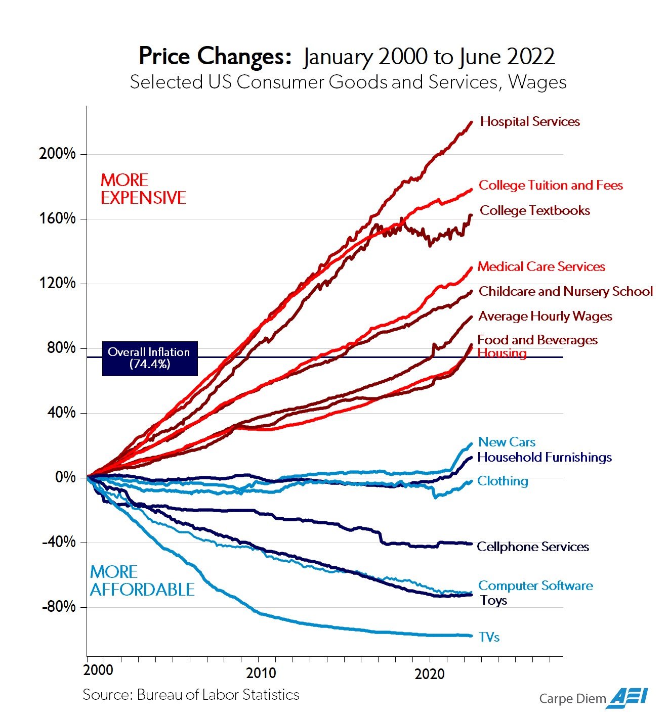
Chart of the Day: 20+ Years of Inflation
Today’s Chart of Day is from @Mark_J_Perry on Twitter and is called, “The Chart of the Century.” It shows price changes of various goods and services..
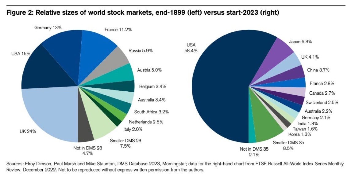
Chart of the Day: U.S. is Now 58%
Besides cutting-edge technology, a thing the United States leads the world in is banking and investments.
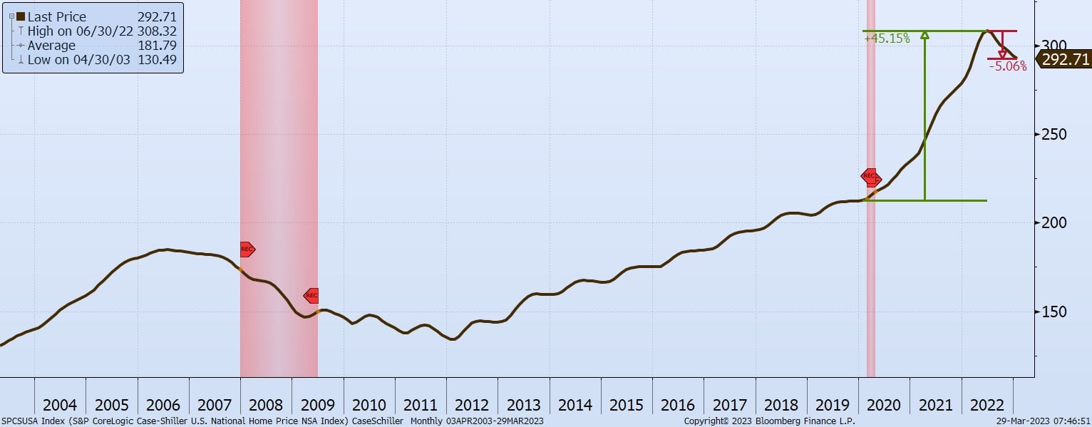
Chart of the Day: Real Estate Down 5%, but Still Up 40%
Today's Chart of the Day is of the S&P CoreLogic Case-Shiller Home Price Index published yesterday, March 28.
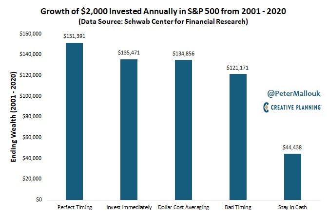
Chart of the Day: Don't Stay in Cash
“Time it right,” and “Don’t buy the peak” are attractive goals; however, the chart from @PeterMallouk shows the difference between perfect timing and..