
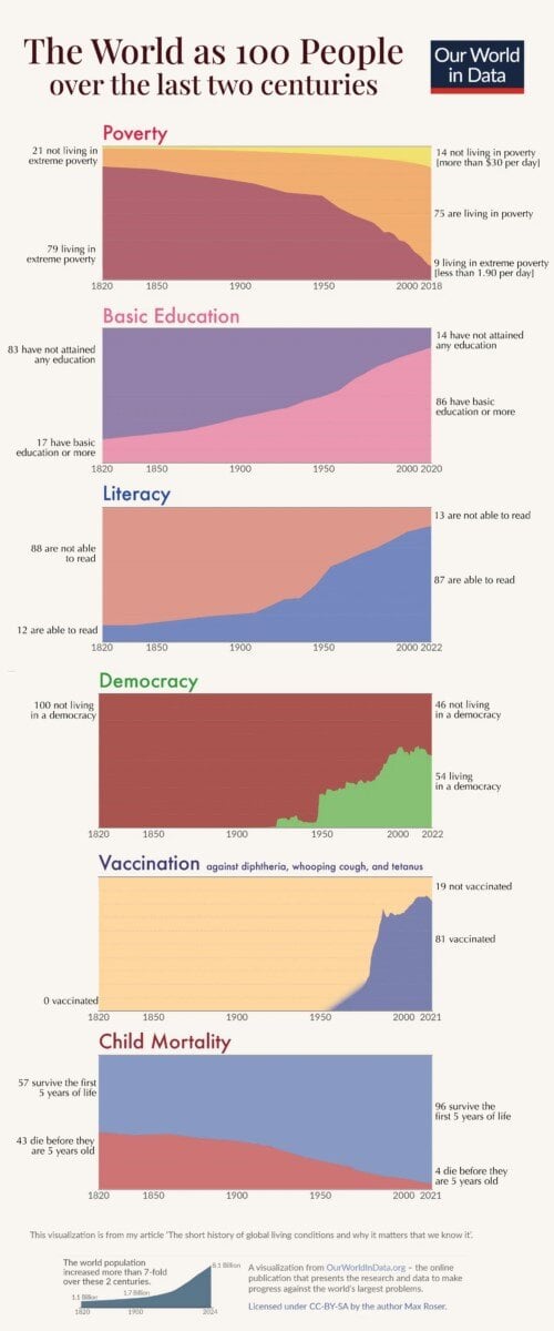
Chart of the Day: Good News for Last 200 Years
Today's Chart of the Day, from Our World in Data, shows how the world has improved per 100 people since 1820.
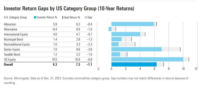
Chart of the Day: Mind the 15% Gap
Today’s Chart of the Day is from a Morningstar article named, “Why Investors Missed Out on 15% of Total Funds Returns.” They call it the “gap,” which..
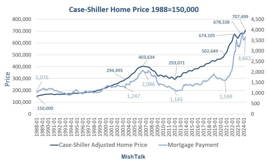
Chart of the Day: 1988 Home Prices to Now
Today’s Chart of the Day is data from Case-Shiller Adjusted Home Price, charted by Mish.
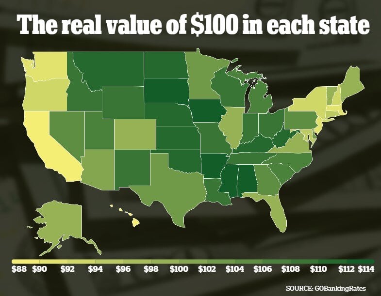
Chart of the Day: Value of $100
Today’s Chart of the Day from GoBankingRates shows the cost-of-living differences between the states. Oddly in Florida, $100 is worth $100.
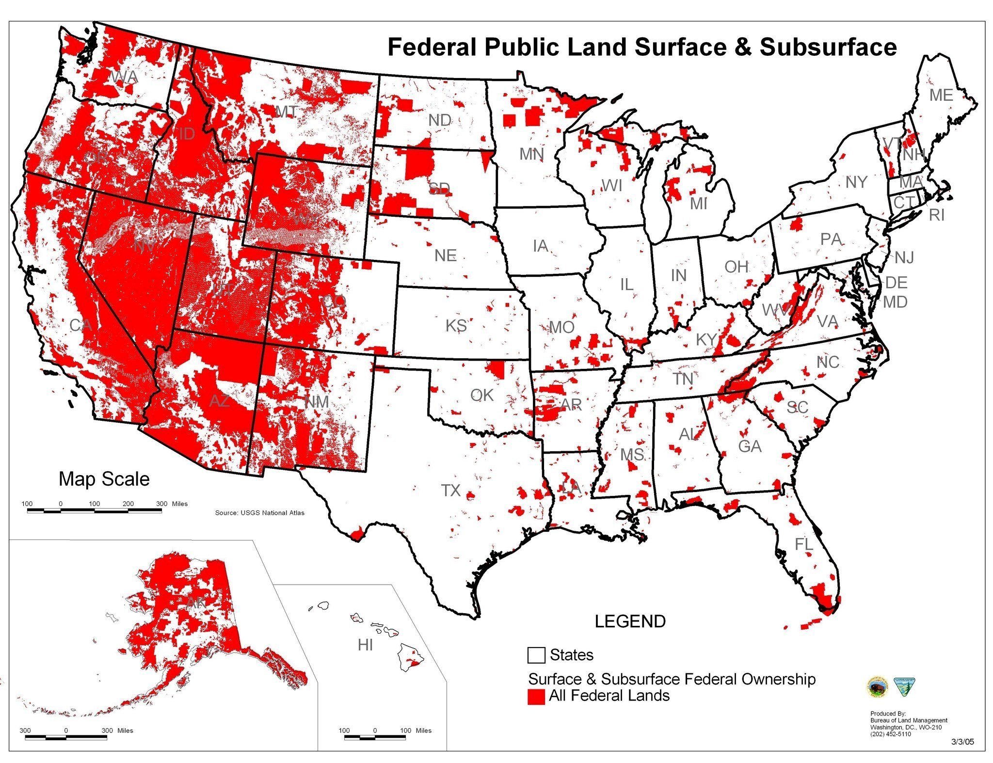
Chart of the Day: Land Owned By Government
Today’s Chart of the Day deviates from our usual financial topics and comes from the Bureau of Land Management.
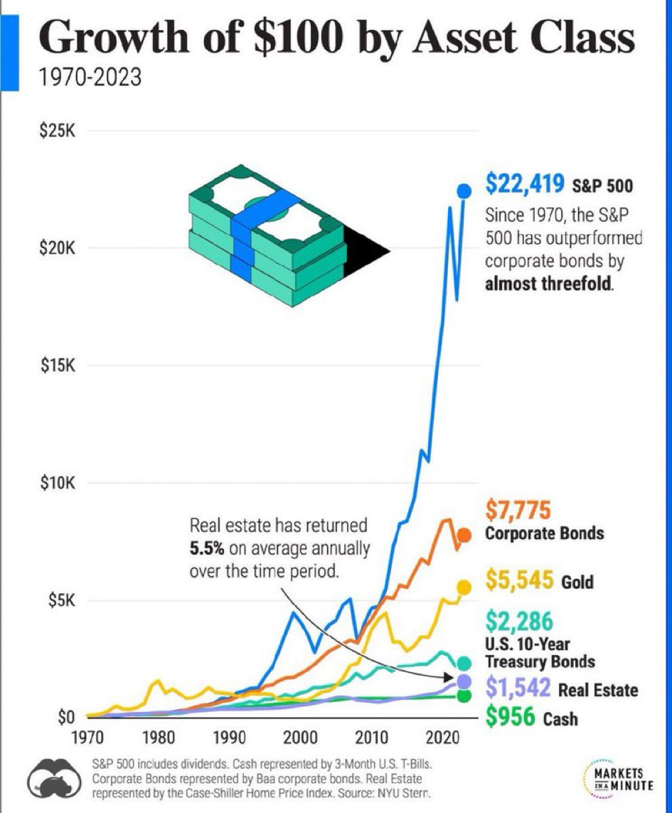
Chart of the Day: Growth of $100 Since 1970
Today’s Chart of the Day is from Markets in a Minute and shows the value of $100 invested in various assets from 1970 to 2023.
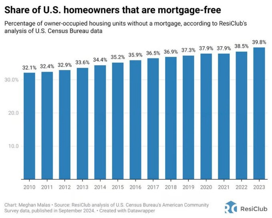
Chart of the Day: More Mortgage Free
Today’s Chart of the Day from ResiClub shows the percentage of homes that are mortgage-free.
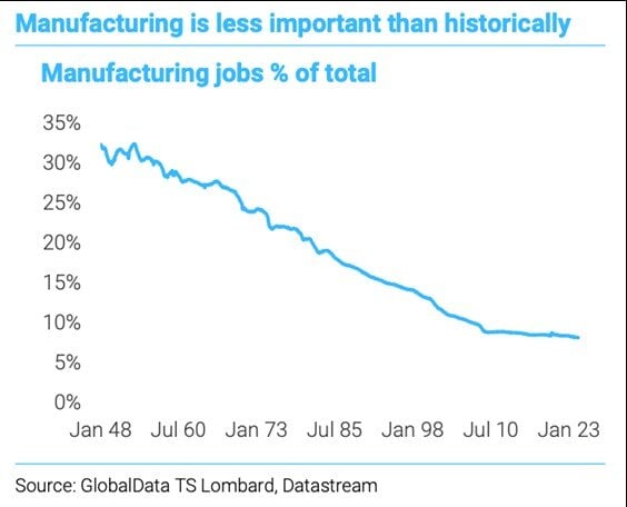
Chart of the Day: Manufacturing Decline
Today’s Chart of the Day comes from GlobalData and shows the percentage of manufacturing jobs in the US, from 1948 to 2023.
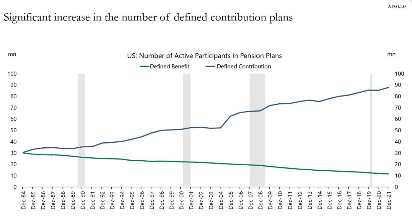
Chart of the Day: More 401(k)'s Than Ever
Today’s Chart of the Day comes from Torsten Slok who is the Chief Economist with Apollo. It shows the increase of defined contributions (401K’s and..