
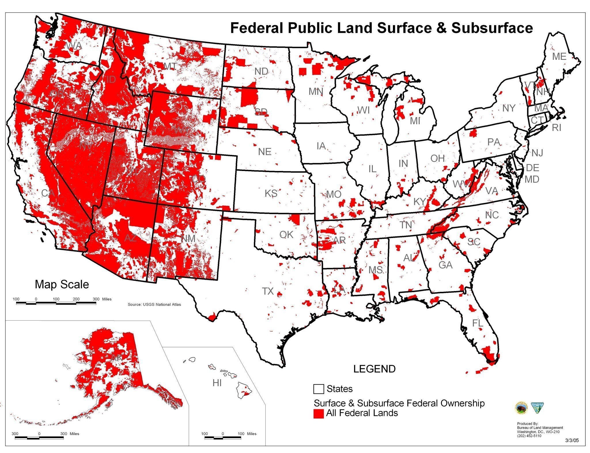
Chart of the Day: Land Owned By Government
Today’s Chart of the Day deviates from our usual financial topics and comes from the Bureau of Land Management.
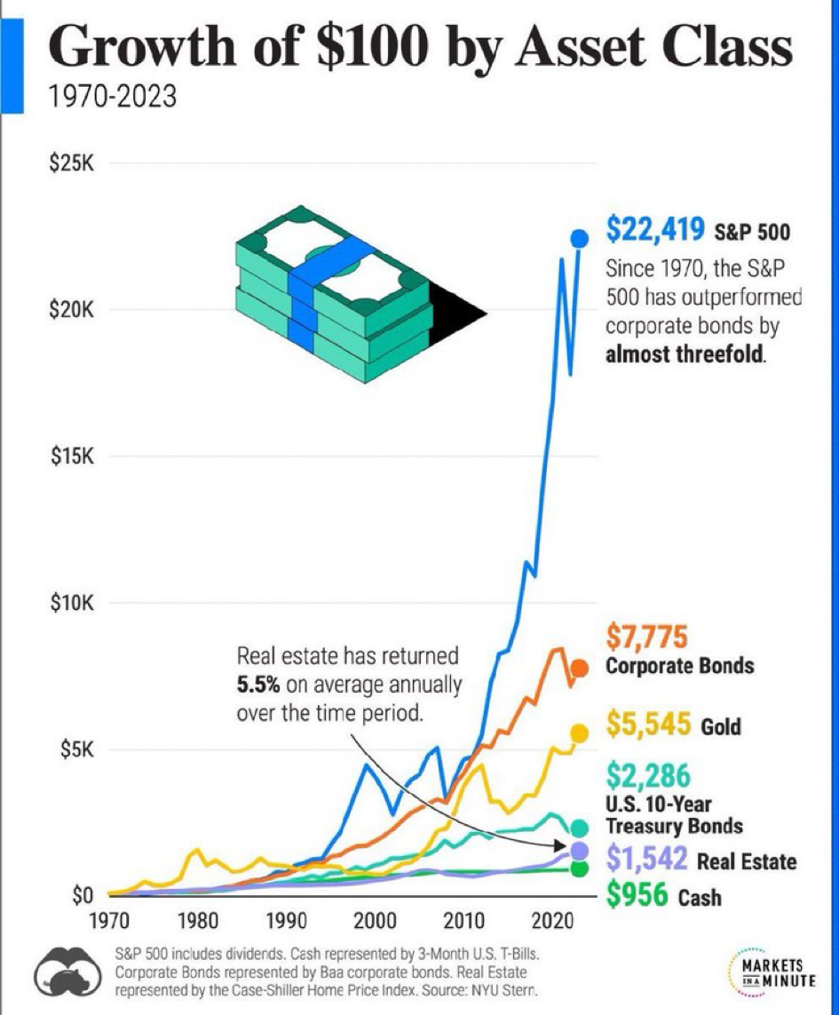
Chart of the Day: Growth of $100 Since 1970
Today’s Chart of the Day is from Markets in a Minute and shows the value of $100 invested in various assets from 1970 to 2023.
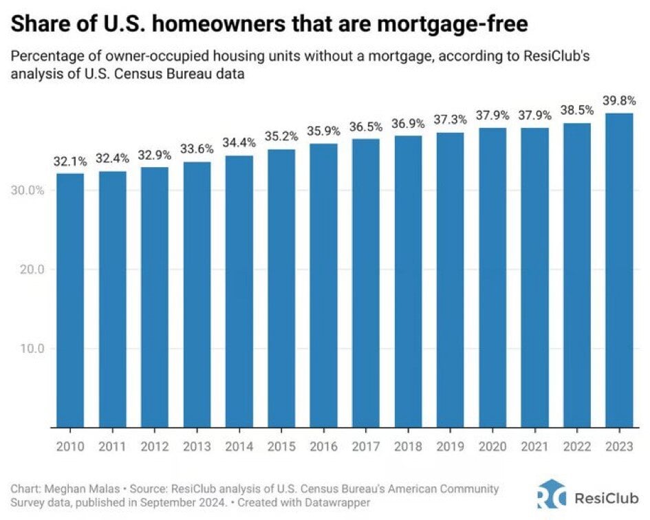
Chart of the Day: More Mortgage Free
Today’s Chart of the Day from ResiClub shows the percentage of homes that are mortgage-free.
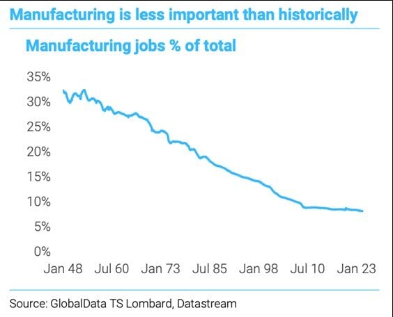
Chart of the Day: Manufacturing Decline
Today’s Chart of the Day comes from GlobalData and shows the percentage of manufacturing jobs in the US, from 1948 to 2023.
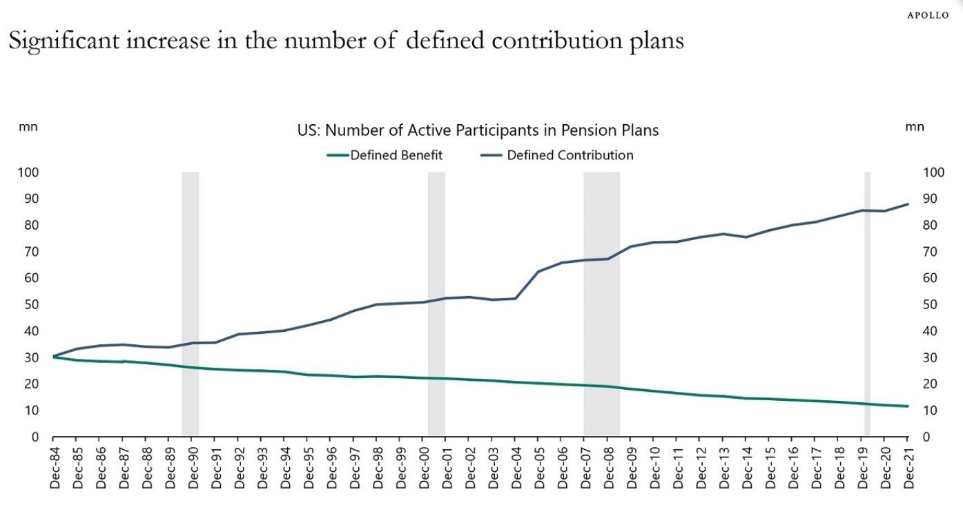
Chart of the Day: More 401(k)'s Than Ever
Today’s Chart of the Day comes from Torsten Slok who is the Chief Economist with Apollo. It shows the increase of defined contributions (401K’s and..
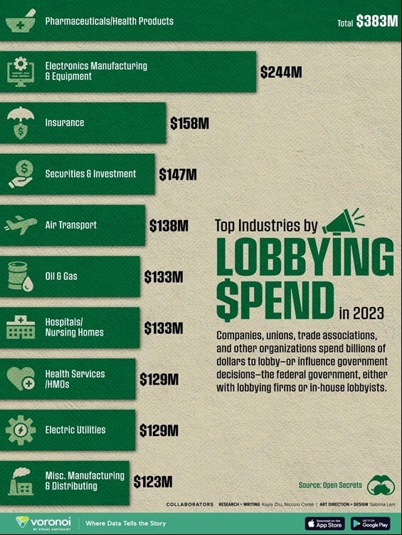
Chart of the Day: Lobbying
Today’s Chart of the Day is from Open Secrets and shows the amount of money spent in lobbying our federal government in 2023. We have all heard about..
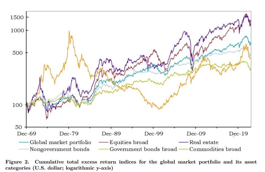
Chart of the Day: The Everything Portfolio (Part 2)
Today’s Chart of the Day is a follow up from the previous post and is from an academic paper called “The Risk and Reward of Investing” published by..
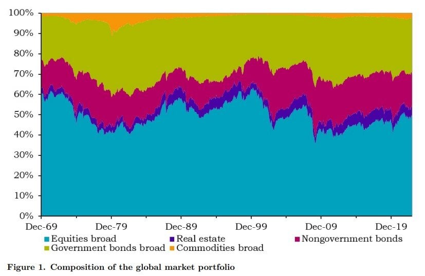
Chart of the Day: The Everything Portfolio (Part 1)
Today’s Chart of the Day is from an academic paper called “The Risk and Reward of Investing” by Doeswijk and Swinkel published in July 2024.
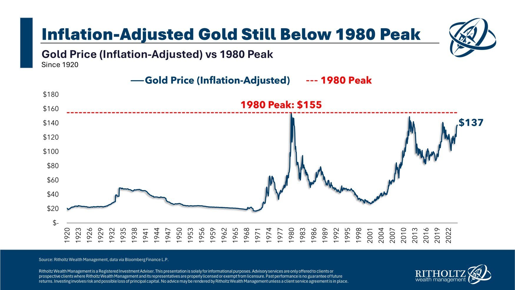
Chart of the Day: Gold vs. Inflation
Today's Chart of the Day from Ben Carlson's book "A Wealth of Common Sense" provides an insightful look at gold prices adjusted for inflation dating..