
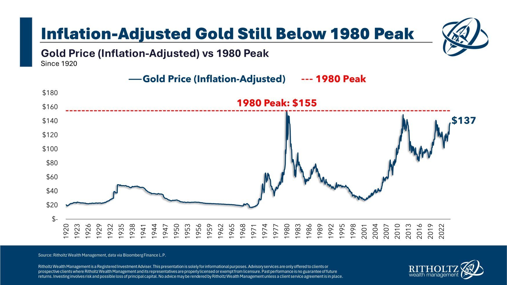
Chart of the Day: Gold vs. Inflation
Today's Chart of the Day from Ben Carlson's book "A Wealth of Common Sense" provides an insightful look at gold prices adjusted for inflation dating..

Chart of the Day: Unbalanced China
Today’s Chart of the Day from Epic Maps on X which shows the population density of China.
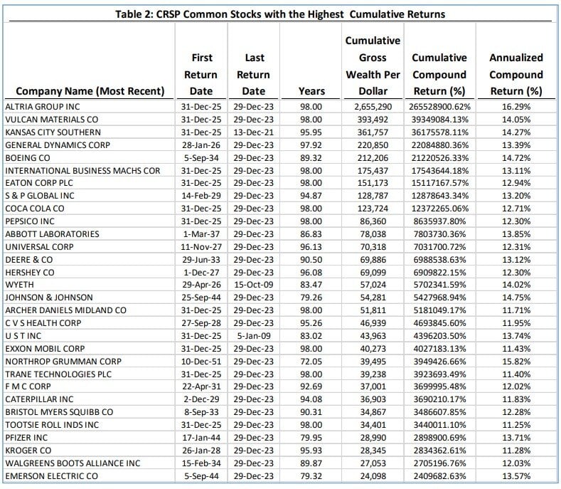
Chart of the Day: List of the Top Stocks
Today’s Chart of the Day is a list by Hendrik Bessembinder from his paper called “Which U.S. Stocks Generated the Highest Long-Term Returns?”..
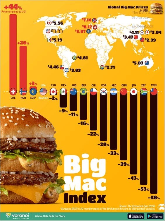
Chart of the Day: Big Mac Index
Today’s Chart of the Day from Voronoi shows the “Big Mac Index," a socially popular measure of a concept called Purchasing Power Parity. The concept..
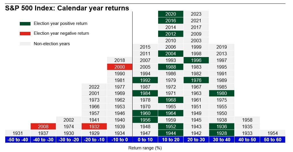
Chart of the Day: Markets in Election Years
Today’s Chart of the Day was provided by Angie Parsons, a Portfolio Manager at Crews Bank & Trust, after attending a presentation by Brian Levitt..
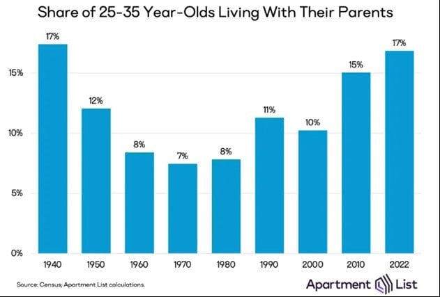
Chart of the Day: 25 to 35-Year-Olds
Today’s Chart of the Day from Apartment List shows the share of 25 to 35-year-olds living with their parents.
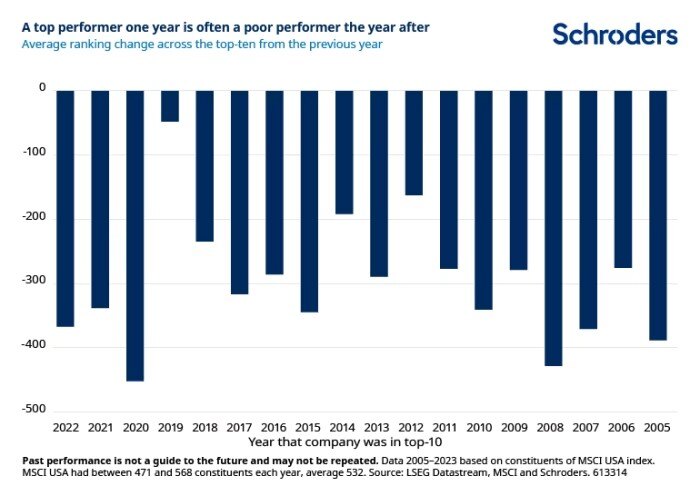
Chart of the Day: Beware of Chasing Performance
Today’s Chart of the Day is from a Financial Times article called “Past Performance is a Public Enemy” and includes a chart provided by Schroders.
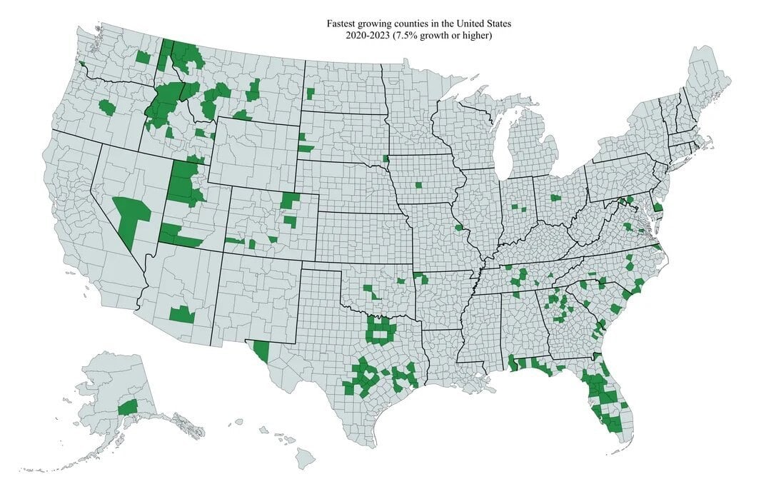
Chart of the Day: Fastest Growing Counties in the US
Today’s Chart of the Day is from @Markets4mayhem on X and shows the fastest growing counties in the United States from 2020-2023, which equates 7.5%+..
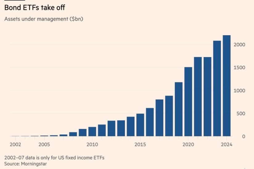
Chart of the Day: Bond ETFs Take Off
Today’s Chart of the Day from the Financial Times shows the growth of Bond ETFs from 2007 to present.