
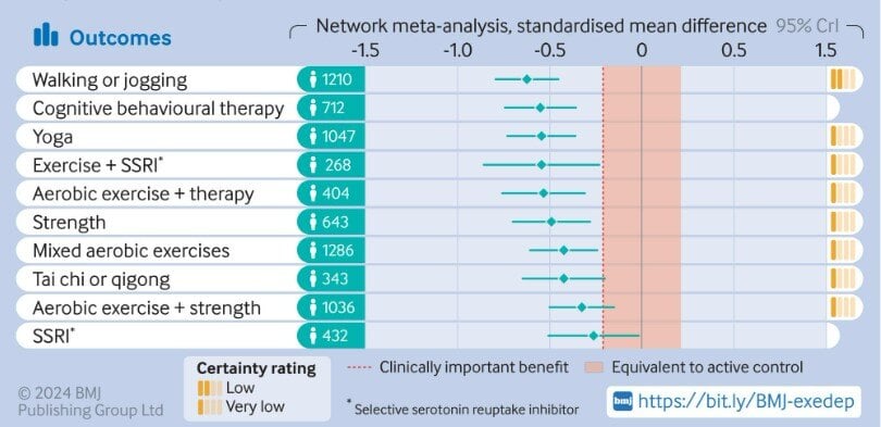
Chart of the Day: Depression and Walking #1
Today's Chart of the Day is from a research article in the British Medical Journal titled “Effect of Exercise for Depression.”
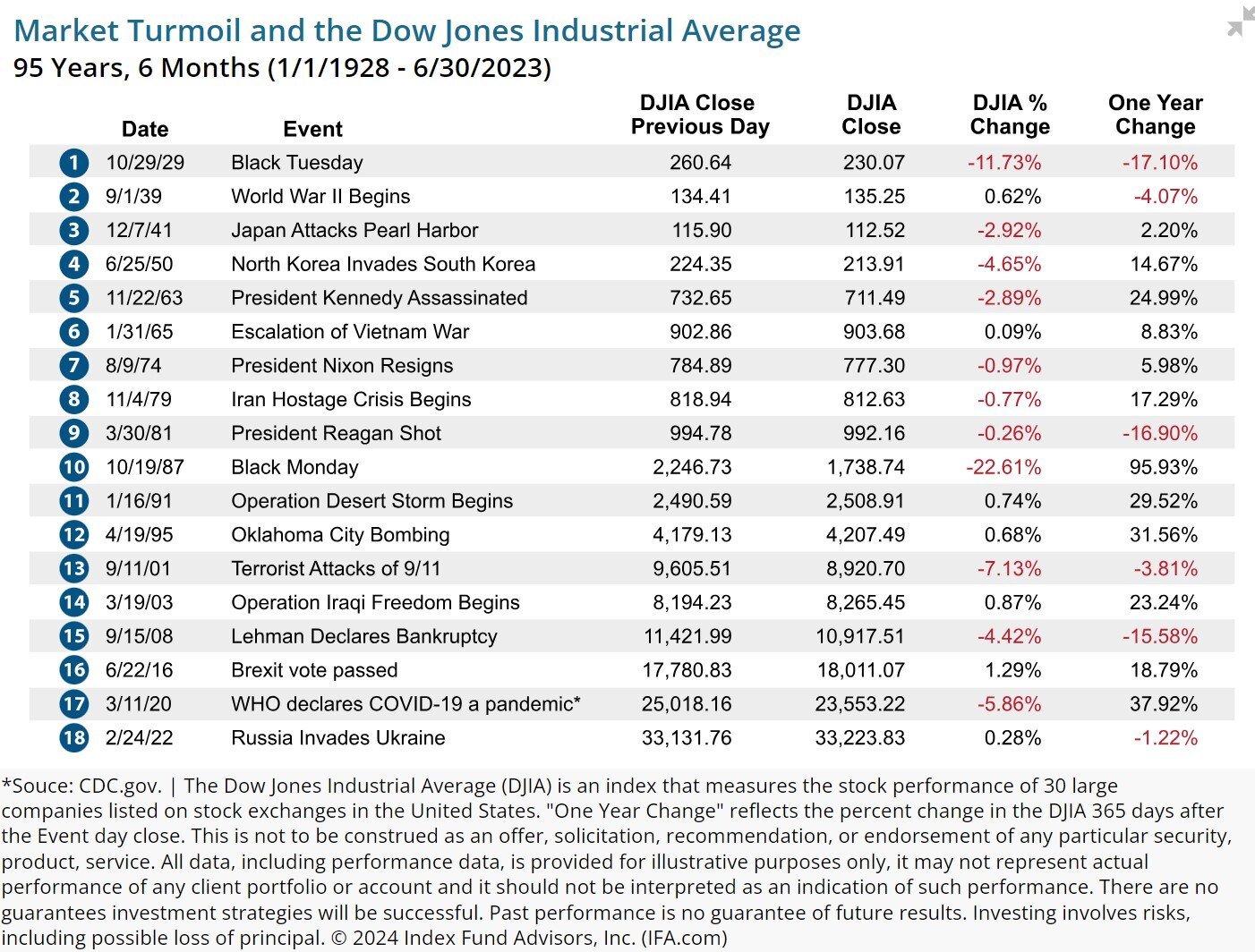
Chart of the Day: Every Five Years or So
Today’s Chart of the Day, from an article written by Robin Powell with IFA.com, shows the 18 largest market events over the last 95 years.

Chart of the Day: Hurricanes and the Equator
Today’s Chart of the Day is a slight departure from a typical financial post, and similar to one I shared a few years ago, but has some additional..
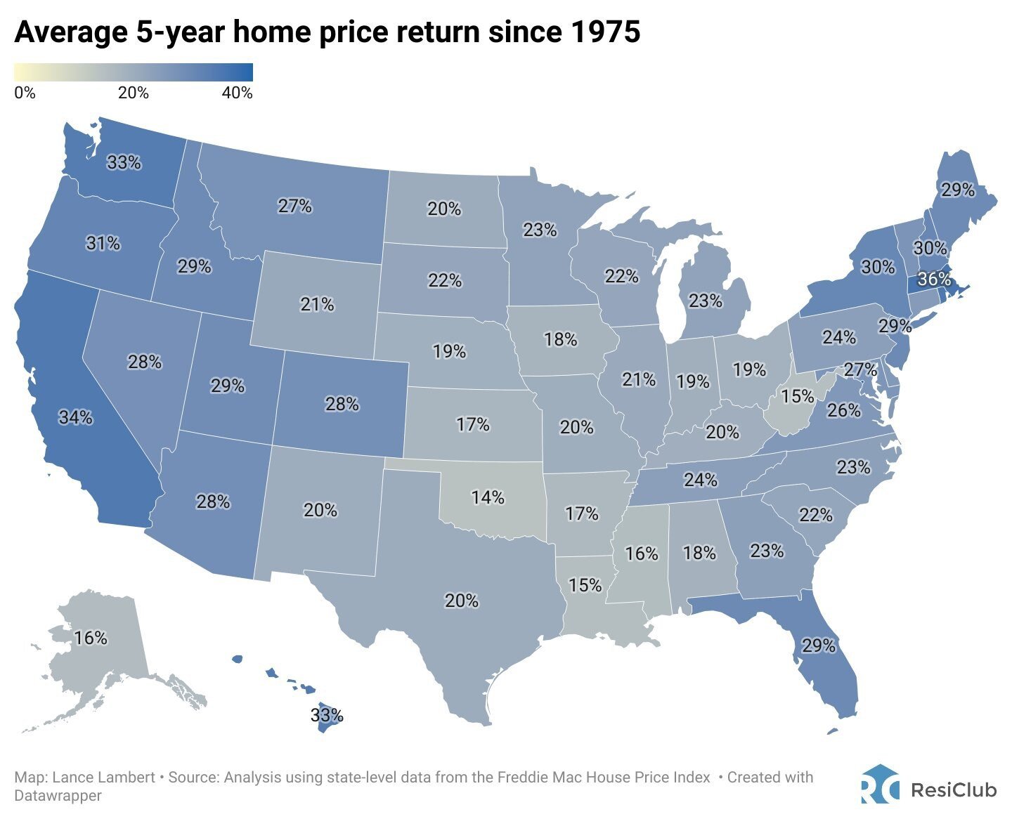
Chart of the Day: Real Estate Over Five Year Spans
Today’s Chart of the Day from ResiClub shows the average 5-year home price return has averaged 26% per state since 1975.
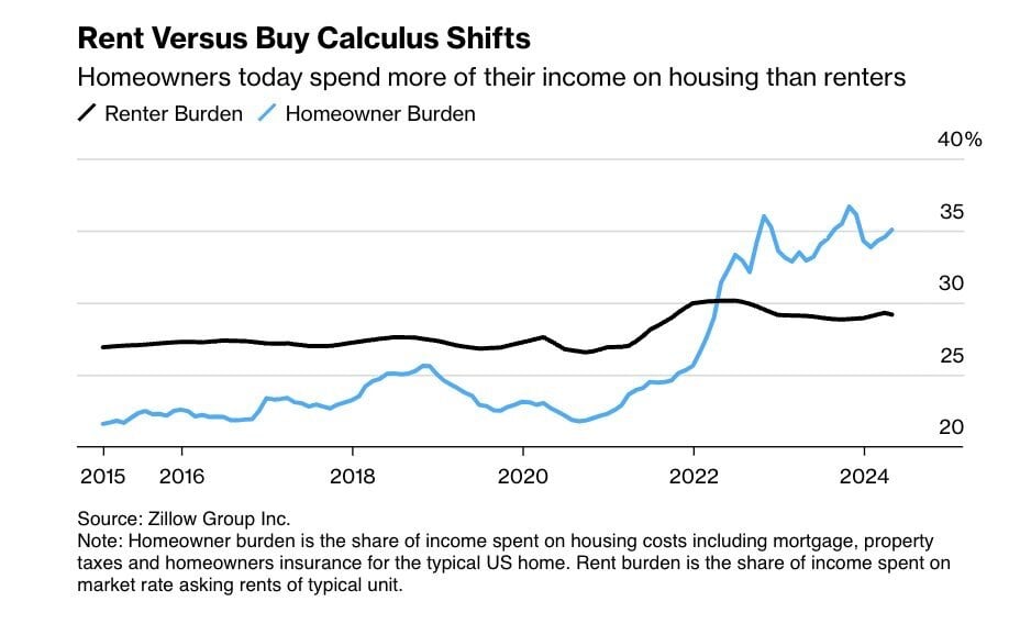
Chart of the Day: Imbalance of Rent vs. Buy
Today’s Chart is from Zillow showing that typically the share of income spent on housing costs for homeowners, such as mortgage, taxes, and..

Chart of the Day: July Record Heat
As we all walk outside this month and think, “It is hot!", remember today’s Chart of the Day from the Statewide High Temperature Records set during..

Chart of the Day: Brand Wheel
Today’s Chart of the Day is from Jon Erlichman and shows what I like to call the “Brand Wheel".
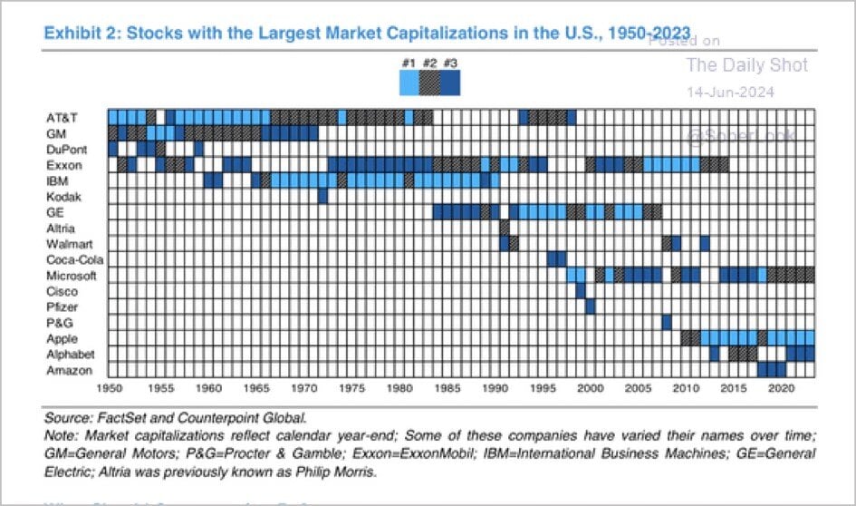
Chart of the Day: Winners Don't Win Forever
Today’s Chart of the Day is from Counterpoint Global with data from FactSet. It shows the top three largest US companies from 1950 to 2023. AT&T..

Chart of the Day: US Work Ethic
Today’s Chart of the Day is from the Financial Times and shows the number of annual hours worked, per worker, for select economies since 1974.