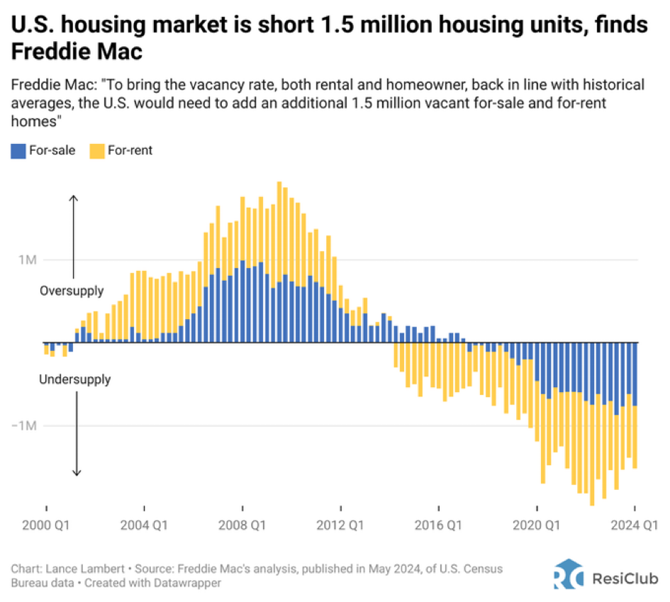
Chart of the Day: Short 1.5 Million Housing Units
Today’s Chart of the Day from ResiClub shows that the US housing market is short 1.5 million housing units. As with all things, the causes, fixes,..
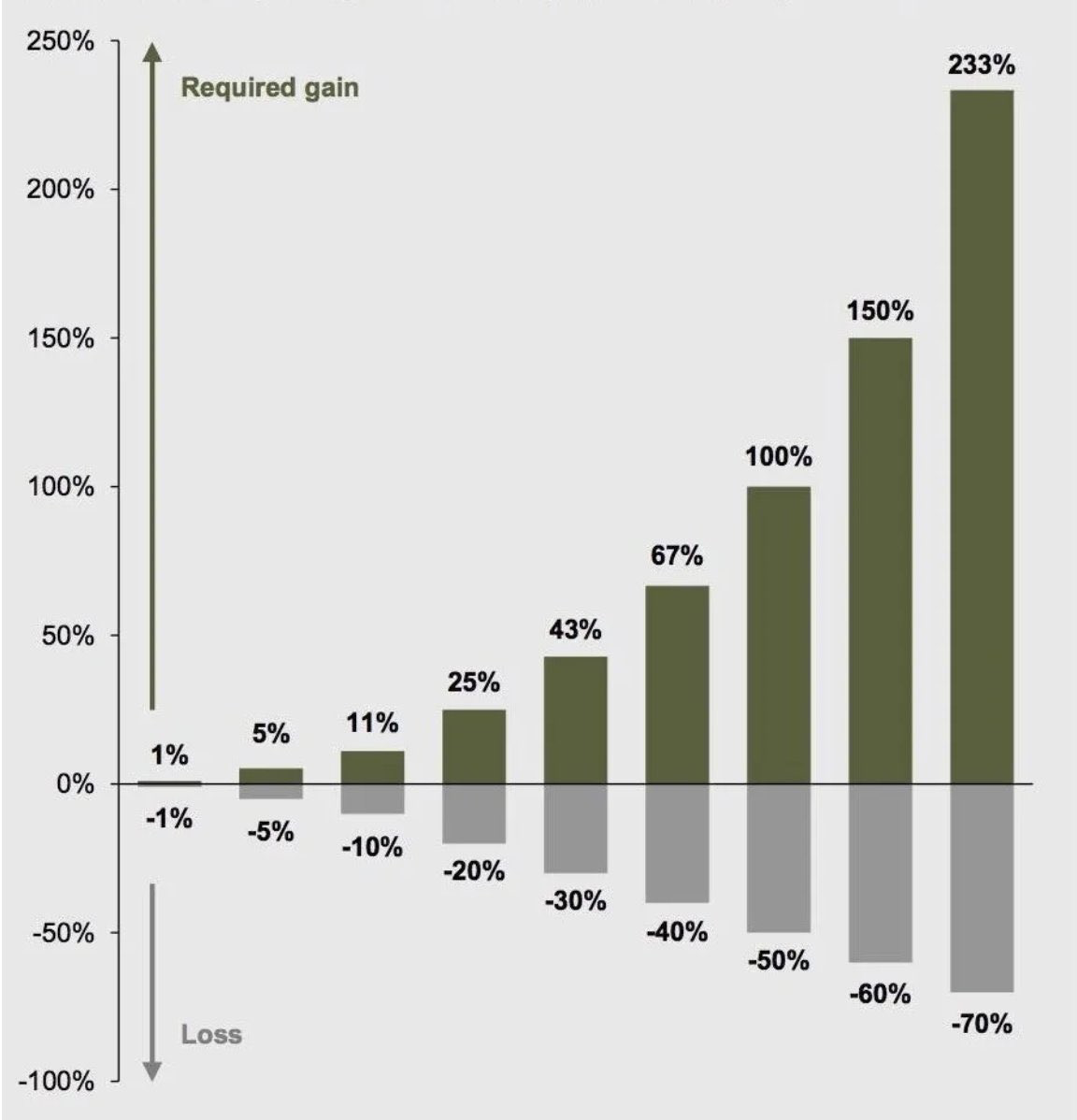
Chart of the Day: Recovering from Losses is Hard
Today’s Chart of the Day is from Compounding Quality ( Compounding Quality (@QCompounding) / X) and shows the percentage gain needed to recover from..
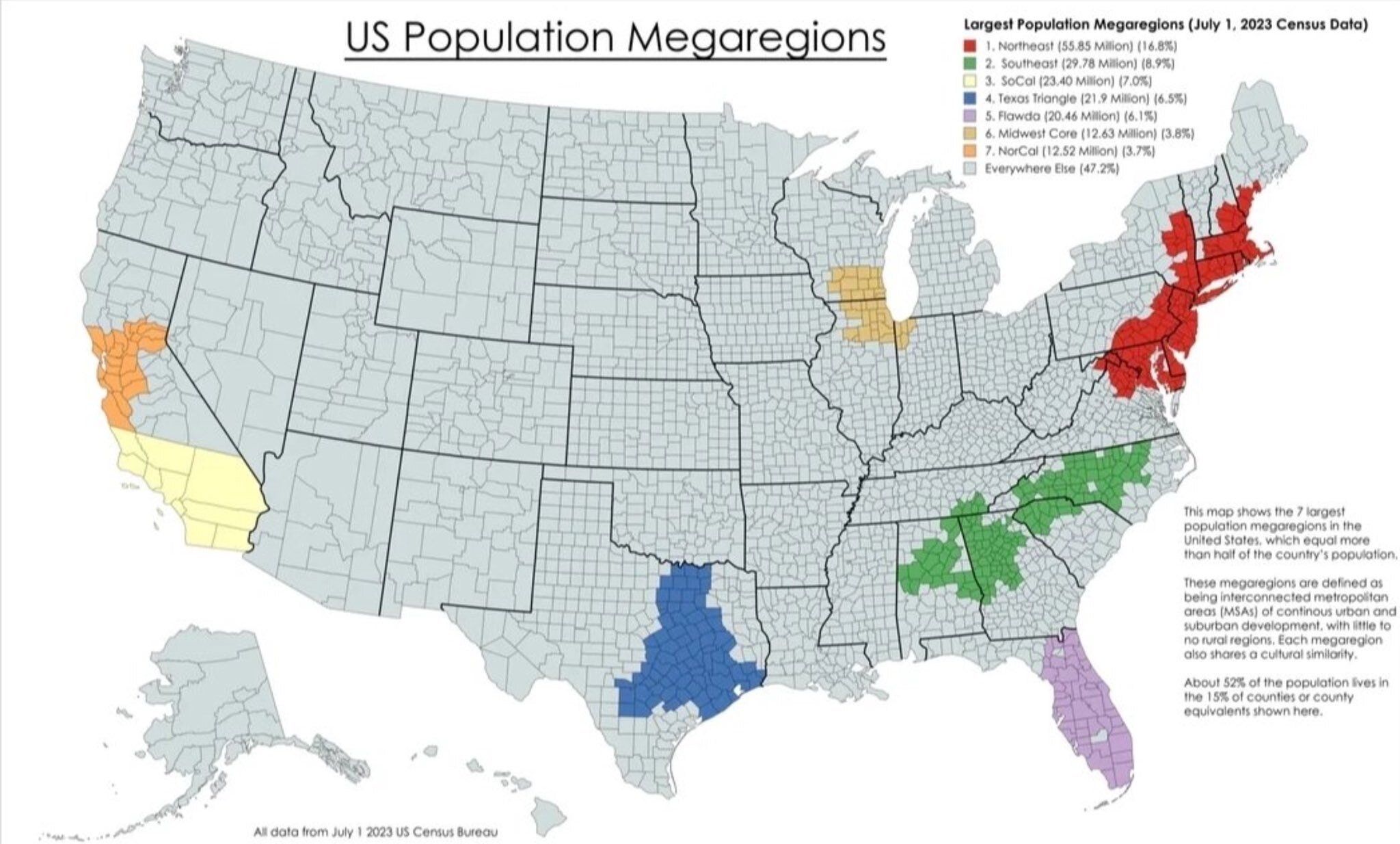
Chart of the Day: Florida's 6%
Today’s Chart of the Day with data from the US Census Bureau compiled by Michael Arouet shows that 52% of the US population lives in seven “Mega..

Chart of the Day: Half of World GDP
Today’s Chart of the Day from Epic Maps, @Locati0ns on X, shows that 50% of the world’s Gross Domestic Product (aka GDP, which is a measure of all..
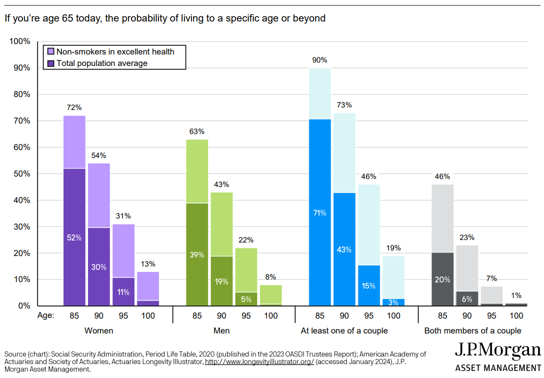
Chart of the Day: Odds to Live at Age 65
Today’s Chart of the Day from JP Morgan shows the probability of how long you'll live if you reach age 65.
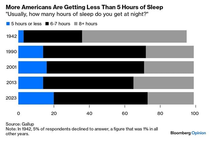
Chart of the Day: 20% Less Than 5 Hours
Today’s Chart of the Day is from Bloomberg and shows the amount of sleep Americans are getting is less and less.
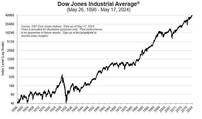
Chart of the Day: The Dow's Double Double
Today’s Chart of the Day is from the S&P Dow Jones Indices showing the history of the Dow Jones Industrial Average index. It started in 1896 at 40..
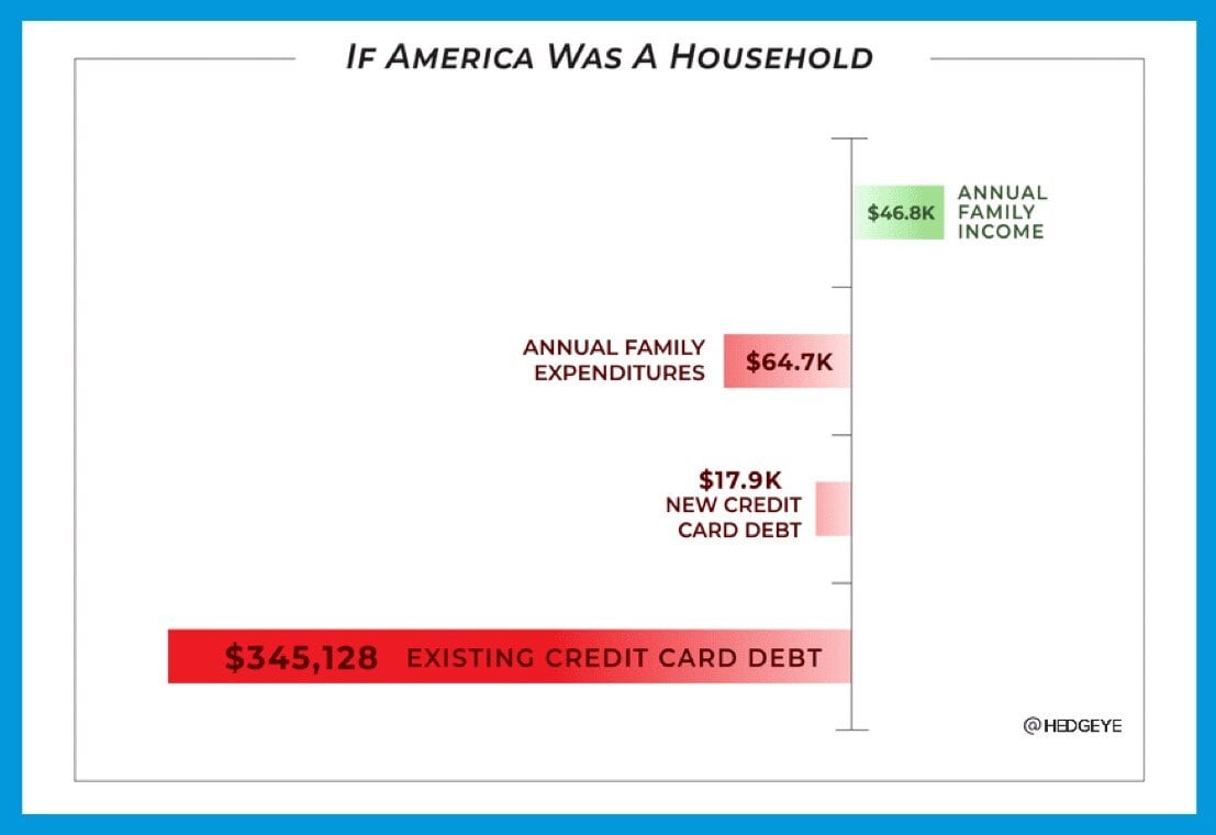
If America Was a Household
Today’s Chart of the Day is from @hedgeye on X, formerly known as Twitter, and shows what a typical family income would look like if the US was a..
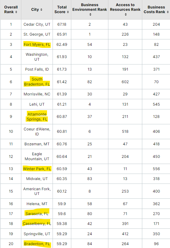
Chart of the Day: Florida Top 7 out of 20
Today’s Chart of the Day was shared by my colleague Christine Davis, Director of Commercial Banking Services at Crews Bank & Trust.

