
Chart of the Day: Darkest Before the Light
Contents
About the Author

Learn about our Refer-a-Friend Program. Terms and conditions apply.
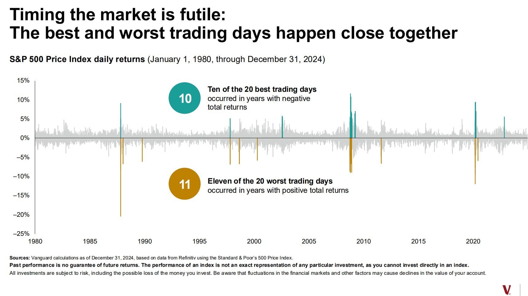
Today’s Chart of the Day is a classic one provided by Vanguard and was recently updated to reflect 2024 performance. It highlights the best and worst days going back to 1980, and notes that often, the best “up” days are right after the worst “down” days. This supports the assertion to not panic on the "down" days since, more often than not, better skies are not far away. As portfolio managers, we understand this concept and try to buy as much as we can on the “down” days.
Samuel serves as Senior Vice President, Chief Investment Officer for the Crews family of banks. He manages the individual investment holdings of his clients, including individuals, families, foundations, and institutions throughout the State of Florida. Samuel has been involved in banking since 1996 and has more than 20 years experience working in wealth management.
Investments are not a deposit or other obligation of, or guaranteed by, the bank, are not FDIC insured, not insured by any federal government agency, and are subject to investment risks, including possible loss of principal.