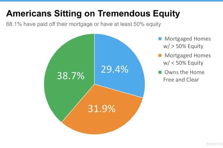
Chart of the Day: Tremendous Equity
Today’s Chart of the Day shows that a combined 68% of Americans have paid off their mortgage or have at least 50% in equity. If there is a “downturn”..

Chart of the Day: ETFs Win Again
Today’s Chart of the Day from OliverWyman shows the number of new funds being created each year in the U.S. since 2016.
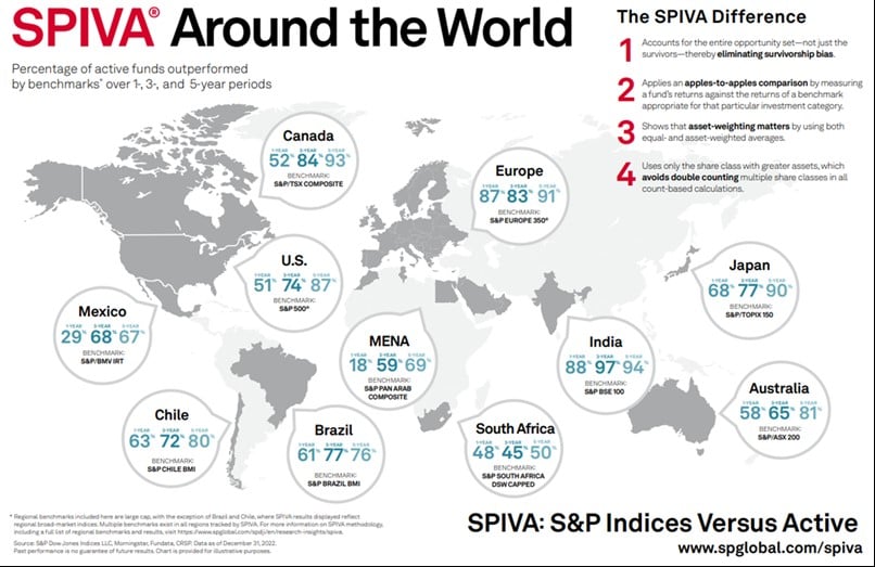
Chart of the Day: Index vs. The World
Over the last five years, 87% of actively managed funds in the US underperformed their index. Today’s Chart of the Day from S&P Global shows this..
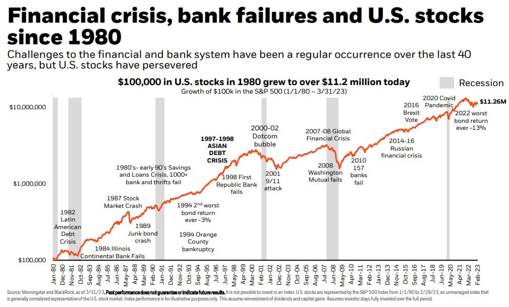
Chart of the Day: Stocks since 1980
Today’s Chart of the Day from iShares by BlackRock shows that, even though we've experienced numerous financial problems along the way, $100,000..
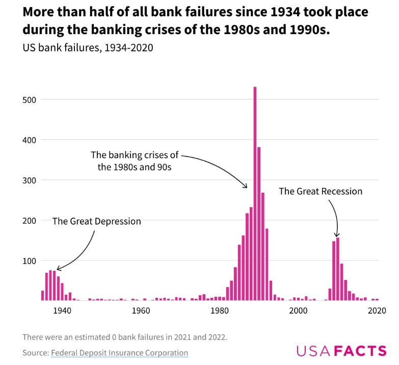
Chart of the Day: History of Bank Failure
Today's Chart of the Day is the history of bank failures from USAFacts. The year 1989 was the height with 531 banks failing from a savings and loan..
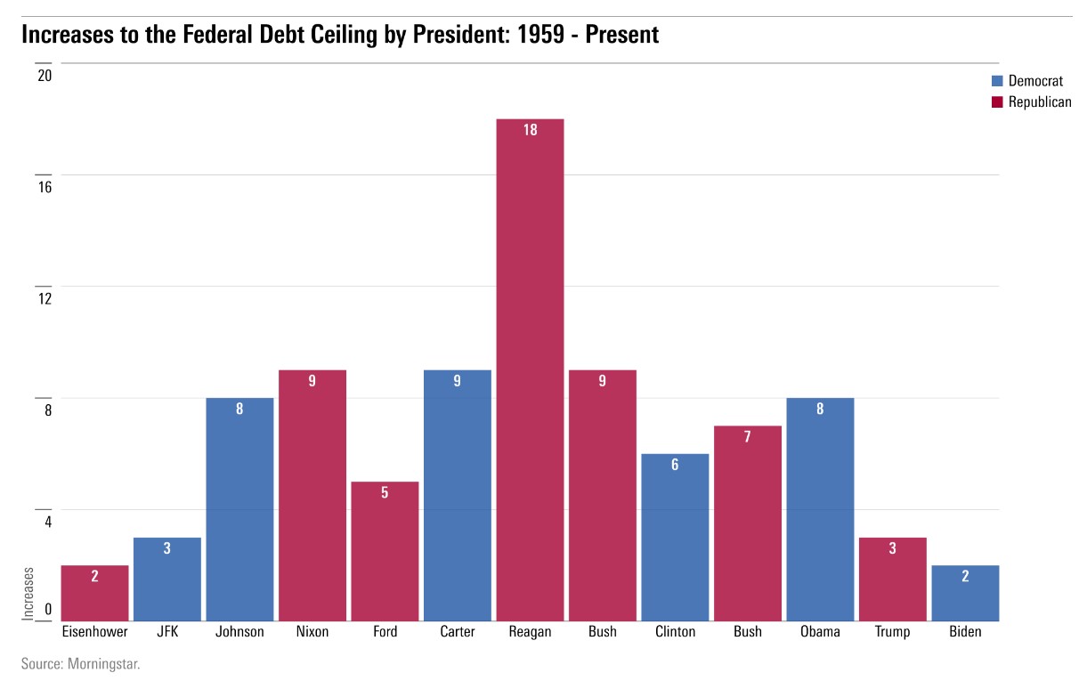
Chart of the Day: Debt Ceiling
Today’s Chart of the Day comes from Morningstar.com. In the last 40 years, the debt ceiling has gone up 53 times.
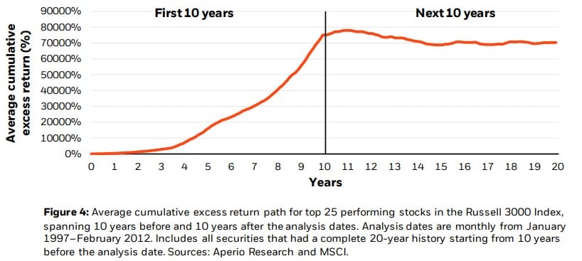
Chart of the Day: First 10 Years vs. Next 10 Years
Today’s Chart of the Day is from a BlackRock research paper on concentrated portfolio risks. In it, they graph the top 25 performing stocks over the..
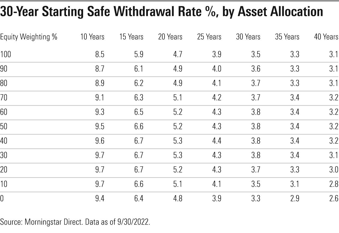
Chart of the Day: 4.2% Withdrawal Rule
Today's chart from Morningstar shows there is a 90% chance you would not run out of money during your life following these projected safe withdrawal..
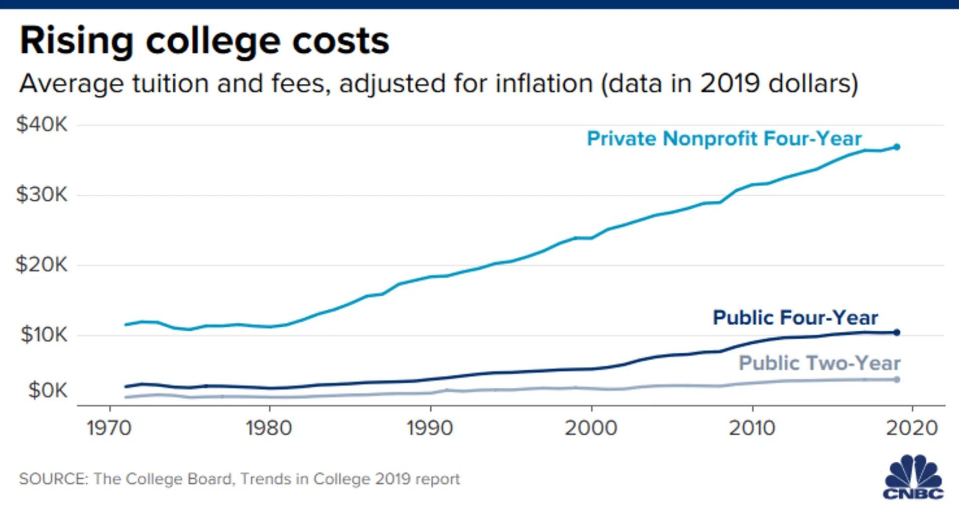
Chart of the Day: 50 Year Cost of College
Today’s Chart of the Day provided from CNBC with data from The College Board shows the average cost of college adjusted for inflation since 1970.

