
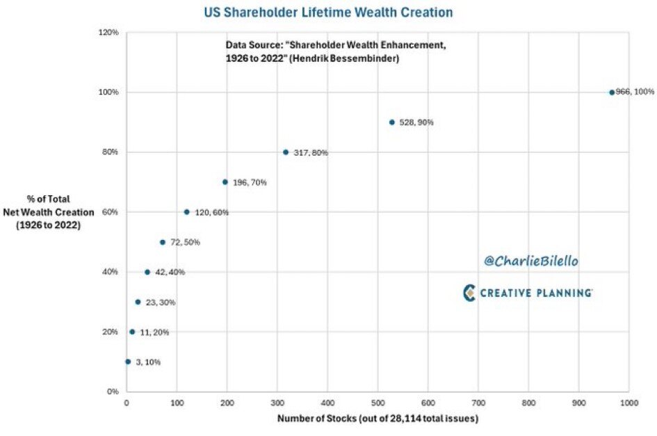
Chart of the Day: 2% Created 90% of Returns
Today’s Chart of the Day is from @CharlieBilello from the Hendrick Bessembinder paper called “Shareholder Wealth Enhancement” published in 2023.
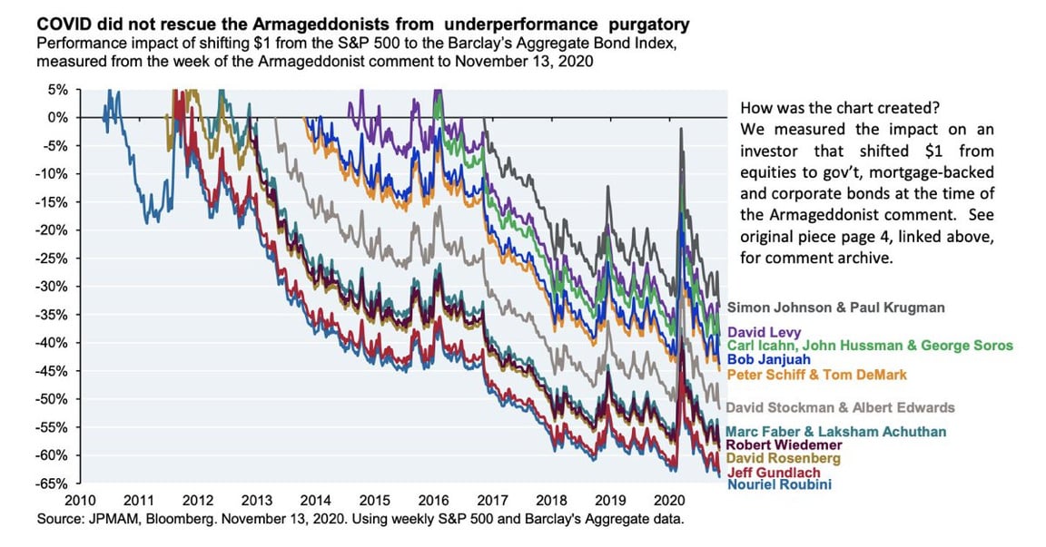
Chart of the Day: Chart of the Doomsday
Today’s Chart of the Day from JP Morgan shared by @StevenKelly49 on X shows the results of popular economists who predicted “Doomsday” scenarios and..
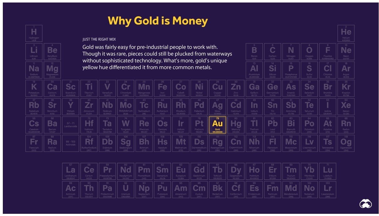
Chart of the Day: Why Gold is Money
Today’s Chart of the Day is a classic from Visual Capitalist outlining why “Gold is Money” and the other 117 elements are not.
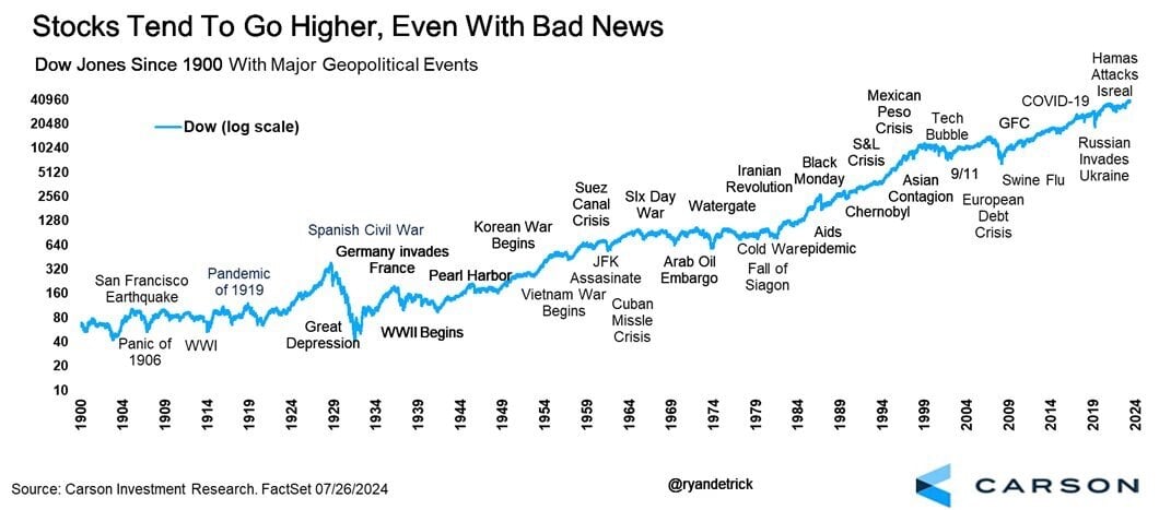
Chart of the Day: 124 Years
Today’s Chart of the Day from Carson Investment Research shows the 35 major “bad news” events in the stock market going back to 1900.
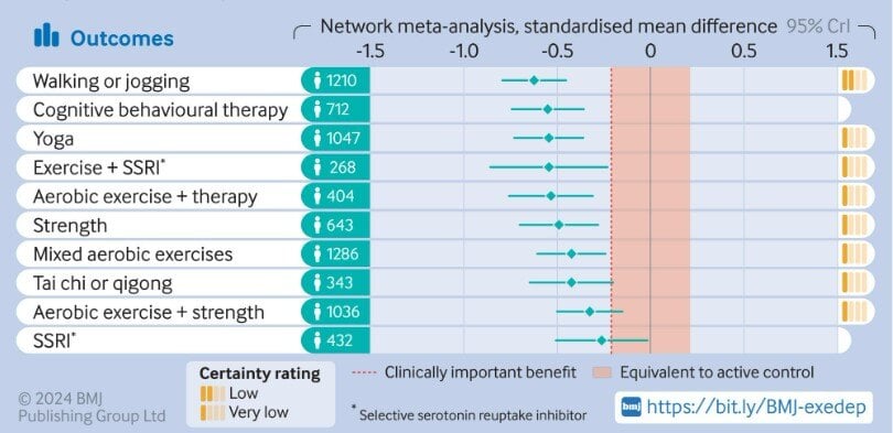
Chart of the Day: Depression and Walking #1
Today's Chart of the Day is from a research article in the British Medical Journal titled “Effect of Exercise for Depression.”
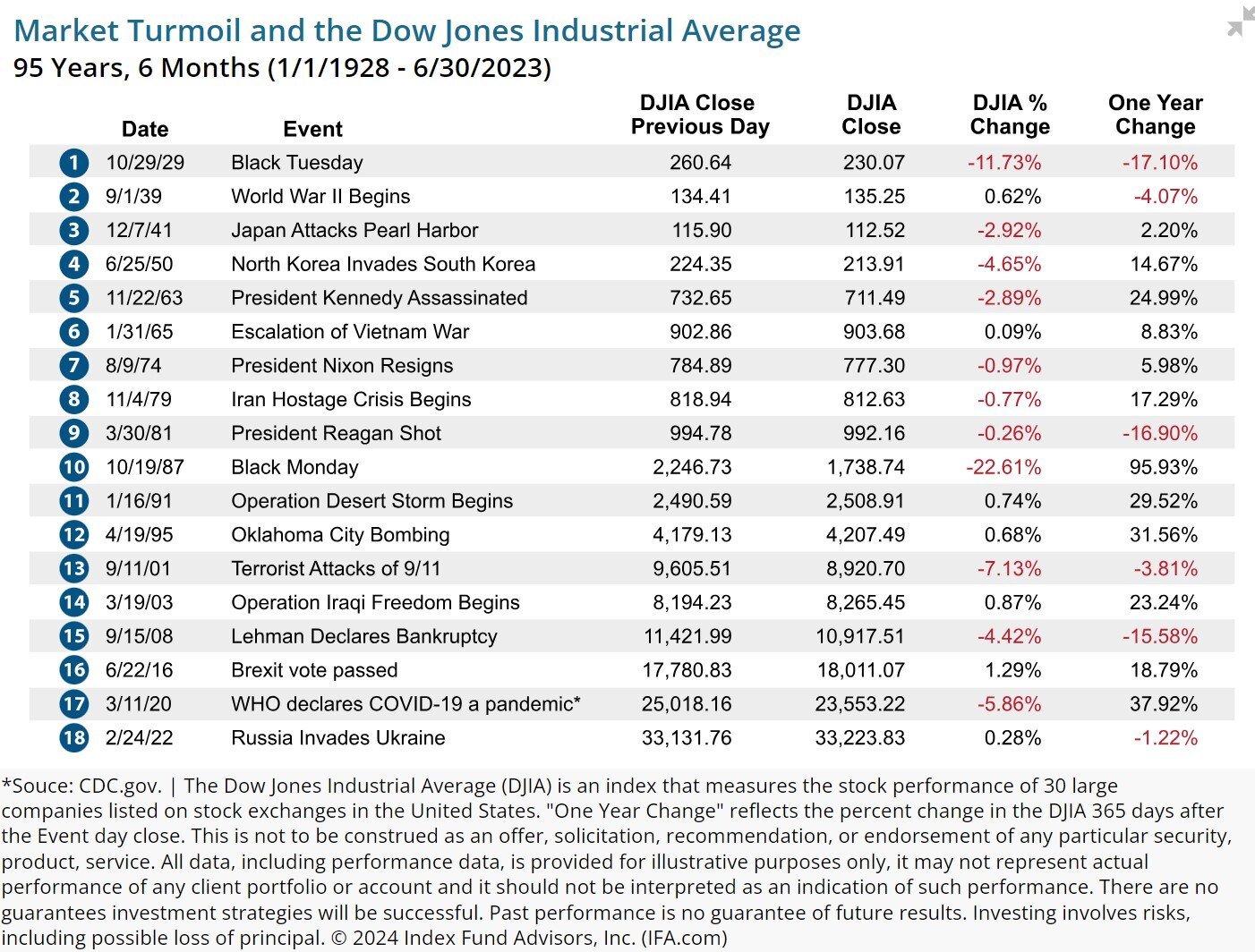
Chart of the Day: Every Five Years or So
Today’s Chart of the Day, from an article written by Robin Powell with IFA.com, shows the 18 largest market events over the last 95 years.

Chart of the Day: Hurricanes and the Equator
Today’s Chart of the Day is a slight departure from a typical financial post, and similar to one I shared a few years ago, but has some additional..
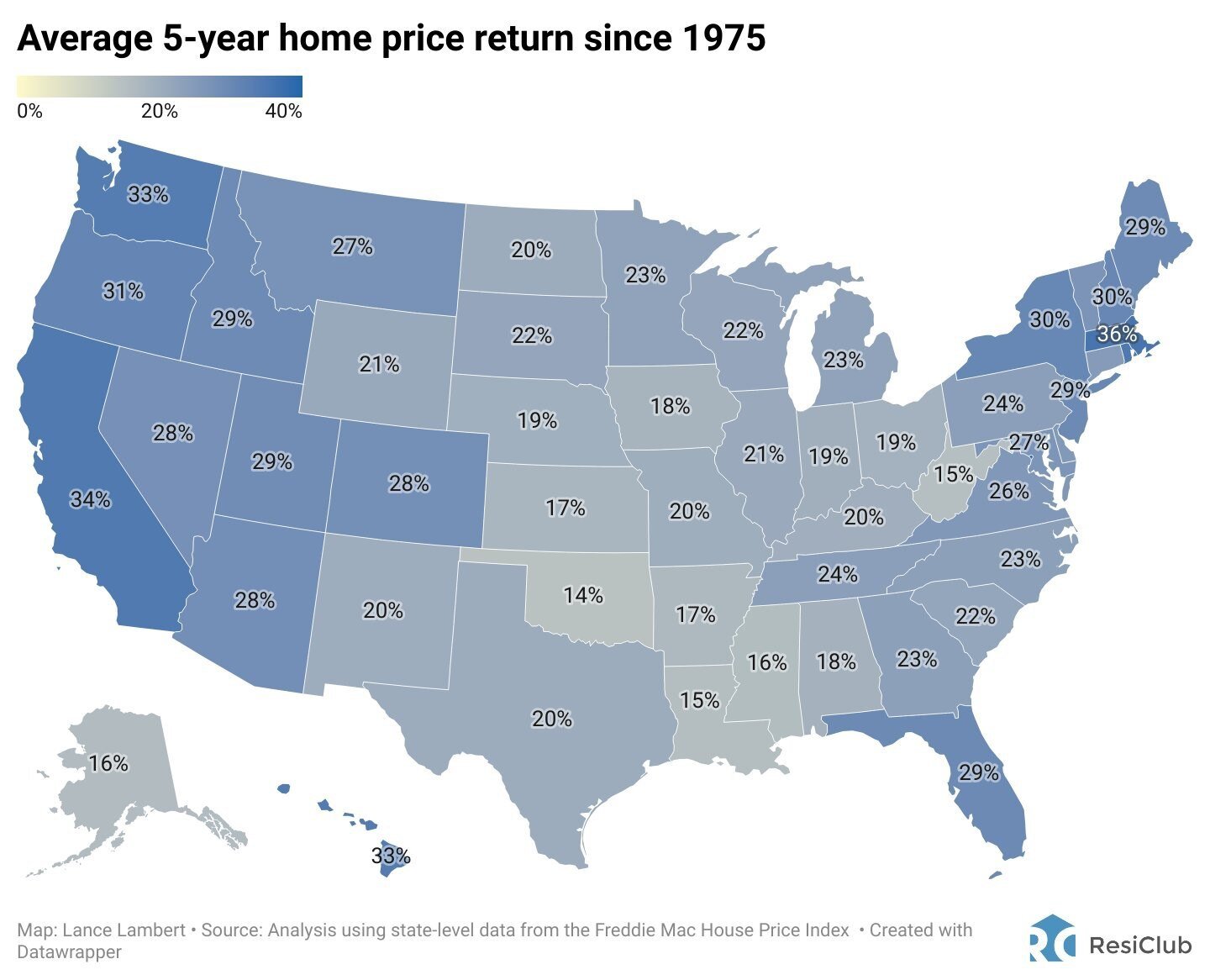
Chart of the Day: Real Estate Over Five Year Spans
Today’s Chart of the Day from ResiClub shows the average 5-year home price return has averaged 26% per state since 1975.
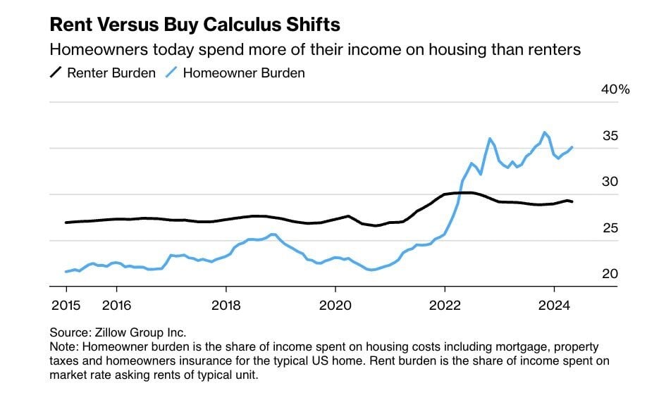
Chart of the Day: Imbalance of Rent vs. Buy
Today’s Chart is from Zillow showing that typically the share of income spent on housing costs for homeowners, such as mortgage, taxes, and..