The Financial Blog
FEATURED RESOURCE
Chart Of The Day
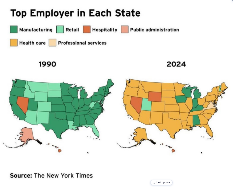
Chart of the Day: Top Employers
Today’s Chart of the Day shared by my colleague Jackson Garner is from an article in the New York Times showing the change in the top employer (by..
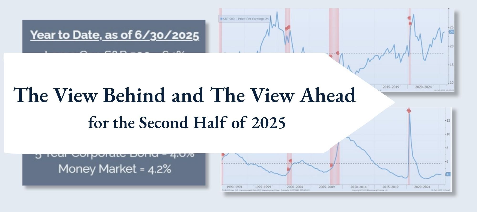
Chart of the Day Extra: The Year-to-Date Recap
As we closed out the first half of 2025, all I could think is, “That was a wild ride!”
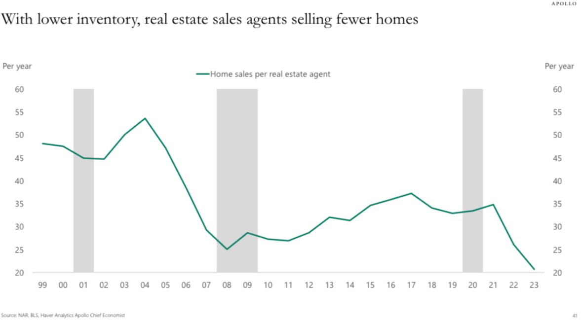
Chart of the Day: Number of Homes Sold Per Agent
Today’s Chart of the Day is from Torsten Slok of Apollo Global Management's US Housing Outlook report, showing home sales per real estate agent since..

Chart of the Day Extra: Complimentary Estate-Planning Seminars 7/29-31
Join Christine Hause, Vice President and Senior Wealth Strategist, and me, Chart of the Day author Samuel A. Kiburz, Senior Vice President, Chief..

Chart of the Day: % of Their Car
Today’s Chart of the Day, from Barron’s with data from Bloomberg, shows what percentage of a car is assembled in the US by manufacturer and the..
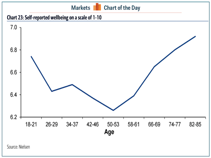
Chart of the Day: Age 52 Then Happier
Today’s Chart of the Day, based on a Nielsen survey, shows the changes in the level of self-reported wellbeingon a scale from 1-10, by age.
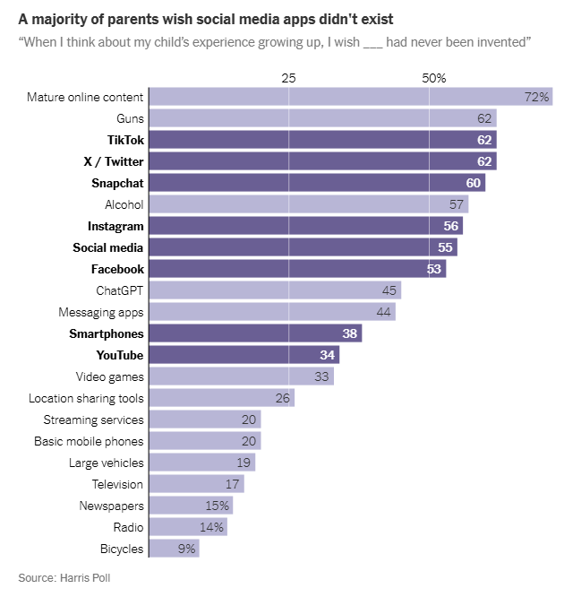
Chart of the Day: Wish This Was Not Around
Today’s Chart of the Day, “We Don’t Have to Give in to the Smartphones,” is from a New York Times article.
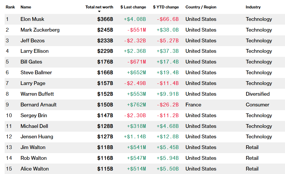
Chart of the Day: Top 15 Individuals
Today’s Chart of the Day is from Bloomberg’s Billionaires Index, listing the 15 wealthiest individuals on the planet.
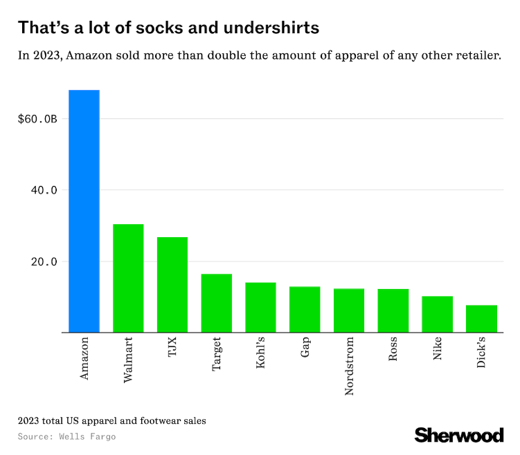
Chart of the Day: Amazon Clothes for the Win
Today’s Chart of the Day, from Wells Fargo in an article by Sherwood, is something to ponder the next time you’re at the mall - if you still go.

