Be Wary of Non-Traded REITs
Today’s Chart of the Day comes from the Wall Street Journal and highlights why investing in Non-Traded, or illiquid, assets pose additional risk.
Learn about our Refer-a-Friend Program. Terms and conditions apply.
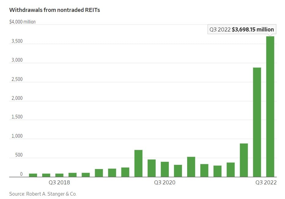
Today’s Chart of the Day comes from the Wall Street Journal and highlights why investing in Non-Traded, or illiquid, assets pose additional risk.
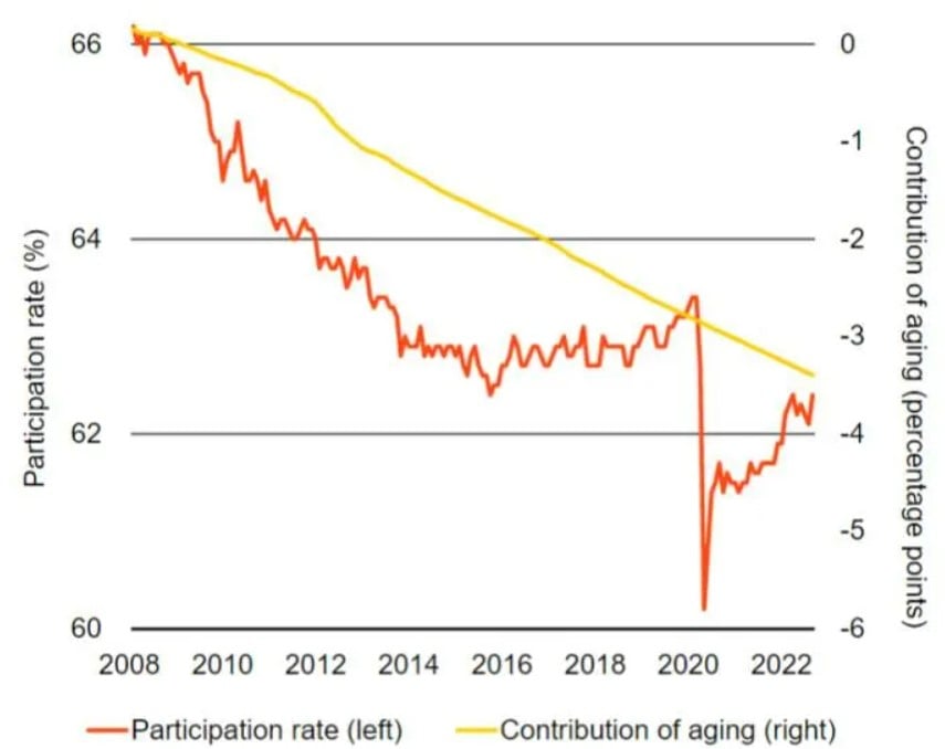
Today’s Chart of the Day comes from the Financial Times and includes an article asking if higher wage demands will increase inflation like in the..
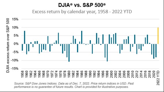
Today’s Chart comes from Benedek Voros from S&P Dow Jones Indices. I always like to point out firsts, and this year there have been many.
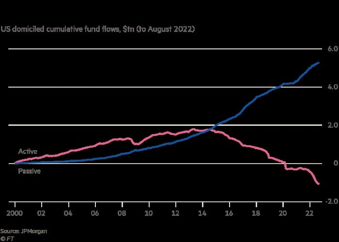
Today’s Chart of the Day comes from FinancialTimes.com and shows that starting in 2015, and each year after, investment funds left actively managed..

Today’s Chart of the Day comes from Compounding Quality, @QCompounding on Twitter, and shows that over the last 20 years, the average investor..
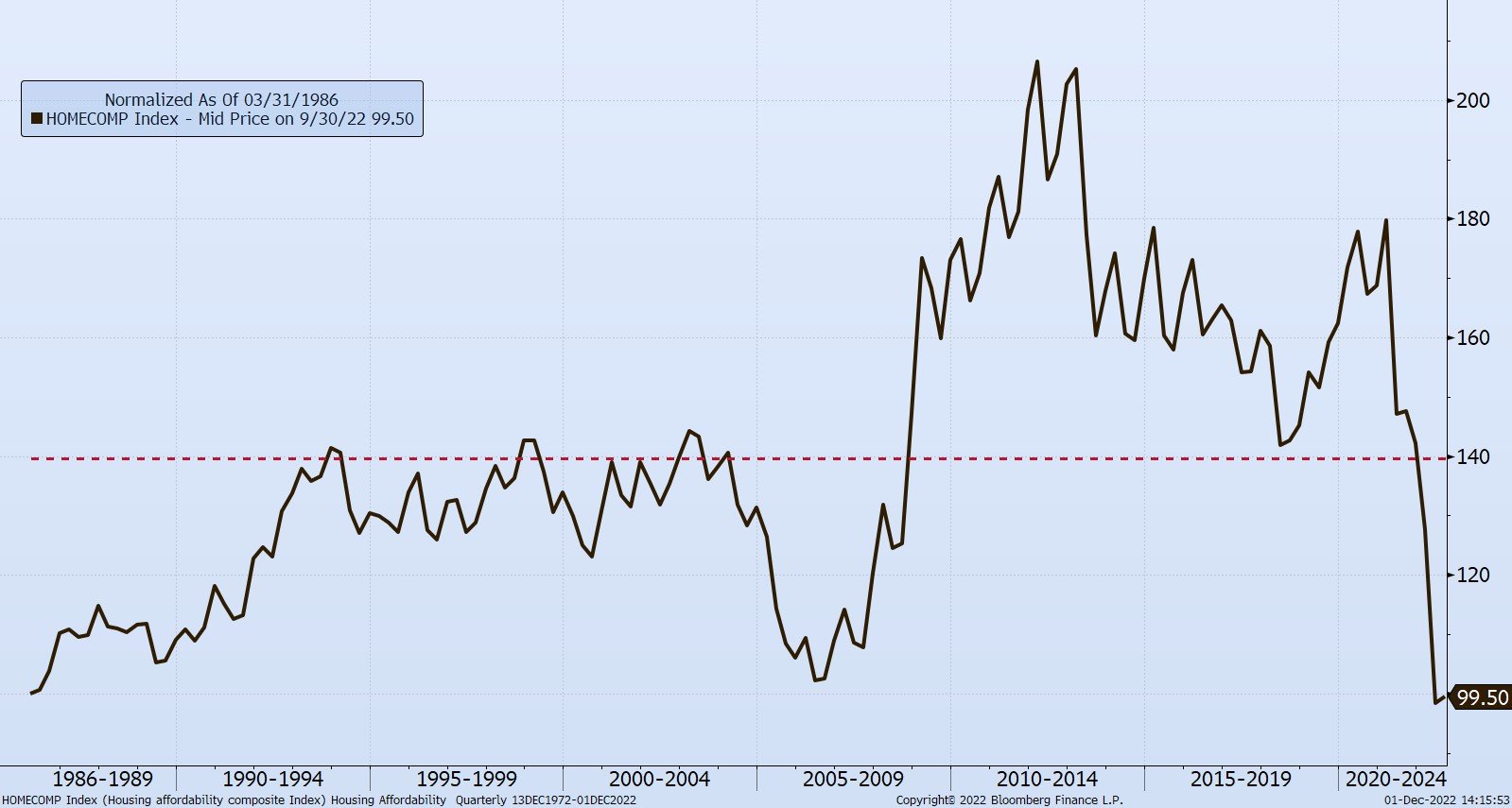
Today’s Chart of the Day is the history of the Housing Affordability Composite Index provided by the National Association of Realtors going all the..

Today’s Chart of the Day from S&P Dow Jones shows the percentage of time the top 25%, or top quartile, of active investment managers stayed in the..

According to Mighty History, “maybe one of the Navy’s finest moments came at the 1864 Battle of Mobile Bay, where Adm. David Farragut forced his way..
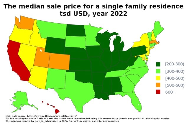
Today’s Chart of the Day comes from @WallStreetSilv on Twitter, with data provided by Redfin, covering the median sale price for a single-family..
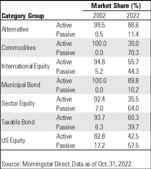
Today’s Chart of the Day comes from @MorningstarInc and @MstarBenJohnson on Twitter. It shows the change from actively to passively managed..
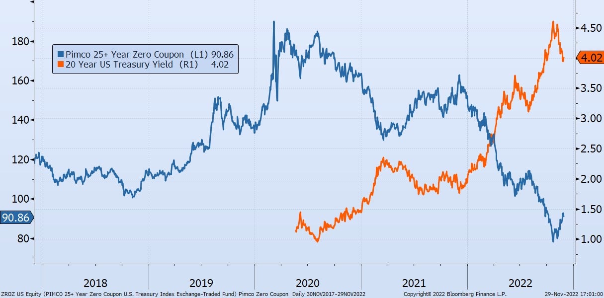
Today’s Chart of the Day is the five-year performance of the PIMCO over 25-year Zero Coupon Treasury (ZROC) in blue versus the 20-year US Treasury..
The theory that index/passive funds perform better than actively managed funds is backed by the fact that 90% of active funds underperformed their..
As high school seniors finish out the school year, some may be asked, “What are you going to major in at college?” Today’s Chart of the Day comes..
We often talk about how over the last 10+ years investors have, in general, been moving out of mutual funds and into Exchange Traded Funds, also..
Samuel serves as Senior Vice President, Chief Investment Officer for the Crews family of banks. He manages the individual investment holdings of his clients, including individuals, families, foundations, and institutions throughout the State of Florida. Samuel has been involved in banking since 1996 and has more than 20 years experience working in wealth management.
Investments are not a deposit or other obligation of, or guaranteed by, the bank, are not FDIC insured, not insured by any federal government agency, and are subject to investment risks, including possible loss of principal.
Today’s Chart of the Day comes from the Wall Street Journal and highlights why investing in Non-Traded, or illiquid, assets pose additional risk.
Today’s Chart of the Day comes from the Financial Times and includes an article asking if higher wage demands will increase inflation like in the 1970s. However, this time it is different since the workforce is shrinking as shown by the Participation Rate, the falling orange line in the chart. The participation rate is defined as the percentage of healthy people 16 or older who are actively working or looking to do so.
Today’s Chart comes from Benedek Voros from S&P Dow Jones Indices. I always like to point out firsts, and this year there have been many.
Today’s Chart of the Day comes from FinancialTimes.com and shows that starting in 2015, and each year after, investment funds left actively managed funds, in red, and were reinvested into passive funds, in blue, which have grown each year for the last 22 years.
The interesting part is the year over year growth is accelerating in 2022 as the downturn in both stock and bond prices provided an opportunity to sell out of many funds and not pay capital gain taxes. Any further downturns in 2023 could accelerate this trend even more.
Today’s Chart of the Day comes from Compounding Quality, @QCompounding on Twitter, and shows that over the last 20 years, the average investor realized only an annual return of 3.6%. This is less than 4.3% on bonds, and not much higher than inflation of 2.2%, meaning that many just barely broke even after inflation and taxes. This can be compared to a return of 9.5% on the large-cap stock index, or 7.4% for even a conservative generic portfolio of 60% stocks and 40% bonds.
Today’s Chart of the Day is the history of the Housing Affordability Composite Index provided by the National Association of Realtors going all the way back to 1986, with the average line in dotted red.
Today’s Chart of the Day from S&P Dow Jones shows the percentage of time the top 25%, or top quartile, of active investment managers stayed in the top 25% after five years. A higher-than-average figure will tell us if the active managers have genuine skill or merely experienced good luck.
If you flipped a coin, randomness would assume 25% of them would stay in the top 25%; however, the evidence does not support this. Yes, 27% of large-cap managers do, which shows that by and large their performance is merely good luck. However, the chilling figures are only 1.5% mid- and 0.9% of small- do. These are terrible odds. To add insult to injury, 15% and 23% of mid- and small-cap managers end up at the bottom 25%, meaning that even in the unlikely event you picked a good one, odds suggest you should sell it right afterward.
There are many theories to why this is, and we’ve discussed them in previous blogs including Why Indexing Works.
In the end, the significantly worse than average probability of active managers constantly beating the market in mid- and small-cap stocks is why we only use passive index funds.
According to Mighty History, “maybe one of the Navy’s finest moments came at the 1864 Battle of Mobile Bay, where Adm. David Farragut forced his way through a Confederate minefield and fought the Confederate Navy to a standstill.
Today’s Chart of the Day comes from @WallStreetSilv on Twitter, with data provided by Redfin, covering the median sale price for a single-family residence in the United States.
Often the price of a house is constrained by the cost to build the structure which limits a wide range. For instance, why pay more for an existing house than you can build a new one for? So, the $200,000 to $600,000 range is quite alarming. Although the size of the home will impact the price, I suspect a large part of the wide range is in the cost of the underlying land, which is influenced by places with better weather, proximity to better employment opportunities, and scarcity of useful land to build on. For instance, places near the water, mountains and lakes could be influenced by these factors.
Today’s Chart of the Day comes from @MorningstarInc and @MstarBenJohnson on Twitter. It shows the change from actively to passively managed investments over the last 10 years.
We often talk about this shift from active to passive, but it's interesting to see that it is not uniform throughout the different types of investments. For instance, in “alternative” investments such as private equity, hedge funds, and long-short funds, the industry’s use of passive investments only went from 1% to 11%.
In commodities, however, passive investments went from 0% to 70%. I suspect passive works better in commodities since the alpha, the opportunity to outperform, is low and low costs are a primary driver of returns.
We primarily use Taxable Bonds and US Equity, and they went from 6% to 40% and 17% to 57%, respectively. Again, primarily from the low alpha and low costs.
It will be interesting to see what the percentages are in 2032.
Today’s Chart of the Day is the five-year performance of the PIMCO over 25-year Zero Coupon Treasury (ZROC) in blue versus the 20-year US Treasury Yield in orange. Since the peak at $189 in 2020, the value of the PIMCO fund has declined 70% to only $90.
According to VettaFi, “ZROZ invests exclusively in . . . the final principal payments of U.S. Treasuries with at least 25 years remaining until maturity. As such, this product will be very sensitive to changes in interest rate movements, performing very well when rates fall but likely struggling if rates begin to climb.”
The reason for the volatility is the fact that there are no interest payments during the life of the loan, and only one payment of principal at the end, there is no chance to reinvest periodic interest payments at higher rates when rates rise. Or conversely, run the risk of reinvesting the interest payment at a lower rate when rates decline.
Why invest in such a product you may ask? Where does the stated return of 3.80% come from? Well, as an example, when a zero coupon bond was issued it could be purchased for $40, then held for 25 years until you get $100 back at maturity.
When the 20-year rates were 1.00% in the summer of 2020, the 3.80% guaranteed appreciation in your principal for the 25 years looked very attractive, hence the near doubling of the price. However, when rates are at their current yield of 4.00% the price fell just as dramatically and is now back to its normal “pre-pandemic” price.
What can we learn?
We can learn that in fixed income, just because bond’s price is down 70%, this does not mean it is “on sale” or provide an opportunity to “buy the dip.” The 3.80% yield you see is what you get when you hold it to maturity. No more, no less. The rate will not change and therefore provides no real “buying opportunity.”
This is evident in this investment, since despite the wild ride up and back down, the investor simply is back to where they started, earning their original 3.8% for the next 25 years.
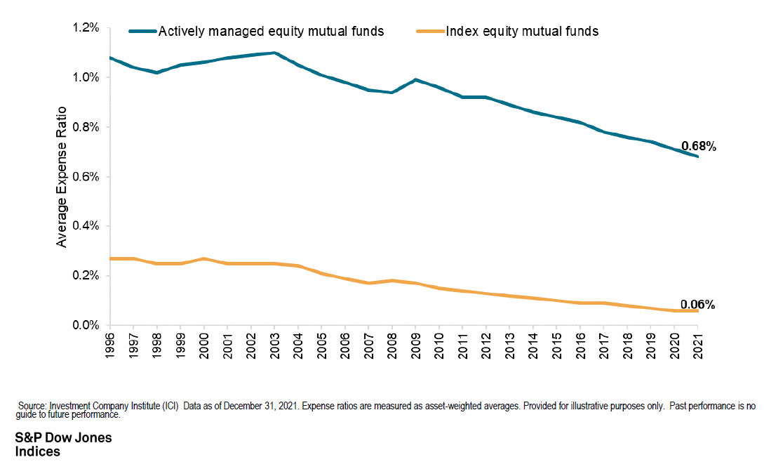
The theory that index/passive funds perform better than actively managed funds is backed by the fact that 90% of active funds underperformed their benchmarks over the last 10 years. So, it begs the question, “Why?”
Firstly, index funds do not have the added expenses of investment analysists and advisors, lowering overall cost and ultimately leaving more returns for investors to keep.
The chart above from S&P Dow Jones Indices shows the average actively managed fund costs 0.68% versus index funds of only 0.06%. So, right off the bat, every year the actively managed fund starts 0.62% in the hole.
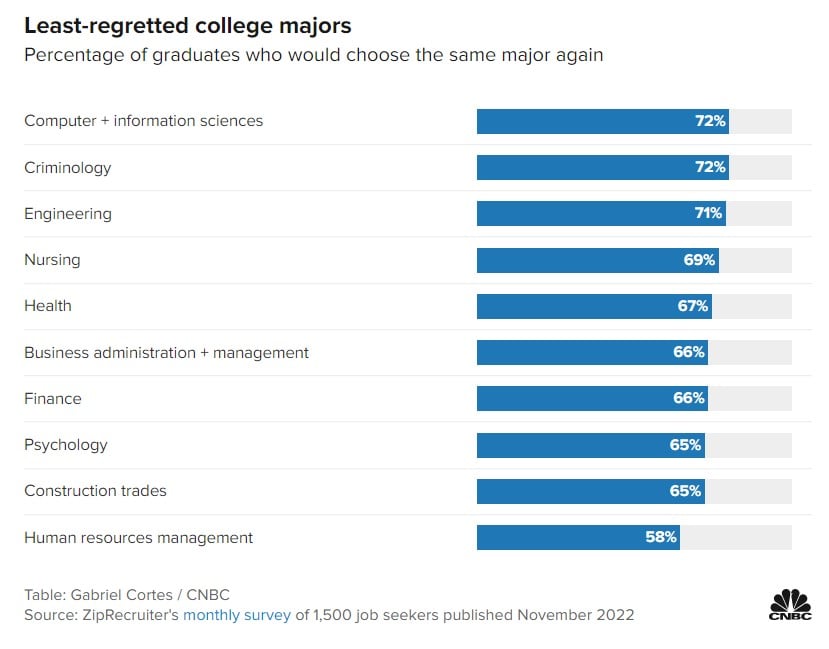
As high school seniors finish out the school year, some may be asked, “What are you going to major in at college?” Today’s Chart of the Day comes from CNBC.com who surveyed 1,500 job seekers for the percentage of graduates who would choose the same major again. The article also included the “most regretted” majors; however, you’ll have to click on the link to see that.
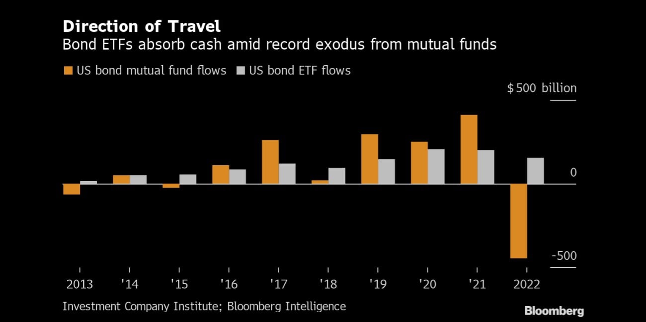
We often talk about how over the last 10+ years investors have, in general, been moving out of mutual funds and into Exchange Traded Funds, also known as ETFs. However, this year the pattern is even more prevalent with bonds. So far this year, a record $446 billion exited bond mutual funds and went into bond ETFs and bank accounts.
Why do we use bond ETFs instead of actively managed bond mutual funds? Bond ETFs have substantially lower costs, more liquidity, increased transparency, and over the last 10 years had a better return than 90% of actively managed mutual funds.
current_page_num+2: 21 -

