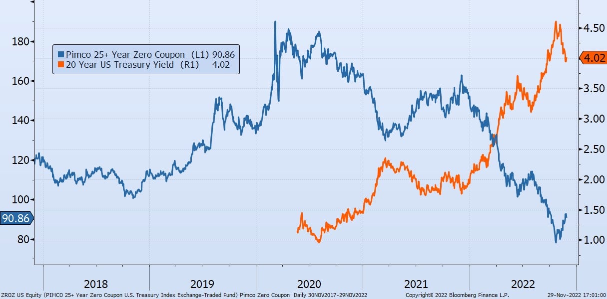
Skip to content
Get Started 863-222-7005

Blog

Your Weekly
Financial Forecast


Stay informed with sound financial know-how

One of our clients calls this the “Chiclets Chart” because of its resemblance to that classic brand of candy-coated chewing gum.

The "Chiclets Chart"

One of our clients calls this the “Chiclets Chart” because of its resemblance to that classic brand of candy-coated chewing gum.

Read More

chart shows annual net flows into passive funds (in purple) vs. active funds (in orange), and their dominance for the last 11 years.

Active vs. Passive Funds

Today’s chart from Morningstar shows annual net flows into passive funds (in purple) vs. active funds (in orange), and their dominance for the last..

Read More

chart shows that from 1940 to 2015 life expectancy went up 15 years and the average years spent in retirement went from six to 37.

37 Years of Retirement

Today’s chart from BlackRock shows that from 1940 to 2015 life expectancy went up 15 years and the average years spent in retirement went from six to..

Read More

chart shows that eight companies make up half of the stock market’s 14% decline year to date

Top Heavy = Top Losses

This chart is from today’s Wall Street Journal. Because of their heavy weights in the S&P 500 index, eight companies make up half of the stock..

Read More

chart shows that the overall index is down 18% from all-time highs.

Diversification Saves in Down Markets

The Russell 3000 Index is made up of the largest 2,750 stocks in the United States.

Read More

chart shows income worldwide

Daily Median Income for World

From 2001 to 2017, the daily median income doubled for everyone in the world.

Read More

This chart shows the price for $1 in earnings from all the companies in the S&P 500 index for the last 20 years

Selling Low

The rule of thumb is to buy low and sell high.

Read More

Updated U.S. Persistence Scorecard

Winning is Hard, Staying a Winner is Even Harder

S&P Dow Jones Indices has published their updated U.S. Persistence Scorecard. A mere 2.2% of actively managed U.S. domestic equity funds in the top..

Read More

 top chart shows that over the last 15 years the stock market was the place to be, bottom chart shows real estate performed better over 30 years

Real Estate vs. Stock Market

Past performance is no predictor of future success, but it is interesting to compare the past performance of different investments. These charts show..

Read More

chart shows the level of dividends for all the stocks in the S&P 500

Sale and Dividends

There are two ways to make money in stocks:

Read More

Chart shows risk of large single stock holdings

100% of the Time

I think about this chart often during discussions with clients on having too much exposure to single stocks.

Read More

chart shows that In the past, an average house in the U.S. cost five times the yearly household income (aka our labor). As of November 2021, that ratio was 7.5 times

Real Estate Prices vs. Income

Real estate is unique since humans need a physical place to live and work. Economics says the price of those physical places is constrained by the..

Read More

chart shows that Austria issued a 100-year bond with a duration of 66 years at a price of $98 and an interest rate of 0.88%.

Bond Length Matters

Duration describes the time it takes for a bond holder to get all their money back and/or the change in price for each 1% change in the interest rate.

Read More

chart shows the percentage of funds that underperformed the S&P 500 in the last 12 years.

S&P 500 Wins Again

This chart from an article in today’s Wall Street Journal shows the percentage of funds that underperformed the S&P 500 in the last 12 years. Again,..

Read More

chart shows car dealer profits over the years

Car Dealer Profits

I am reminded of this chart every time I drive by a car lot. Before the pandemic, financing and insurance profits made up 70% of the dealer’s..

Read More

On Our Minds

List Grid
Browse by topic

The "Chiclets Chart"

One of our clients calls this the “Chiclets Chart” because of its resemblance to that classic brand of candy-coated chewing gum.

More

Active vs. Passive Funds

Today’s chart from Morningstar shows annual net flows into passive funds (in purple) vs. active funds (in orange), and their dominance for the last 11 years.

More

37 Years of Retirement

Today’s chart from BlackRock shows that from 1940 to 2015 life expectancy went up 15 years and the average years spent in retirement went from six to 37.

More

Top Heavy = Top Losses

This chart is from today’s Wall Street Journal. Because of their heavy weights in the S&P 500 index, eight companies make up half of the stock market’s 14% decline year to date. It is notable that the value index was only down 3%, while the technology-heavy growth indexes are down 25%. As usual, the S&P 500, which includes both, splits the difference.

More

Diversification Saves in Down Markets

The Russell 3000 Index is made up of the largest 2,750 stocks in the United States.

More

Daily Median Income for World

From 2001 to 2017, the daily median income doubled for everyone in the world.

More

Selling Low

The rule of thumb is to buy low and sell high.

More

Winning is Hard, Staying a Winner is Even Harder


S&P Dow Jones Indices has published their updated U.S. Persistence Scorecard. A mere 2.2% of actively managed U.S. domestic equity funds in the top quartile for 12 months performance at the end of 2019 stayed ahead of three-quarters of their peers when measured two years later.

More

Real Estate vs. Stock Market

Past performance is no predictor of future success, but it is interesting to compare the past performance of different investments.

These charts show the value of $100 invested in real estate (red) and the stock market (blue.)

The chart above shows that over the last 15 years, the stock market was the place to be.

More

Sale and Dividends

There are two ways to make money in stocks:

More

100% of the Time

I think about this chart often during discussions with clients on having too much exposure to single stocks.

More

Real Estate Prices vs. Income

Real estate is unique since humans need a physical place to live and work. Economics says the price of those physical places is constrained by the cost of the physical labor to build them.

More

Bond Length Matters

Duration describes the time it takes for a bond holder to get all their money back and/or the change in price for each 1% change in the interest rate.

More

S&P 500 Wins Again

This chart from an article in today’s Wall Street Journal shows the percentage of funds that underperformed the S&P 500 in the last 12 years. Again, passive indexes beat 85% of the active managers last year, and the majority have done so for 12 consecutive years. This is one of the reasons why we champion passive index funds. 

More

Car Dealer Profits

I am reminded of this chart every time I drive by a car lot. Before the pandemic, financing and insurance profits made up 70% of the dealer’s profits. Now, due to price appreciation of their inventory, that percentage has changed. However, the dollar profits from financing and insurance continue to increase. Car dealers have become more like finance and insurance companies.

More