
Chart of the Day: Richest Billionaires
Today's Chart of the Day from Visual Capitalist shows the richest billionaire in every state.

Today's Chart of the Day from Visual Capitalist shows the richest billionaire in every state.
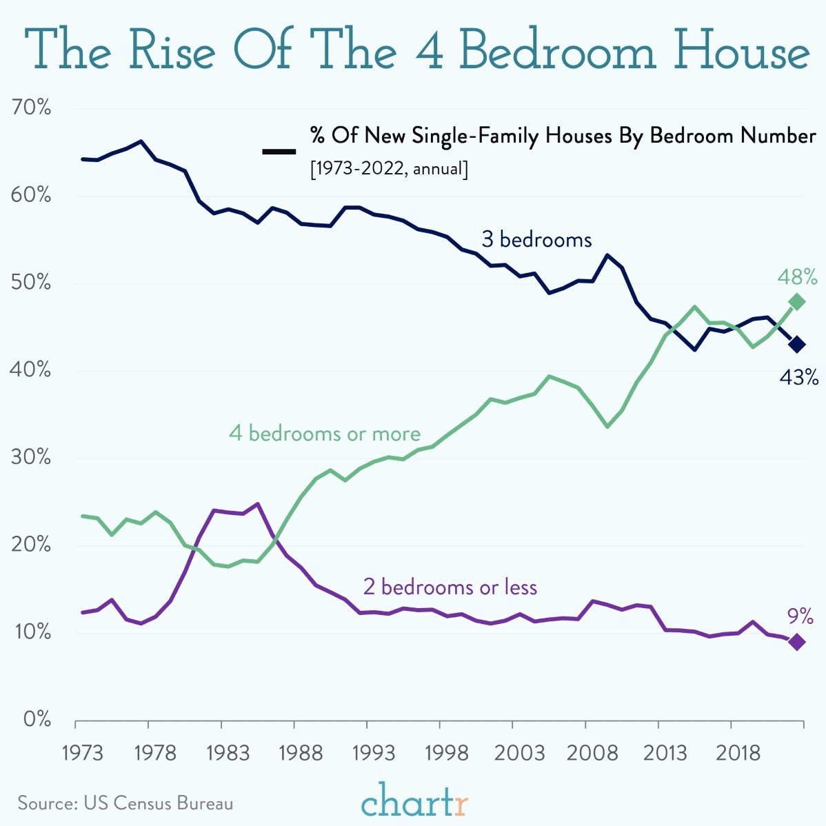
Today’s Chart of the Day from Chartr shows that 4+ bedroom houses went from being 25% of homes in 1973 to just under 50% of the nearly one million..
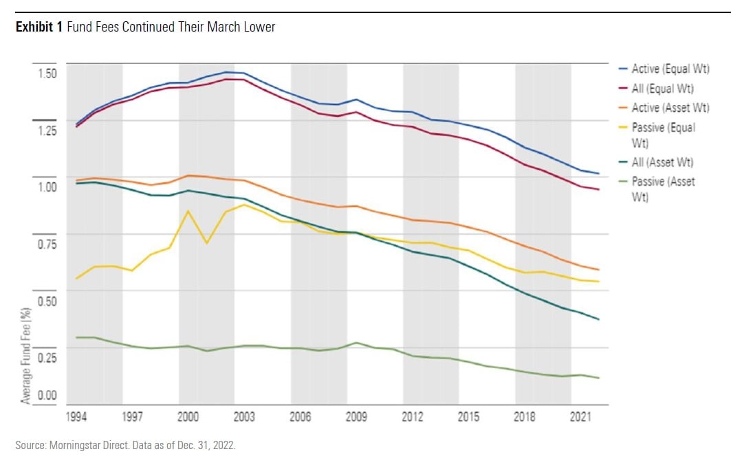
Today’s Chart of the Day comes from the annual 2022 US Fund Fee Study, which was released last month. Conducted by Morningstar, this study goes back..
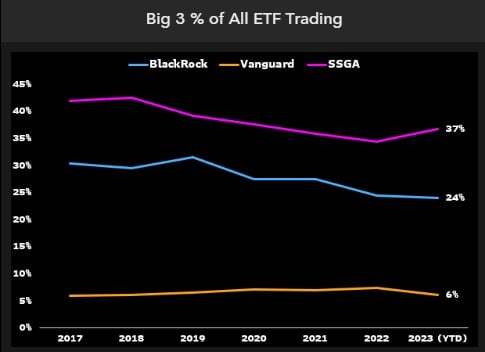
Today’s Chart of the Day from Bloomberg’s Eric Balchunas shows that the “big three” of providers of Exchange Traded Funds (aka ETFs), which are..
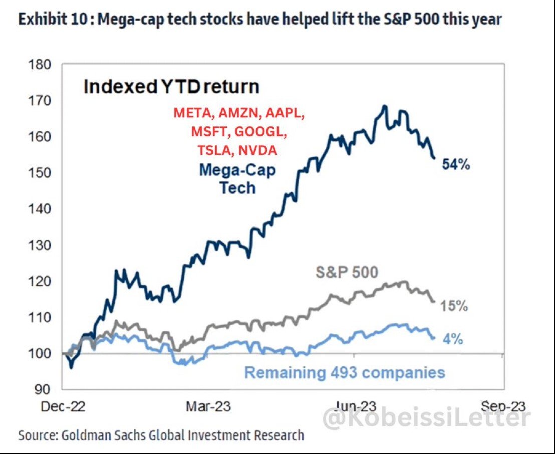
Today’s Chart of the Day shared by @KobeissiLetter on X, formerly known as Twitter, shows that seven companies, often called “The Magnificent Seven”..
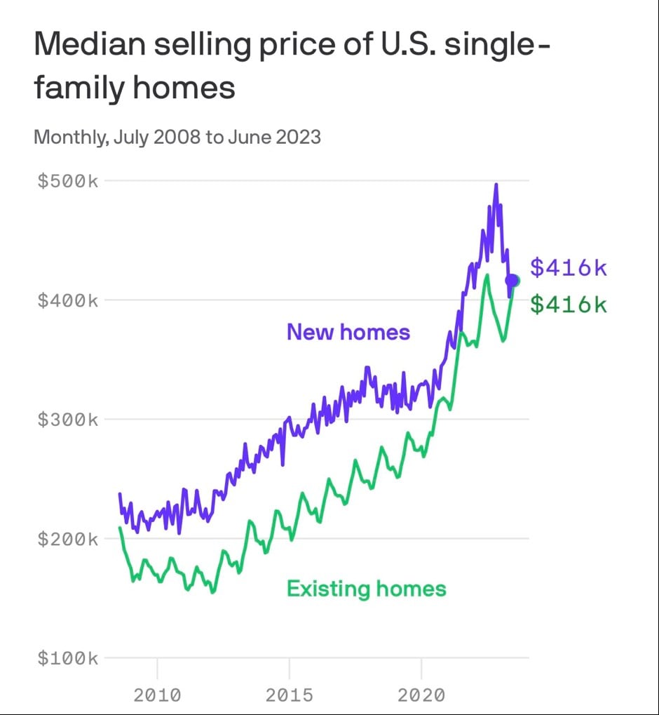
Today’s Chart of the Day from The Kobeissi Letter, @KobeissiLetter on X, shows that the prices of new homes are falling and are now the same price as..
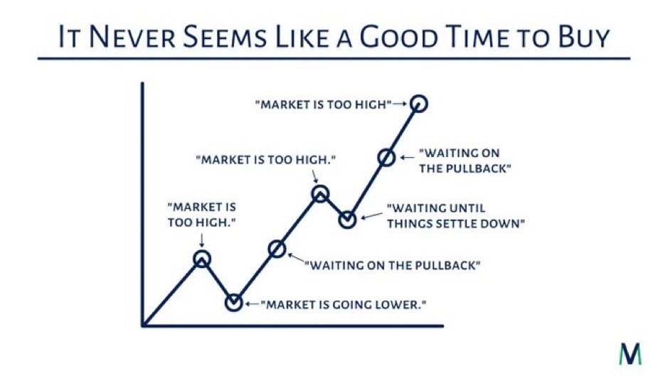
Today’s Chart of the Day from @MVMoneyVisuals on X, formerly known as Twitter, sums up many of the comments heard by advisors over the years. On a..
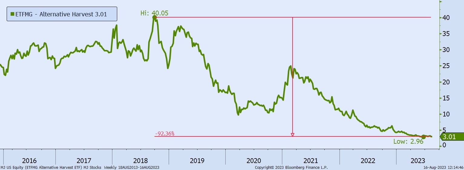
Today’s Chart of the Day is a reminder that investing in the “next big thing” can be fraught with risk, and, in this case, cannabis-related companies..
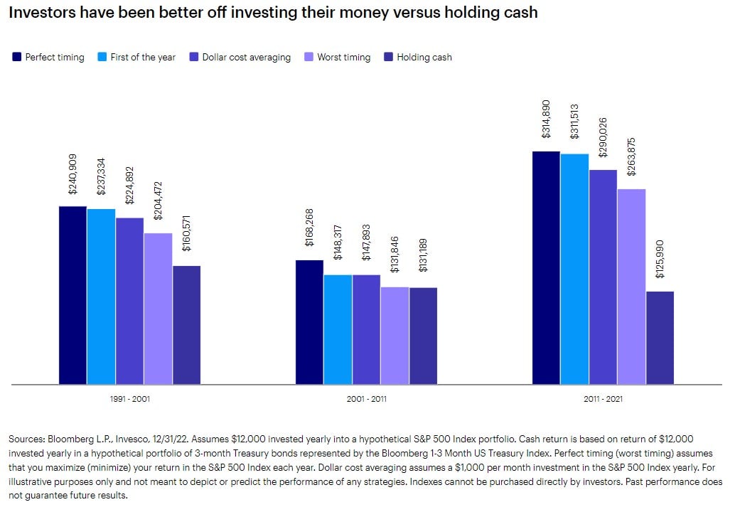
Today’s Chart of the Day and commentary is from Invesco and shows three instances when cash balances were high — following the 1991 and 2002..
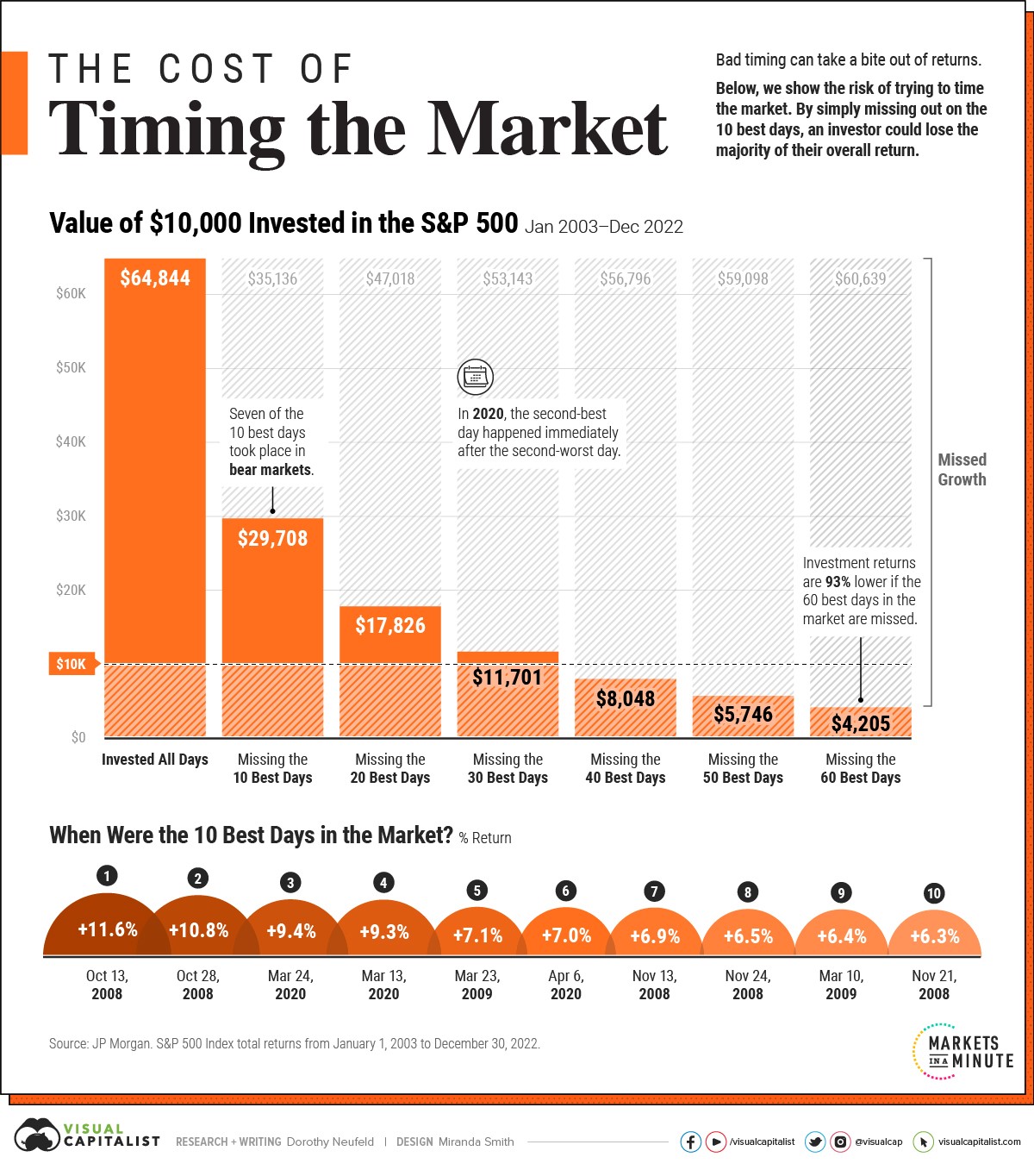
Today’s Chart of the Day from Visual Capitalist shows the impact of missing just a few positive days over the last 20 years. If you've followed the..
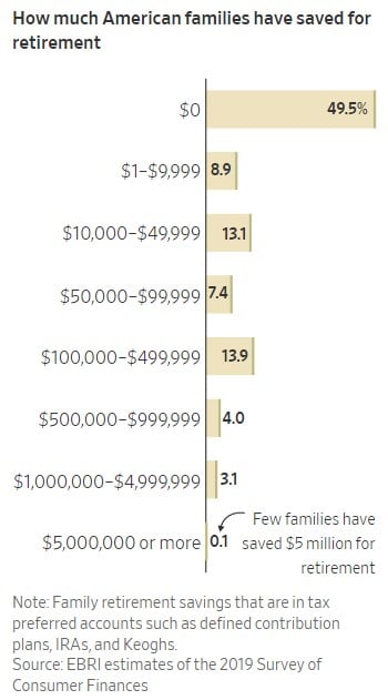
Today’s Chart of the Day shows how much families have saved for retirement. Roughly 50% have ZERO saved, and only 21% have over $100,000.
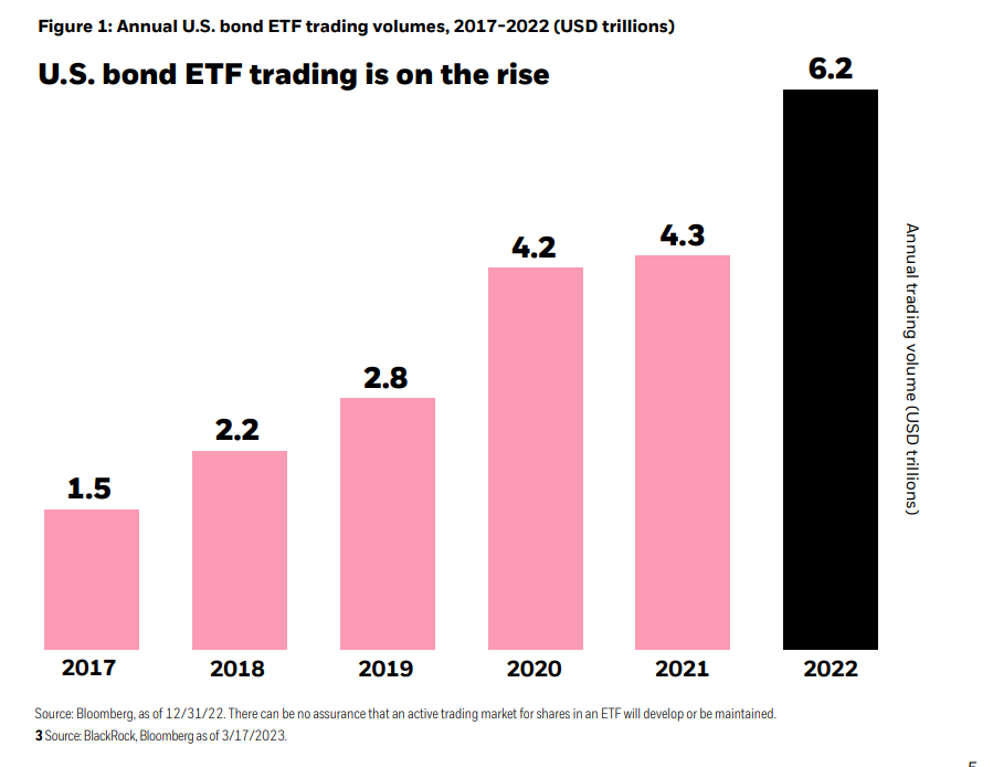
Today’s Chart of the Day from BlackRock shows the increasing use of Bond Exchange Traded Funds (ETFs) in the US. Why? Many investors see them as more..
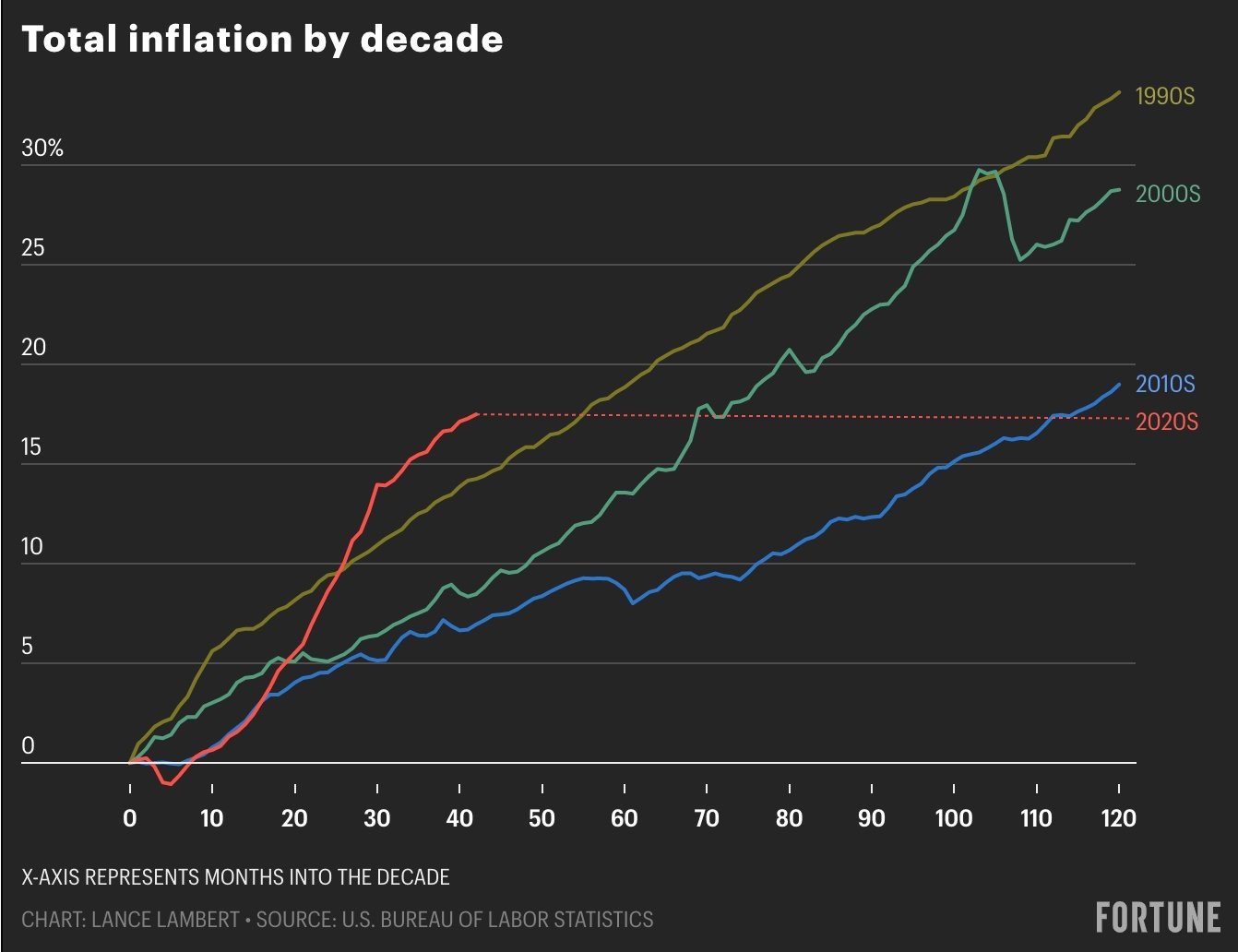
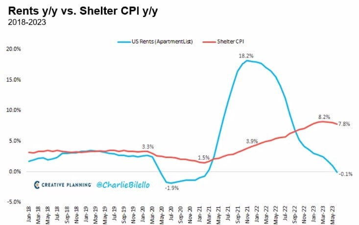
Today’s Chart of the Day comes from Lance Lambert, @NewsLambert on Twitter, who works for Fortune Magazine. The chart shows total inflation by decade..

I’m going to take a small detour from my typical Chart of the Day to tell a short story of Aretha Franklin’s will.